Global Trade Flows

Finally, at least some documentation for the “Global Trade Flows” project I completed last year for citibank. Unfortunately, I cannot publish the full interactive tool, but I hope the screenshots are informative enough.
Data Stories

I started a podcast series — together with Enrico Bertini — named DATA STORIES. Exciting!
WEF Risk Report 2012

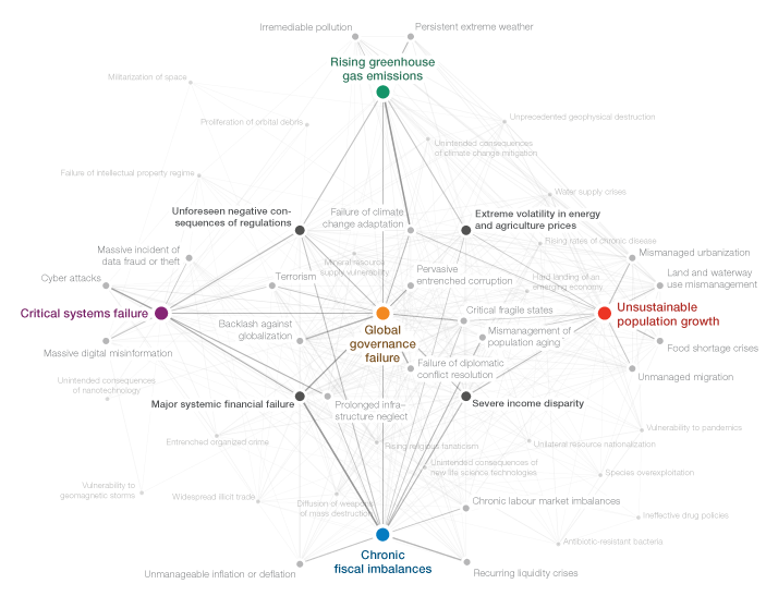
For the third year in a row, I was responsible for a good deal of the graphics in the annual Global Risk Report published by the World Economic Forum. For the report, hundreds of experts take part in a survey on their perception of what they consider the most important global risk and their inter–dependency.
Three types of graphics are at the heart of the report:

The “crystal” network diagram sheds light on the “Centers of Gravity” (systemically most important risks) in each category (Economic, Environmetal, Societal, Geopolitical, and Technological Risks) and the risks strongest connected to these. The network was layed out in d3.js, using force-directed layout and a “magnetic” grid for regular spacing and to avoid overlaps. The centers of gravity and the 4 most important connectors were fixated manually in this process, to enforce the “crystal” structure. This rough layout was then imported into Illustrator and refined and tweaked by hand. There is also a version which shows a cloud of all risks in the background, but I think this one obscures the conceptual/diagrammatic nature of the original, so personally, I prefer the cleaner version.

The same interconnectivity information can be explored in an “orbit” visualization that plays a bit on the gravity theme established in the survey. Clicking a risk will put it into the center and show how strongly the other risks are connected by how close or far away they are located – a very simple, but quite effective and clean approach to network visualization, by getting rid of the lines altogether and just working with size and distance to express connectivity.

Last, but not least, we have a simple cartesian plot arranging the risks by impact and likelihood. As we gathered some information on the respondents’ region of residence and their stakeholder group, you can explore how, for instance, Asian experts’ perception on economic issues differs from the rest of the respondents.
All interactive visualizations were implemented using jQuery, underscore.js, and raphael.js. For the network visualization, I used the force directed layout from d3.js.
Make sure to consume the full interactive report or in pdf form.
Truth and Beauty
For those who missed it the first time around – here is my talk from the eyeo conference this summer:
You should definitely also check out the other videos in the eyeo collection, and watch out for upcoming releases, there were literally dozens of great, great talks.
Max Planck Research Networks
Science! Multitouch! Networks! All in one project! Can it be true? Yes, it can. Here it is:

The multi-touch installation Max Planck Research Networks reveals how Max Planck Institutes collaborate with each other, and with their international partners.
The piece is exhibited at the Max Planck Science Gallery, a highly interactive exhibition space presenting new forms of science communication in Berlin. You should come and visit it.
This is the first larger Java project I ever did, and it would not – at all – have been possible without Christopher Warnow from onformative, so thanks for for the great cooperation! (Big thanks go to the rest of onformative, too – to Cedric for the idea for the label placement algorithm and Julia for the great support with the documentation.)
Big thanks also to my colleagues at Elsevier and Max Planck Gesellschaft, who made the collaboration a real pleasure. I was also quite impressed with the overall project direction of Archimedes, who did a fabulous job of conceiving and realizing the exhibition space.
Chances to see me
I am back after a small summer break in lovely Bavaria. I would like to point you to some events I will take part in.
alpha-ville symposium Sep 23, London
Find out what post-digitalism might actually mean, with, among others: Filip Visnjic – Architect, Lecturer and Founder of Creative Applications Network, Tom Uglow – Director of Creative Labs Europe, Google, Drew Hemment – Director & Founder of Future Everything etc. And me!
decoded conference 2011 Oct 15, Munich
Last year, I was invited as a speaker, and now I come as a visitor and friend. Looking forward to a really interesting mixture of speakers!
EDIT 2011 Oct 21–23, Røros
I hope I am not jumping the gun here, but you might want to have an eye on the EDIT festival in case you are from Norway! Just saying!
visualizing marathon Dec 3–4, Munich Berlin
I like the sportive idea behind the visualizing marathon, where teams of students compete in producing the best visualization in 24 hours. I will be around for the Munich Berlin event, and give a short introductory speech.
this happened
Watch me talk about the notabilia project at “this happened Hamburg” (in German, though!)
And find the slides here.
Also make sure to watch the other speakers as well – everyone was very inspiring and unique!
The VIZoSPHERE
A new diversion of mine: mapping twitter accounts related to information visualization with gephi:

This map shows 1645 twitter accounts related to the topic of information visualization. The accounts were determined as follows: For a subjective selection of “seed accounts”[1], the twitter API was queried for followers and friends. In order to be included into the map, a user account needed to have at least 5 links (i.e. follow or being followed) to one of these accounts. The size of the network nodes indicates the number of followers within this network.
[1] The seed accounts were; @moritz_stefaner, @datavis, @infosthetics, @wiederkehr, @FILWD,
@janwillemtulp, @visualisingdata, @jcukier, @mccandelish, @flowingdata, @mslima, @blprnt,
@pitchinteractiv, @bestiario140, @eagereyes, @feltron, @stamen, @thewhyaxis
Places & Spaces
I am happy to announce that the MACE taxonomy visualization I did a few years ago will be part of this year’s Places and Spaces exhibition. For this occasion, I brushed up the original graphic a bit (most notably somehow managed to export a somewhat editable pdf from Flash with AlivePDF), and added some explanations, and voila, here is the poster:

Feel free to print it yourself (CC BY-NC-SA):
download portrait version (pdf)
download landscape version (pdf)
Lasst die Daten sprechen
Here is the recording of my (German) talk from last year’s decoded conference: “Lasst die Daten sprechen – Datenvisualisierung und Informationsaesthetik”