WEF Risk Report 2012
For the third year in a row, I was responsible for a good deal of the graphics in the annual Global Risk Report published by the World Economic Forum. For the report, hundreds of experts take part in a survey on their perception of what they consider the most important global risk and their inter–dependency.
Three types of graphics are at the heart of the report:

The “crystal” network diagram sheds light on the “Centers of Gravity” (systemically most important risks) in each category (Economic, Environmetal, Societal, Geopolitical, and Technological Risks) and the risks strongest connected to these. The network was layed out in d3.js, using force-directed layout and a “magnetic” grid for regular spacing and to avoid overlaps. The centers of gravity and the 4 most important connectors were fixated manually in this process, to enforce the “crystal” structure. This rough layout was then imported into Illustrator and refined and tweaked by hand. There is also a version which shows a cloud of all risks in the background, but I think this one obscures the conceptual/diagrammatic nature of the original, so personally, I prefer the cleaner version.
The same interconnectivity information can be explored in an “orbit” visualization that plays a bit on the gravity theme established in the survey. Clicking a risk will put it into the center and show how strongly the other risks are connected by how close or far away they are located – a very simple, but quite effective and clean approach to network visualization, by getting rid of the lines altogether and just working with size and distance to express connectivity.
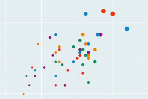
Last, but not least, we have a simple cartesian plot arranging the risks by impact and likelihood. As we gathered some information on the respondents’ region of residence and their stakeholder group, you can explore how, for instance, Asian experts’ perception on economic issues differs from the rest of the respondents.
All interactive visualizations were implemented using jQuery, underscore.js, and raphael.js. For the network visualization, I used the force directed layout from d3.js.
Make sure to consume the full interactive report or in pdf form.


