Where the wild bees are
I am happy to announce that I just published my first information graphic for Scientific American on a topic that is very close to my heart – bees :)
Together with my passion for communicating complex science, Jen Christiansen correctly realized this package would be an offer I could hardly resist (despite my packed schedule), and I am really glad how the project and collaboration turned out.
Personally, I am always keen on hearing the inside stories behind projects — so, here is me returning the favor, with a brief overview of how I approached the project:
Mapping Electionland
I created a whole new kind of election map for the German Bundestag elections 2013 for ZEIT Online. Instead of showing the electoral districts results on a geographic map, or in a table, I decided use the data to map a new land: Electionland (german version | english version), where all the districts which vote in a similar way are located nearby. This new kind of map allows us to see a Germany grouped by lifestyles, preferences and attitudes.
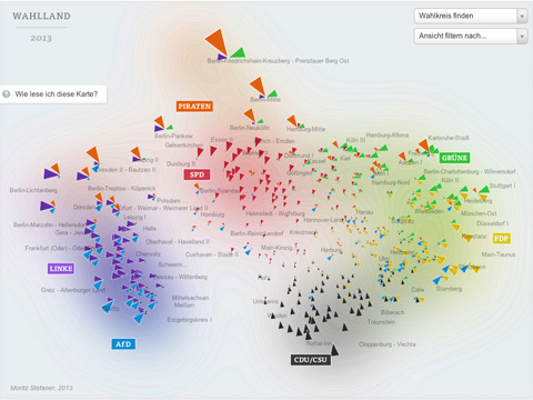
Here is some background on how I created this map. First of all, I need to normalize the data and make the parties comparable. To this end, I applied a z-score normalization on the data. In short, a z-score centers the data (so the average value is at zero), and it rescales the data, so that one standard deviation difference from the average lands at one, two standard deviation differences from the average lands at 2, etc. This makes the relative differences in voting behavior comparable, even if we compare huge parties with smaller ones.
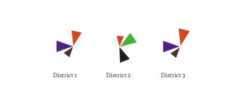
In the map, the triangle sizes correspond to these z-scores per party; I only show the results above average – these are the “characteristic” parties for a district. Each color and angle stands for one party.
I then use scikit-learn to calculate a 2-dimensional map of the resulting “electoral district space” using Multi-Dimensional Scaling or short: MDS.
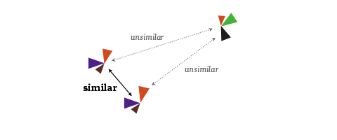
It is an algorithm that you can feed a matrix of similarities between objects (in our case, how similarly the districts voted), and it will attempt to find an arrangement that expresses these similarities as good as possible on a two-dimensional map. (For me, also a nice flashback to my 2005 B.Sc. Thesis, where I investigated MDS and related algorithms quite a bit :)
Some words about the interpretation of the map: First of all, it is important to note that the rotation of the map is a purely aesthetic choice. The MDS algorithms defines only a relative space, where the positions of all elements with respect to each are important, but not on absolute axes. But within the data, some interesting axes seem to emerge nevertheless: top-to-bottom seems to be correspond quite well to the traditional left-to-right spectrum. The left-to-right axis to interpret is a bit trickier but definitely seems related to social status or income. Also interesting to see how the blue AfD party — a newly founded euro-sceptic protest party, sort of a wild card — seems to be all over the map in the vertical center. A bit shocking also to see how there still seems to be a gap in Germany (the island on the left in pretty much exclusively ex-east Germany), with only Leipzig and Postdam (yay) bridging the gap. A note on the huge orange triangles for the Pirate party – actually, their results were not that great, but the enabled them to be very much above average in some districts.
A few words on workflow: For the frontend, I used my new favorite development combo of d3, coffeescript and SASS. In addition, I used the jQuery plugins select2 for the dropdowns and qTip2 for the tooltips.
The labels of the parties and the districts were actually hand-arranged in Adobe Illustrator. I first exported a rough version of the graphic generated with d3 using the very handy SVG crowbar bookmarklet. I hand then hand-tweaked the placements in Illustrator, and saved the resulting graphic as an SVG, which I then dynamically load into page using a combination of this technique with this one (to make it IE9 compatible). Because the layer names actually translate to group IDs in SVG, I was also able to identify the graphics elements from d3, and assign them individual click actions, etc. A very promising approach which I will surely explore further in the future.
You might wonder how I achieved the blurry contour line look in the background – the answer is simply (and a bit embarassingly) Photoshop :) Again, I used a rough version of the graphic, which was then blurred, levelled and edge-detected.
And, yes, it would definitely be interesting to compare 2009 and 2013, and see which districts moved around how much :) but this is tricky due to both the districts structure as well as the parties for vote not being exactly the same. Happy to share my data though, in case anyone is interested in that type of analysis :)
Stadtbilder — mapping the digital shape of cities
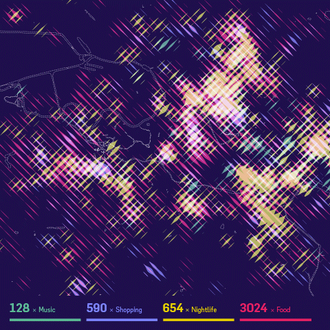
Stadtbilder (“city images”) is a new little side project of mine — an attempt to map the digital shape of cities. I am increasingly fascinated by the idea of mapping the “real world” — life and culture as opposed to just physical infrastructure — and when I learned about the really deep datasets Georgi from Uberblic had been collecting, I just had to work with the data.
The maps show an overlay of all the digitally marked “hotspots” in a city, such as restaurant, hotels, clubs, etc. collected from different service like yelp, or foursquare. What they don’t show are the streets, the railroads, the buildings. I wanted to to portray the living parts of the cities as opposed to the technical/physical infrastructure you usually see on maps.The only exception are the rivers and lakes, because I felt they help a lot in orienting on these fairly abstract maps.
While the designs are meant to be printed, as a digital companion, the website helps you decipher the posters by providing a little map overlay on click. If you are interested in a print, please sign up to be notified when prints are available — I still need to figure out the precise logistics. (Let me know if you know of a high-quality poster printing and shipping service a la imagekind which can also ship from EU/worldwide..)
For now I settled on the three main German cities, because they have very different characteristics, and I know them very well. But I might be convinced to do other city editions as well :)
Here are some process shots!
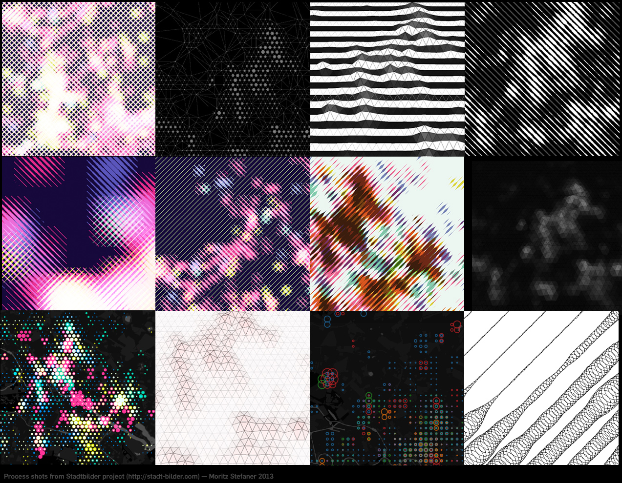
It took me a while to figure out how to overlay these four different heatmaps on top of each other. I experimented with 3D manifolds, different dot patterns, small multiples, etc. etc. In the end, I am really happy with the solution I came up with, as combining always two of them in one stroke direction allows to decipher all of the dimensions, and just by looking at stroke width and brightness (if the two overlap), no need to do “color mixing reverse engineering” in your head, which is pretty much impossible anyways. The downside of this approach is obviously a low spatial resolution.
How does it work technically?
I first query the Uberblic API (not public yet, sorry ;) for the scores in the different categories by marching through a hexagonal grid.
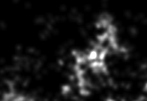
From the values, I first draw fairly blurry heatmaps in processing:
I then walk over these heatmaps pixel by pixel in diagonal lines, and draw on a new canvas a line whose stroke corresponds to the brightness of the pixel on each step:

and then I merge and simplify these images in Illustrator. That’s it!
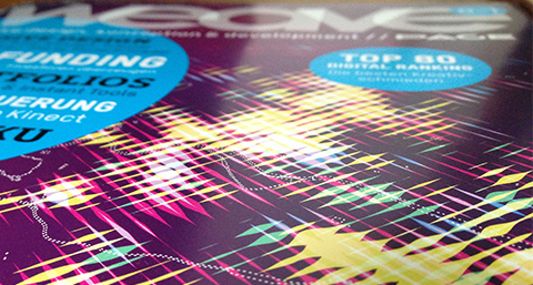
In other news, the Berlin version made it to the cover of WEAVE magazine already (but it should be noted that for this use case, the background was tweaked more into a blueberry tone, the original is way more violet):
If you find this project interesting, Flowingcity hosts a collection many more projects in this direction.
Anyways, let me know what you think of it!
Update: Prints are now available!
“Weltbilder” master course
This semester, I taught a master course on information visualization at HfK Bremen. It was quite fun and I think I was able improve a bit on the teaching side compared to the first full course I taught two years ago.
The topic was “Weltbilder” – “World views” which has become sort of a theme for my work lately. Here are the introductory slides and reference projects:
The course took place on 8 full days over the course of four weeks in February and March 2013. Overall, I had more than 20 students in the course (although some were only listening in without handing in a final project). The first few sessions were partly filled with me teaching basic craftmanship (slides—30MB) and establishing context, while the students gave presentations on some of my favorite scientific papers and articles (dropbox) and practitioners (such as Nathalie Miebach, Stefanie Posavec, Density Design, Santiago Ortiz, Nicholas Felton, Periscopic, Stamen, Ben Fry, Martin Wattenberg & Fernanda Viegas and the NYT graphics desk). We also had a few practical exercises on drawing family trees and fixing broken charts.
The second half of the course was much concerned with the student’s projects, and I did mostly 1:1 consultations. You can find a few of the final projects here. I like how the course results reflect the diversity of the students themselves – we had artists, computer scientists, journalists, people from humanities – quite a mixed bunch. Overall, I am quite happy with how things worked out and hope I could excite a few of my students to keep doing things in this field :)
Here are two of my favorite projects:
but in sum, they were all pretty nice in one way or the other :) Here’s the gallery
Mapping research excellence

Together with Lutz Bornmann, Rüdiger Mutz and Felix de Moya Anegon, I have been looking into which institutions (universities or research-focused institutions) are most active in different subject areas of science and which have published the most excellent papers. Based on my colleagues data analysis, we produced a small web application which allows to browse and explore the data set. The application is password protected, so you will need to end an email to password-request at excellencemapping.net to request access.
FIFA Development Globe

We finally launched the FIFA Development Globe, a project that has been in the making over the whole year. High fives and congrats to my fellow colleagues at Medienfabrik, Studio NAND, and Jens Franke. It was great to collaborate with you.
Information is Beautiful Award

As you know, I was never too fond of awards — until I won two of them in one night :)
emoto data sculpture
We just finished the documentation for emoto – a data art project visualising the online response to the Olympics London 2012.
In many ways, the crowning piece of the project, and a conceptual counterpoint to the ephemeral web activities, our data sculpture preserved the more than 12 million tweets we collected in physical form. We had 17 plates CNC-milled — one for each day of the games — with a relief heatmap indicating the emotional highs and lows of each day. Overlay projections highlighted individual stories, and visitors could scroll through the most retweeted tweets per hour for each story using a control knob.

The tweets and topics displayed in the installation can also be investigated in interactive heatmaps. Rollover the rows to see a tooltip display of the most retweeted tweet on the given topic at the respective point in time.
Thanks so much to my fantastic collaborators at Studio NAND, and Drew Hemment and the team at and around Future Everything and everyone involved!
Plenty-plenty Sentimenti!
Find a brief documentation at moritz.stefaner.eu/projects/emoto/
or read more on the project here:
nand.io/visualisation/emoto-installation
nand.io/visualisation/emoto
Article and interview on Creators Project
Data Stories podcast episode #11 with Stephan Thiel on emoto
emoto

A true mamooth project has finally launched: emoto.
Together with a huge team around Drew Hemment and Studio NAND, and a partnership with MIT Senseable City Lab, we aim at visualising the online reponse to the Olympic Games for the London 2012 Festival and Cultural Olympiad in the Northwest.

Basically, the idea is to track Twitter messages for content (which topics, disciplines, athletes etc they refer) to and emotional tone (are they cheering, swearing, being indifferent) and make that info available real-time on http://emoto2012.org, as a supplement or even alternative to traditional ways of consuming the Games coverage.

Our goal is to reveal both the big picture as well as the little anecdotes that make up the big, big stream of messages.

After the games, we will turn the collected tweets into an actual physical object, to archive these ephemeral little “things flying by” forever.
And during the games, we are posting insights and in-depth analyses (here is a first post on the Opening Ceremony), so there is also a little data journalistic angle to the whole package.
I have to say, this is probably one of the most ambitious projects I have worked on this far, and despite some small rocks encountered along the way, I am really happy how it turned out.. I hope you like it, too!
Data Cuisine

I am happy to announce my most out-there infovis related activity this year: The open data cooking workshop. Organized together with Prozessagenten and Miska Knapek, we will invite 15 participants to explore the data-expressive qualities of food together. Our idea is to cook food with local ingredients that represents local (open) data about the region where the workshop is. If you think about it, there are some many ways food can be used to express data: 2d painting/drawing, 3d sculpture, taste dimensions, texture, all the cultural connotations (potato vs. caviar), preparation processes and variables (e.g. automated oven temperature regulation), presentation, … The possibilities are endless!
Much looking forward. Thanks to pixelache and okfn for making this happen!