Little boxes
Would the field of data vis benefit from a clear line between art and design, as Lisa C. Rost suggests (see also the follow-up post)?
This debate has been around for a while (see e.g. Lev Manovich’s Info Aesthetics, The Manifesto debate, the Cargo Cult debate, Jorge Camoe’s attempts, but also helpful papers like “The Role of Design in Information Visualization“ etc) and of course, there is a literally a century of discourse on art and design in other fields as well.
Here’s my take:
-ach, -ingen, -zell
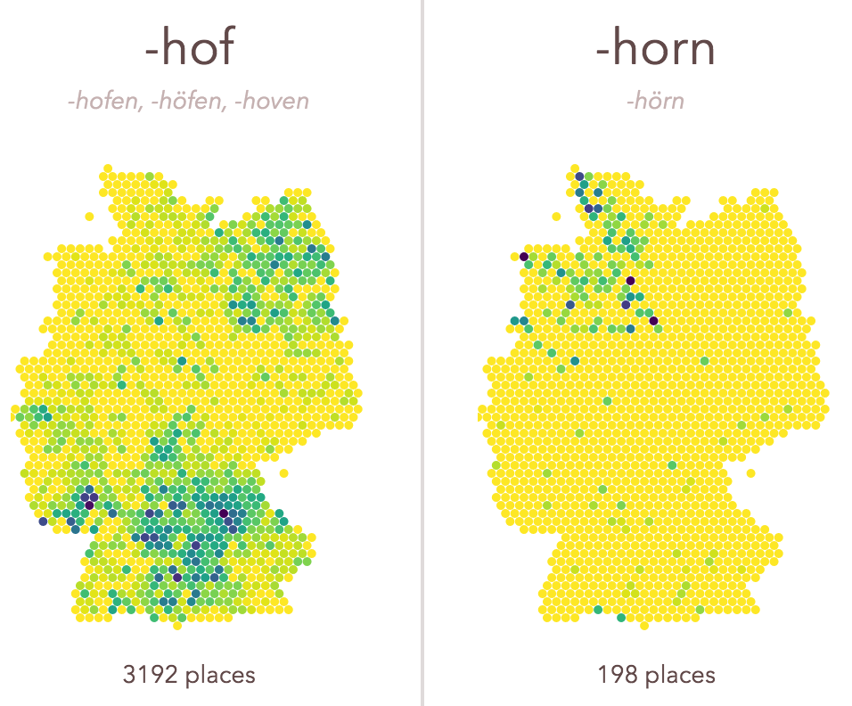
If you travel across Germany, you will notice how some place name endings are quite universal, and others are quite specific, regionally. -ach, -ingen, -zell is a little exploration of those spatial patterns. It was a welcome opportunity to experiment with a few techniques I wanted to learn more about. Find the code with some remarks on github.
eyeo community visualizations
The eyeo festival and the community around it has a very special place in my heart. When Dave Schroeder announced the team was editing a book to celebrate the fifth anniversary, my immediate thought was to use this opportunity to follow up on an old idea, which I had been kicking around for a while (also with a few friends) — mapping the community around this arts-tech-creative-code-datavis thing.
What are the different niches in the community? Who is bridging the clusters? How do places, institutions, shape these communities, how do people influence each other over time? End of the day, I’d really like to have this big map of how the last 20 years went down in the field.
So, I took the chance and asked each eyeo contributor (speaker, panelist, lecturer…) from the past five years to name their most important connections in three categories:

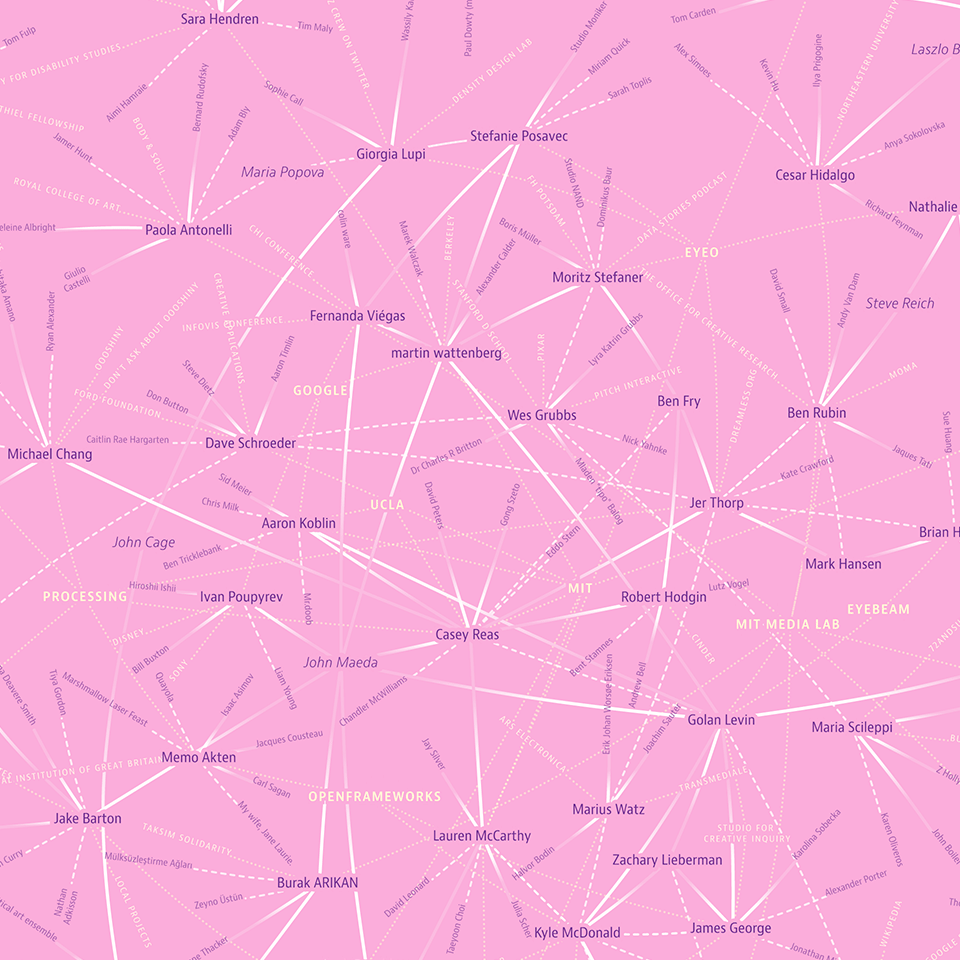
resulting in the eyeo scenegraph network visualization:
This map is much less about the big topology and importance of individual nodes, but much more about all the individual connections and anecdotes. You really need to take some time to study all the links and references.
Most interesting to me — the list of people who were mentioned by at least two others, but never spoke themselves at the festival (or, at least, din’t answer the survey): Nicole Aptekar, Mike Migurski, Laszlo Barabasi, Maria Popova, Steve Reich, John Cage, Aurelia Moser, Alexander Galloway, Daito Manabe (spoke in 2013), Jesper Kouthoofd, Michael Naimark, Sep Kamvar, John Maeda.
The workflow for this one was quite complex – a python script to collect the data (took days, as the new twitter API allows only very limited access), layout calculations in gephi, svg export for manual tweaks in Illustrator.
But, it left me (and Golan Levin, who dropped by at my house one day :D) a bit unsatisfied: where are all the other people… Just focussing on the people on stage seemed inadequate for eyeo, where the visitors are sometimes more interesting than the speakers :D
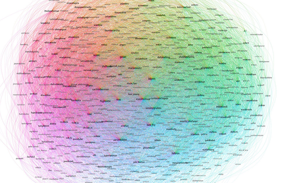
Luckily, the eyeo team collected twitter handles from attendees! So I went on and created the eyeo crowdcloud:
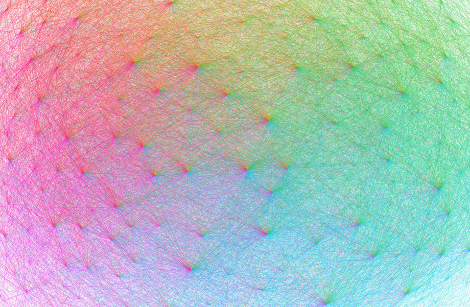
A network map, showing 852 twitter accounts related to the eyeo festival. The network layout was calculated using gephi and brings more strongly connected accounts closer together. The size of the account labels corresponds to the number of followers in this network. Each line drawn is a followership relation. It is colored according to the followers color which is assigned based on the angular position on the map. As a result, accounts with followers from many different regions of the map look more colorful.
This one is much more dense and interesting from a “landscape” point of view — the different sub communities are represented quite well on different areas in the map, with colorful connectors in the center :)
Obvious “see also”: The resonet visualization I did for resonate.
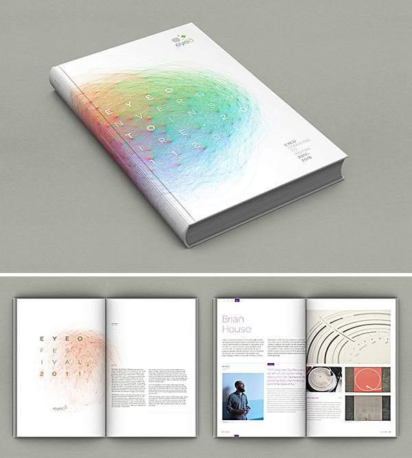
And, here’s the best part — the visuals actually made it to the book — as cover and chapter visuals!
I am super grateful to Dave Schroeder and the team for this huge honor, and enabling me to give back to a festival that has been so important for me!
Now, my only drop of bitterness is that I’ll miss the festival next week… but there’s only so-and-so much travel I (and the family) can enjoy. I’ll be following on twitter! ;)
All new: Truth & Beauty Operations
After many months — building your own sites is hard! — I am finally able to launch truth-and-beauty.net, my new portfolio site! It replaces the old moritz.stefaner.eu, which now lives at archive.stefaner.eu, as I was not able to (and probably won’t) migrate all old contents over.
A few notes on technology – I knew I wanted a static site generator, rather than a database driven site. Being able to sync, version control, move the whole site with normal file operations is such a huge win. After a few experiments with Jekyll, Octopress and DocPad, I finally settled for kirby. I really don’t like php. But I really like kirby. It is the only half-way sane CMS I know and working with it has been a breeze so far. Thanks Bastian!
VIS 2014
I long, long resisted going to IEEE VIS, but this year, it’s about time. I’ll moderate a panel featuring top notch speakers: Tariq, Scott, Matteo, Greg and I will try to shed some light on what it’s like to work with and publish data in the NGO context, and how we can improve! This should be interesting. Check out the (simple) announcement video here:
The other thing I am really looking forward to, is the tutorial I’ll teach together with Dominikus Baur. We will look at all the practical aspects of producing successful web-based data visualizations — except the actual data vis code. So, we will discuss deeplinking, performance, shareability, help and explanations, fallbacks, mobile optimizations – all the stuff that makes great web applications really great, but which we all underestimate all the time.
Looking forward! Who else is going? Ping me!
PS: Maybe we should do a datastories listener meetup? Or something?
Shared tag space
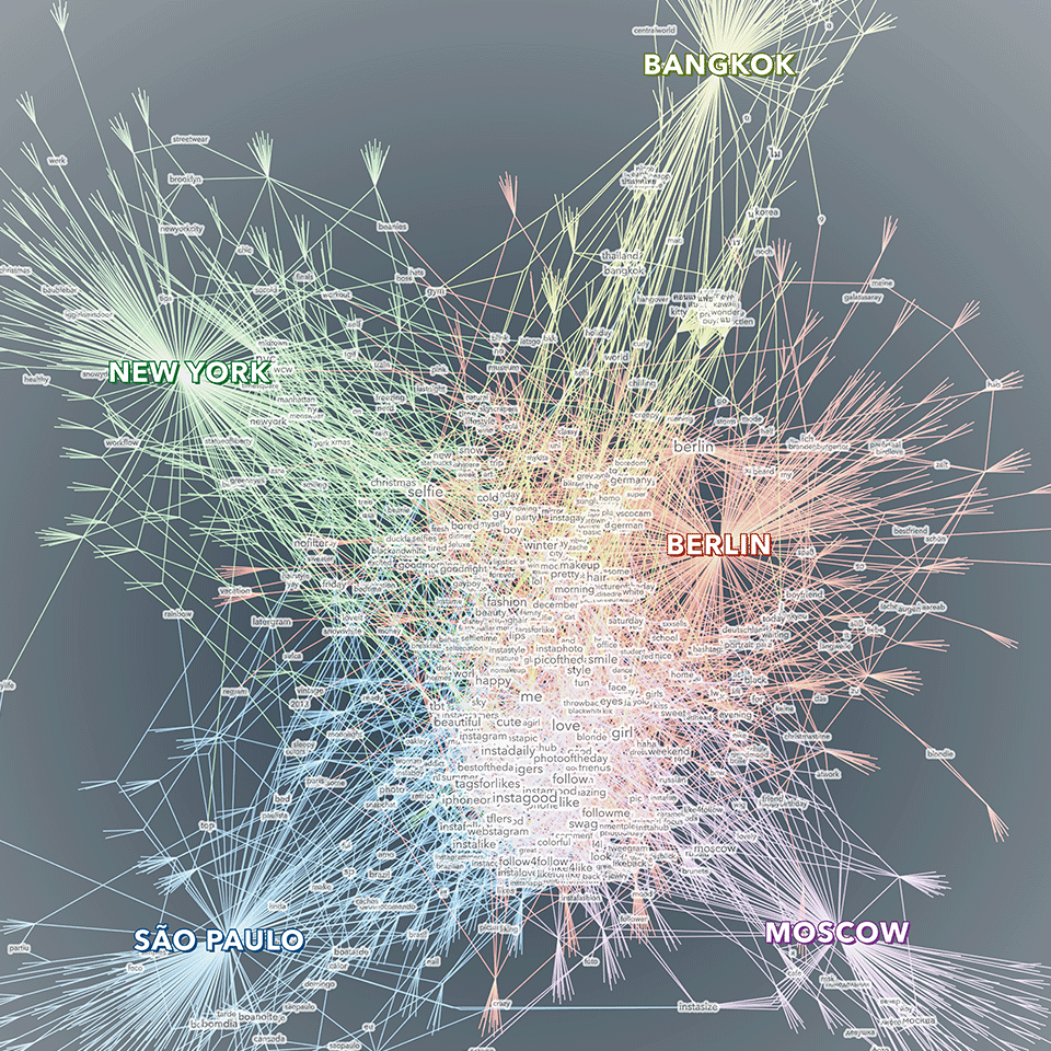
A little sideproduct from the selfiecity project:
Shared tag space — a comparative visualization of the keywords people in five cities use to describe their selfies. The visualization displays a network of tags, cities and photos. The photos are used as bridges between tags and cities. Only tags that have been used at least twice are displayed with a text label. Bigger tags are used more often. The tags in the center constitute shared vocabulary across the cities, while the ones on the outside are more specific to one (or sometimes two) cities. The visualization was created as part of the selfiecity project, an interdisciplinary investigation of the selfie phenomenon.
Created with gephi, processing, Adobe Illustrator.
OECD Data Portal
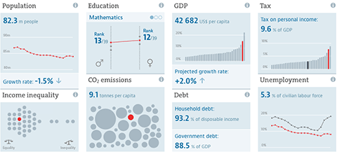
A few notes on a new, big project I have been involved with: The OECD Data Portal is now in public beta. It is still a bit rough around the edges, but we are excited to see the full website in its entirety. The main design credit goes to Raureif, and the UI implementation has been done by 9elements. I have been responsible for the chart design and specifications, and general data visualization strategy.
Unlike many of my other projects, this project is less about spotting patterns in the data, or communicating insights, but starts one step earlier: How can we actually make large collections of data sets available, and how can we guide users to the datasets they are looking for?
OECD Regional Well-Being
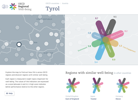
OECD Regional Well-Being: A new site for the OECD, and once again with my great collaborator Dominikus Baur and some help from my friends over at Raureif.
The site presents an exciting new perspective on more than 300 regions worldwide. As we all know, conditions inside a country can differ quite drastically, so going beyond the country averages presents an important step in the Better Life Initiative.
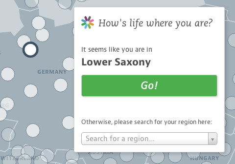
The user experience of the site is very consciously centered around the comparison of single regions in their context. Instead of presenting complex overviews, we start the experience with what people know best – their own home region. How does it compare to other regions in their country? And across all OECD regions? How have things developed over time?
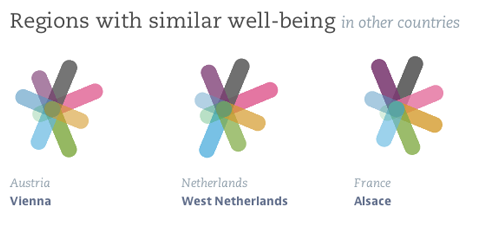
The key visual element – the multi-colored star charts – represent the diversity of aspects we need to consider at when talking about regional differences. Each region receives a unique symbol, representing its particular well-being profile. This design principle was pioneered in the famous flower design of the OECD Better Life Index — which is part of the same initiative — and was now brought to a new logical extension for this new “family member”.
Reflecting your own region in context provides a natural starting point for further explorations. One particular option we offer is the “Regions with similar well-being” section, which suggests regions with similar indiator values all over the world. Who knew that Texas and Scotland are actually not that far apart, when it comes to well-being (well, except for the Safety aspect)? Or that Berlin has a similar profile as Alsace?
From a design point of view, the main challenge has been to deal with the complexity and scale of the data set. With ten indicators per region, most of which have also trend values, and 362 regions in the dataset, the site provides access to over 7000 data points. In designing the site, we made sure to introduce a hierarchy of information that presents the most important values values at a glance, but at the same always provides the context to a single data points that makes it meaningful, and reveals deeper information step by step.
Another detail we really like is that we added twitter and facebook buttons to all the auto-generated short factoid sentences, so you can easily spread facts you find interesting or surprising. Just hover with your mouse and wait for two seconds for the pop-ups to appear.
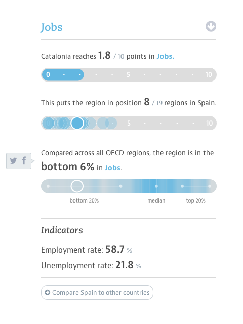
Here is a full region page in all its glory:
And finally — if you like the “no overview” approach, you should also definitely check out our datastories episode with Marian Dörk.
Now, go and find out how your region fares :)
PS: In case you would like to report on the project – why not use these crisp retina screenshots!
Data Cuisine Workshop Barcelona: The results
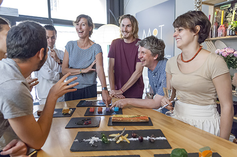
The Data Cuisine Workshop Barcelona was fantastic, we had a really great time.
Big thanks to my collaborators Dr. Susanne Jaschko and Sebastian Velilla, thanks to Jose Luis de Vicente and Olga Subiros for bringing us over, and last but not least for our great participants for the crazy dish ideas they came up with!
Check out the full documentation at data-cuisine.net. (And do get in touch in case you have ideas for other occasions where we could place the workshop – we love exploring this field.)
Data Cuisine: Barcelona
I am *ridiculously* excited to announce a new edition of data cuisine workshop. This time, it is the Data Cuisine Workshop Barcelona!
The workshop is happening in coordination with CCCB, the Big Bang Data exhibition, and Sónar. For the culinary side of the project, we will collaborate with Sebastian Velilla — a chef who has worked for the Alícia Foundation and is currently involved in the activities of the Torribera Food and Nutrition Campus of the University of Barcelona. And — it’s all happening in two and a half weeks (June 10-13). This. is. Crazy!
In case you are interested – register right now! (I expect things to move very fast, so be quick!)
 Foto credit