Tyne – simulation as visualization

Together with Stephan Thiel (who did all the heavy lifting) from NAND.io, I am happy to present a small new visualization: Tyne, a visualization of the sensor data generated by ~flowmill, a tide mill floating on the river Tyne, in Newcastle.

Stephan has already a great write-up on the nand.io site, which I recommend reading first, so here are a few comments beyond this project description:
What I find quite interesting about the project is the use of simulation as visualization. Although we used little image thumbnails as icons for each visualization, the actual visualization is in fact a particle simulation which is seeded with the five sensor values measured at a given point in time. Four of these are used as physics parameter – expanding the stream for values greater than the mean, contracting for values below. The fifth parameter – wheel speed – is directly related to the water speed and is thus guiding the particle speed. This experiential, process-based, anecdotal, slowly unravelling form of visualization, evoking thoughts of water and wood at the same time, reflects our experience of this highly unusual project after visiting the flowmill ourselves. It became clear that the precise values of the sensors themselves are only side actors in a larger, association-rich and quite unusual system, which we wanted to reflect in our work. Also, the anecdotal nature of the measurements (only every half hour, with quite varying results) called for a treatment of the values beyond a simple line or area chart, so we decided to represent each “data anecdote” in a like-wise closed, single anecdotal visualization, representing the situation at a given, but ultimately arbitrary point in time. Also, the imprecision in visual translation did not happen without thought, in fact, an overly precise display of the values would have, ironically, resulted in “lying about the data”, given the imprecise nature of the system generating the values. (Compute that, line chart afficionados.)
Scaling and transforming real-time sensor data in a robust manner is always tricky.To get the data into a form that it was handleable and also allowed comparisons across the very different scales in the different variables (with values ranging from fractions of zero to hundreds), we employed a z-score scaling, which centers the data around zero (i.e. “usual” data points lie around zero), and also scales the data such that around two thirds of the data lie between -1 and 1. This helps both in using the values in a predictable way, but also allowing quick identification of high, low, or average values, without having to learn different scales across variables – in the end, who knows, if a salinity value of 238 is high or low for a North English river.
Finally, I want to share one dismissed approach which was hard to control, and aesthetically not exactly the thing we were after, but quite interesting nevertheless:
Based on Kyle McDonald’s code, which in turn was based on John McCabe’s explorations of multi-scale Turing patterns, we toyed with the idea of trying to force the algorithm to produce blobs of specific sizes by “injecting” black pixels while the algorithm was running. Also, we muted all but the bottom and a few top layers, resulting in a bigger difference between micro- and macro-structure. In the end, the computations turned out to heavy to be run directly in the browser, and the code a wee bit too unpredictable, so we went with a more controllable and visually more fitting approach. Right now, the code is not quite ready for sharing, but I can offer to clean up and upload the code, in case anyone has a strong interest.
Muesli Ingredient Network

I put a little new project online, analyzing which ingredients were ordered together most often in custom muesli mixtures from mymuesli.com customers. Besides chocolate, nuts and oat, the project description also features a little excursion on matrix views of networks, and conditional probabilities.
Data Stories

I started a podcast series — together with Enrico Bertini — named DATA STORIES. Exciting!
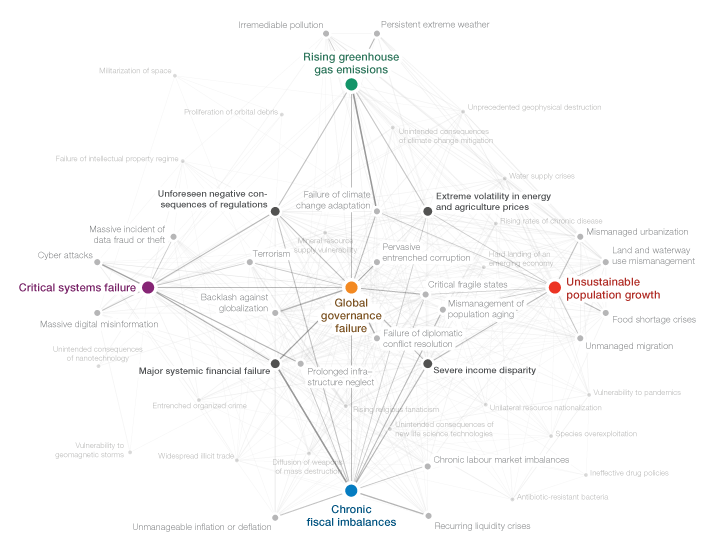
WEF Risk Report 2012

For the third year in a row, I was responsible for a good deal of the graphics in the annual Global Risk Report published by the World Economic Forum. For the report, hundreds of experts take part in a survey on their perception of what they consider the most important global risk and their inter–dependency.
Three types of graphics are at the heart of the report:

The “crystal” network diagram sheds light on the “Centers of Gravity” (systemically most important risks) in each category (Economic, Environmetal, Societal, Geopolitical, and Technological Risks) and the risks strongest connected to these. The network was layed out in d3.js, using force-directed layout and a “magnetic” grid for regular spacing and to avoid overlaps. The centers of gravity and the 4 most important connectors were fixated manually in this process, to enforce the “crystal” structure. This rough layout was then imported into Illustrator and refined and tweaked by hand. There is also a version which shows a cloud of all risks in the background, but I think this one obscures the conceptual/diagrammatic nature of the original, so personally, I prefer the cleaner version.

The same interconnectivity information can be explored in an “orbit” visualization that plays a bit on the gravity theme established in the survey. Clicking a risk will put it into the center and show how strongly the other risks are connected by how close or far away they are located – a very simple, but quite effective and clean approach to network visualization, by getting rid of the lines altogether and just working with size and distance to express connectivity.

Last, but not least, we have a simple cartesian plot arranging the risks by impact and likelihood. As we gathered some information on the respondents’ region of residence and their stakeholder group, you can explore how, for instance, Asian experts’ perception on economic issues differs from the rest of the respondents.
All interactive visualizations were implemented using jQuery, underscore.js, and raphael.js. For the network visualization, I used the force directed layout from d3.js.
Make sure to consume the full interactive report or in pdf form.
Substratum interview

The fine folks over at Interactive Things interviewed a few great designers and hackers for their substratum interview series. I also answered some questions – read the interview here.
5 years of well-formed-data
Five years ago, I posted the first entry on this blog. I think it is safe to say, it’s been a wild ride. I know lots of you who read this have been following my work for a long time, and I would sincerely thank you all for your attention, comments, and help.
For the younger ones among you: 5 years ago, infosthetics was pretty in purple (with that awkward off-center vertical axis). 5 years ago, there was no flowingdata.com. But yes, we did have electricity, thanks for asking.
What was I doing 5 years ago? Well, I was just starting my master’s at the interface design program at FH Potsdam. The fabulous Prof. Boris Müller took me under his wings, and he made me visualize the heck out of this brand new thing called web 2.0! Tags! Feeds! Blogging! Wikipedia! A new world order! Ah, exciting times. Although clearly a child of its times, I still think my thesis turned out quite nice, and laid the foundation for many, many good things to come. The weeks of my thesis presentation were probably the most intense of my life, with me and Sina moving together, me presenting my thesis, Sina’s father dying and our son Juri being born in the course of only a few very short weeks. A whole new chapter had started, and now I was living on the country side with a baby, commuting to Potsdam for my part-time research position, and at the same time working freelance datavis jobs.
Well, many things have happened in the meantime, and I am very grateful for where I am at right now. Here’s to the next 5 years of well-forming whatever data I come across!
Global Agenda Survey 2011
Old news for you, if you follow me on twitter already (or read infosthetics), but here is a quick pointer to the interactive graphics for the Global Agenda Survey 2011 we launched last week for the World Economic Forum:

I realized the project together with the talented Jan Willem Tulp, from who you surely will hear much more over the next few months.
A little technical note: The interactive graphics were all done in HTML5, with the help of the following great Javascript frameworks: raphael.js, underscore.js, d3.js. Except for the network visualization, all graphics run fully interactive down to IE6. #techachievement #lookma #noflash
Truth and Beauty
For those who missed it the first time around – here is my talk from the eyeo conference this summer:
You should definitely also check out the other videos in the eyeo collection, and watch out for upcoming releases, there were literally dozens of great, great talks.
On the role of bacon in visualization
I recently ran across a chart on Spiegel Online, the most popular German site for online news. The chart was a tilted 3D heatmap in fully saturated primary colors, with a thick black arrow aside.

I quickly uttered my surprise at the presence of such a poorly designed chart – esp. in such a high profile online publication – in a snarky Twitter comment, and soon after, Robert Kosara posted a whole blog post defending the graphic, and calling for “a bit more subtlety in our criticism”.
Well, I am not sure if Twitter was optimized for subtlety, yet, I guess I should clarify a bit the background of my judgement (especially since Robert’s speculative assumptions about my train of thought is not accurate in all points).
The VIZoSPHERE
A new diversion of mine: mapping twitter accounts related to information visualization with gephi:

This map shows 1645 twitter accounts related to the topic of information visualization. The accounts were determined as follows: For a subjective selection of “seed accounts”[1], the twitter API was queried for followers and friends. In order to be included into the map, a user account needed to have at least 5 links (i.e. follow or being followed) to one of these accounts. The size of the network nodes indicates the number of followers within this network.
[1] The seed accounts were; @moritz_stefaner, @datavis, @infosthetics, @wiederkehr, @FILWD,
@janwillemtulp, @visualisingdata, @jcukier, @mccandelish, @flowingdata, @mslima, @blprnt,
@pitchinteractiv, @bestiario140, @eagereyes, @feltron, @stamen, @thewhyaxis