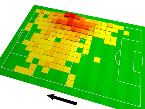
Little boxes
Would the field of data vis benefit from a clear line between art and design, as Lisa C. Rost suggests (see also the follow-up post)?
This debate has been around for a while (see e.g. Lev Manovich’s Info Aesthetics, The Manifesto debate, the Cargo Cult debate, Jorge Camoe’s attempts, but also helpful papers like “The Role of Design in Information Visualization“ etc) and of course, there is a literally a century of discourse on art and design in other fields as well.
Here’s my take:
On the role of bacon in visualization
I recently ran across a chart on Spiegel Online, the most popular German site for online news. The chart was a tilted 3D heatmap in fully saturated primary colors, with a thick black arrow aside.
I quickly uttered my surprise at the presence of such a poorly designed chart – esp. in such a high profile online publication – in a snarky Twitter comment, and soon after, Robert Kosara posted a whole blog post defending the graphic, and calling for “a bit more subtlety in our criticism”.
Well, I am not sure if Twitter was optimized for subtlety, yet, I guess I should clarify a bit the background of my judgement (especially since Robert’s speculative assumptions about my train of thought is not accurate in all points).
 Foto credit