On the role of bacon in visualization
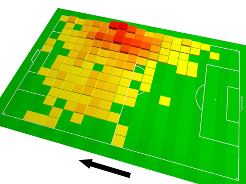
I recently ran across a chart on Spiegel Online, the most popular German site for online news. The chart was a tilted 3D heatmap in fully saturated primary colors, with a thick black arrow aside.
I quickly uttered my surprise at the presence of such a poorly designed chart – esp. in such a high profile online publication – in a snarky Twitter comment, and soon after, Robert Kosara posted a whole blog post defending the graphic, and calling for “a bit more subtlety in our criticism”.
Well, I am not sure if Twitter was optimized for subtlety, yet, I guess I should clarify a bit the background of my judgement (especially since Robert’s speculative assumptions about my train of thought is not accurate in all points).
