Stadtbilder — mapping the digital shape of cities
Stadtbilder (“city images”) is a new little side project of mine — an attempt to map the digital shape of cities. I am increasingly fascinated by the idea of mapping the “real world” — life and culture as opposed to just physical infrastructure — and when I learned about the really deep datasets Georgi from Uberblic had been collecting, I just had to work with the data.
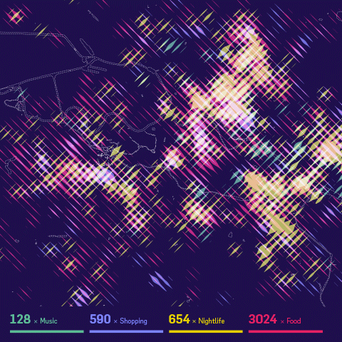
The maps show an overlay of all the digitally marked “hotspots” in a city, such as restaurant, hotels, clubs, etc. collected from different service like yelp, or foursquare. What they don’t show are the streets, the railroads, the buildings. I wanted to to portray the living parts of the cities as opposed to the technical/physical infrastructure you usually see on maps.The only exception are the rivers and lakes, because I felt they help a lot in orienting on these fairly abstract maps.
While the designs are meant to be printed, as a digital companion, the website helps you decipher the posters by providing a little map overlay on click. If you are interested in a print, please sign up to be notified when prints are available — I still need to figure out the precise logistics. (Let me know if you know of a high-quality poster printing and shipping service a la imagekind which can also ship from EU/worldwide..)
For now I settled on the three main German cities, because they have very different characteristics, and I know them very well. But I might be convinced to do other city editions as well :)
Here are some process shots!
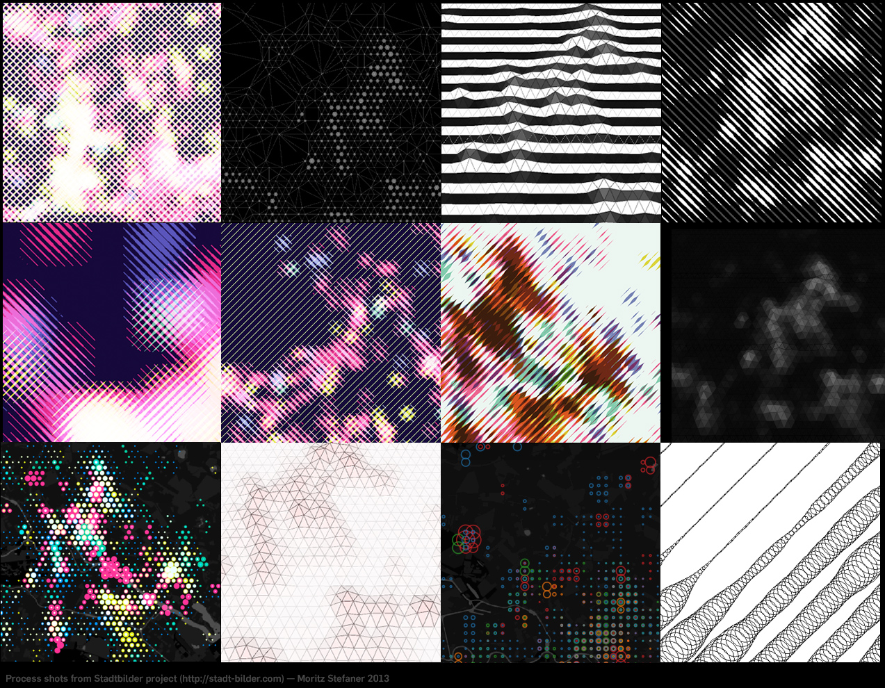
It took me a while to figure out how to overlay these four different heatmaps on top of each other. I experimented with 3D manifolds, different dot patterns, small multiples, etc. etc. In the end, I am really happy with the solution I came up with, as combining always two of them in one stroke direction allows to decipher all of the dimensions, and just by looking at stroke width and brightness (if the two overlap), no need to do “color mixing reverse engineering” in your head, which is pretty much impossible anyways. The downside of this approach is obviously a low spatial resolution.
How does it work technically?
I first query the Uberblic API (not public yet, sorry ;) for the scores in the different categories by marching through a hexagonal grid.
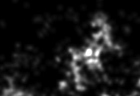
From the values, I first draw fairly blurry heatmaps in processing:
I then walk over these heatmaps pixel by pixel in diagonal lines, and draw on a new canvas a line whose stroke corresponds to the brightness of the pixel on each step:

and then I merge and simplify these images in Illustrator. That’s it!
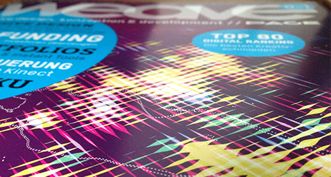
In other news, the Berlin version made it to the cover of WEAVE magazine already (but it should be noted that for this use case, the background was tweaked more into a blueberry tone, the original is way more violet):
If you find this project interesting, Flowingcity hosts a collection many more projects in this direction.
Anyways, let me know what you think of it!
Update: Prints are now available!
Interview for Nathan Yau’s new book “Data Points”
Nathan Yau‘s new book “Data Points” is out, and while I am still waiting for a copy, here is already a short contribution I made – a few paragraphs of bla:
Nathan Yau: With client work, you must hear “innovative”, “compelling”, and
“engaging” often. Personally, I get a lot of this, and potential clients often don’t have data to work with. What makes a project interesting to you and worth your time?
Moritz Stefaner: In hindsight, the most satisfying projects for me were the ones, where the client or project partners were able to follow me in exploring, questioning, and extending the original data basis and project, sometimes going far away from the original project idea. Some ideas sound really good in the beginning, but turn out bland or much too complicated once executed with real data. Other ideas sound boring beforehand, but become exciting in a specific context. And other ideas you just develop by getting inspired from the data material itself. So, I realize this approach is a lot about trust and also flexibility on side of the client, but is the only way to get your visualization on point, ultimately.
NY: For people like us, the data is interesting as a CSV file, but most
don’t get that luxury. What role does aesthetics play in making data
interesting to a wider audience? What about truth? (You are after all,
the truth and beauty operator :).
MS: I honestly hope, and sometimes think, that the playfulness and organic nature of some of my visualizations does actually get people excited about a topic they would not have been interested in beforehand. I do like to dig in data and be a little “data detective” myself, and if my work can contribute to getting more people excited about querying and questioning data, and, most importantly, come up with new questions to ask, than I am happy :) Aesthetics and appeal are of course a big part of the equation here, besides, of course, relevance of the information presented and truthfulness of the representation. But to me, aesthetics is very little about “decoration” – in my world, a clearly pronounced, rigorous, characteristic, “on point” representation of data lets the inner beauty of a compelling data set shine, instead of trying to “sex up” bland lists of facts.
NY: When getting started with visualization, everyone seems to want to know
the “rules” of turning data into geometry. Are there any rules?
MS: There are no hard rules, but, as in any skill-based profession, there are some things that work better than others, and as for any cultural activity, you are not acting in the void, but in an established set of conventions, expectations and common knowledge. In my experience, great works are not strictly adhering to “the rules”, but, at the same time, are very sensitive to these two types of contexts, and are able to refer to, and sometimes even play with them.
NY: What’s the first thing you do when you have your data and get started on
a project?
MS: Get a coffee, put on a DJ set, fire up Tableau and or Gephi, and Sublime Text for Python and data massaging and plot the sh*t out of the data. Then inspect, take a day to do something else, and follow up on the interesting perspectives. To continue, I might transform the existing data, get some new data, or take one of the interesting, but still very generic views and start to tailor it more to the specific issue at hand.
—
Looking forward to having a copy of the book in my hands! And thanks, Nathan!
—
Btw, a few weeks ago, iCharts interviewed me, too. Good times!
Gender balance visualization
So, I made this thing on how many women speakers we have on stage at the type of conferences I like to go to. Personally, I think our field is probably already quite grown-up in respect of diversity and balance, but I think we could still do much better. I hope my small data collection and visualization helps a bit for organizers to reflect where they would like to land on my x-axis :) Relatedly, if somebody has good intentions, but trouble finding good female speakers, drop me a line, I know plenty.
Look ma, no story!
Storytelling has been one of the big buzzwords in data visualization the last year. By now, there are even whole conferences about the topic and I heard even some podcasts carry the word in their name :D
So, one could be tempted to think that storytelling is the magical ingredient to turn boring charts into killer visuals, make the blind see and save the world at large.
But, as so often, the pure and simple truth is rarely pure and never simple.
In fact, some of my favorite visualizations have no story to them.

Look at the legendary map of the market. A fantastic tool to understand the state of the stock market at one glance.

Consider Aaron Koblin’s Flight Patterns.

The brilliant map of optimal tic-tac-toe moves by xkcd.
And so on.
Tools have no stories to them. Tools can reveal stories, help us tell stories, but they are neither the story itself nor the storyteller.
Portraits have no story to them either. Like a photo portrait of a person, a visualization portrait of a data set can allow you to capture many facets of a bigger whole, but there is not a single story there, either.
Let us not forget about these important genres. There is more to information visualization than punchlines.
—
Update: After a few twitter discussions, here is a clarification: I argue against the often heard claim “every good visualization tells a story”. I would agree that, in a loose reading of the word, you could say that some of the above visualizations “reveal stories” or might “trigger stories” in the viewer’s mind.
Where people move in Germany

A quick diversion based on Bing search results for the phrase “von X nach Y gezogen” (“moved from X to Y”) applied to the top 30 German cities.
Made with Gephi and pattern.py
Mapping research excellence

Together with Lutz Bornmann, Rüdiger Mutz and Felix de Moya Anegon, I have been looking into which institutions (universities or research-focused institutions) are most active in different subject areas of science and which have published the most excellent papers. Based on my colleagues data analysis, we produced a small web application which allows to browse and explore the data set. The application is password protected, so you will need to end an email to password-request at excellencemapping.net to request access.
FIFA Development Globe

We finally launched the FIFA Development Globe, a project that has been in the making over the whole year. High fives and congrats to my fellow colleagues at Medienfabrik, Studio NAND, and Jens Franke. It was great to collaborate with you.
Information is Beautiful Award

As you know, I was never too fond of awards — until I won two of them in one night :)
emoto data sculpture
We just finished the documentation for emoto – a data art project visualising the online response to the Olympics London 2012.
In many ways, the crowning piece of the project, and a conceptual counterpoint to the ephemeral web activities, our data sculpture preserved the more than 12 million tweets we collected in physical form. We had 17 plates CNC-milled — one for each day of the games — with a relief heatmap indicating the emotional highs and lows of each day. Overlay projections highlighted individual stories, and visitors could scroll through the most retweeted tweets per hour for each story using a control knob.

The tweets and topics displayed in the installation can also be investigated in interactive heatmaps. Rollover the rows to see a tooltip display of the most retweeted tweet on the given topic at the respective point in time.
Thanks so much to my fantastic collaborators at Studio NAND, and Drew Hemment and the team at and around Future Everything and everyone involved!
Plenty-plenty Sentimenti!
Find a brief documentation at moritz.stefaner.eu/projects/emoto/
or read more on the project here:
nand.io/visualisation/emoto-installation
nand.io/visualisation/emoto
Article and interview on Creators Project
Data Stories podcast episode #11 with Stephan Thiel on emoto
emoto

A true mamooth project has finally launched: emoto.
Together with a huge team around Drew Hemment and Studio NAND, and a partnership with MIT Senseable City Lab, we aim at visualising the online reponse to the Olympic Games for the London 2012 Festival and Cultural Olympiad in the Northwest.

Basically, the idea is to track Twitter messages for content (which topics, disciplines, athletes etc they refer) to and emotional tone (are they cheering, swearing, being indifferent) and make that info available real-time on http://emoto2012.org, as a supplement or even alternative to traditional ways of consuming the Games coverage.

Our goal is to reveal both the big picture as well as the little anecdotes that make up the big, big stream of messages.

After the games, we will turn the collected tweets into an actual physical object, to archive these ephemeral little “things flying by” forever.
And during the games, we are posting insights and in-depth analyses (here is a first post on the Opening Ceremony), so there is also a little data journalistic angle to the whole package.
I have to say, this is probably one of the most ambitious projects I have worked on this far, and despite some small rocks encountered along the way, I am really happy how it turned out.. I hope you like it, too!