Tyne – simulation as visualization
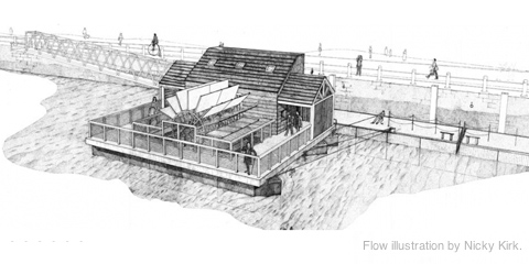
Together with Stephan Thiel (who did all the heavy lifting) from NAND.io, I am happy to present a small new visualization: Tyne, a visualization of the sensor data generated by ~flowmill, a tide mill floating on the river Tyne, in Newcastle.
Stephan has already a great write-up on the nand.io site, which I recommend reading first, so here are a few comments beyond this project description:
What I find quite interesting about the project is the use of simulation as visualization. Although we used little image thumbnails as icons for each visualization, the actual visualization is in fact a particle simulation which is seeded with the five sensor values measured at a given point in time. Four of these are used as physics parameter – expanding the stream for values greater than the mean, contracting for values below. The fifth parameter – wheel speed – is directly related to the water speed and is thus guiding the particle speed. This experiential, process-based, anecdotal, slowly unravelling form of visualization, evoking thoughts of water and wood at the same time, reflects our experience of this highly unusual project after visiting the flowmill ourselves. It became clear that the precise values of the sensors themselves are only side actors in a larger, association-rich and quite unusual system, which we wanted to reflect in our work. Also, the anecdotal nature of the measurements (only every half hour, with quite varying results) called for a treatment of the values beyond a simple line or area chart, so we decided to represent each “data anecdote” in a like-wise closed, single anecdotal visualization, representing the situation at a given, but ultimately arbitrary point in time. Also, the imprecision in visual translation did not happen without thought, in fact, an overly precise display of the values would have, ironically, resulted in “lying about the data”, given the imprecise nature of the system generating the values. (Compute that, line chart afficionados.)
Scaling and transforming real-time sensor data in a robust manner is always tricky.To get the data into a form that it was handleable and also allowed comparisons across the very different scales in the different variables (with values ranging from fractions of zero to hundreds), we employed a z-score scaling, which centers the data around zero (i.e. “usual” data points lie around zero), and also scales the data such that around two thirds of the data lie between -1 and 1. This helps both in using the values in a predictable way, but also allowing quick identification of high, low, or average values, without having to learn different scales across variables – in the end, who knows, if a salinity value of 238 is high or low for a North English river.
Finally, I want to share one dismissed approach which was hard to control, and aesthetically not exactly the thing we were after, but quite interesting nevertheless:
Based on Kyle McDonald’s code, which in turn was based on John McCabe’s explorations of multi-scale Turing patterns, we toyed with the idea of trying to force the algorithm to produce blobs of specific sizes by “injecting” black pixels while the algorithm was running. Also, we muted all but the bottom and a few top layers, resulting in a bigger difference between micro- and macro-structure. In the end, the computations turned out to heavy to be run directly in the browser, and the code a wee bit too unpredictable, so we went with a more controllable and visually more fitting approach. Right now, the code is not quite ready for sharing, but I can offer to clean up and upload the code, in case anyone has a strong interest.

