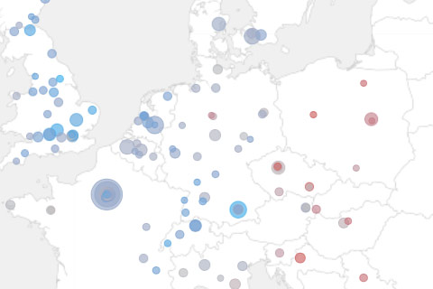
Mapping research excellence
Together with Lutz Bornmann, Rüdiger Mutz and Felix de Moya Anegon, I have been looking into which institutions (universities or research-focused institutions) are most active in different subject areas of science and which have published the most excellent papers. Based on my colleagues data analysis, we produced a small web application which allows to browse and explore the data set. The application is password protected, so you will need to end an email to password-request at excellencemapping.net to request access.

December 6th, 2012 at 1:37 pm
Great job, i’m also a pretty big fan of the d3 + polymap stack. Slick map, what did you use to build it? Is it tilemill?
thanks
Dario
December 6th, 2012 at 1:50 pm
Yes, indeed. In fact, I exported pngs from tilemill and host them directly on our we server (doable for that zoom factor).
December 6th, 2012 at 7:26 pm
https://xkcd.com/1138/
December 11th, 2012 at 10:28 am
mankoff, I don’t see how the linked xkcd is relevant (which is weird as there always is a relevant xkcd :)
The graduated symbol map is not a heatmap, and – more important – the research output seems to be not overly strongly correlated with population density. You kind of can see the blue banana, but there are many special cases and outliers, too.
December 11th, 2012 at 10:32 am
Thanks Till :) I also agree we need to look harder for a relevant xkcd!
December 16th, 2012 at 6:43 pm
@3: Don’t mess with the map guys!
:)