Mapping research excellence
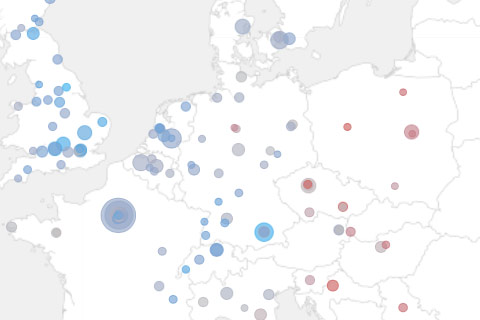
Together with Lutz Bornmann, Rüdiger Mutz and Felix de Moya Anegon, I have been looking into which institutions (universities or research-focused institutions) are most active in different subject areas of science and which have published the most excellent papers. Based on my colleagues data analysis, we produced a small web application which allows to browse and explore the data set. The application is password protected, so you will need to end an email to password-request at excellencemapping.net to request access.
well-formed.eigenfactor
Finally, the results of a cooperation with the guys from eigenfactor are online!
For the impatient: here’s the direct link: http://well-formed.eigenfactor.org
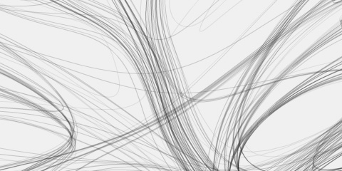
The site features 4 different visualizations, trying different approaches to mapping information flow and citation structure in the sciences.
Eigenfactor
Some interesting work from the Bergstrom Lab at the department of Biology(!), University of Washington.
(PDF version here, more info here)
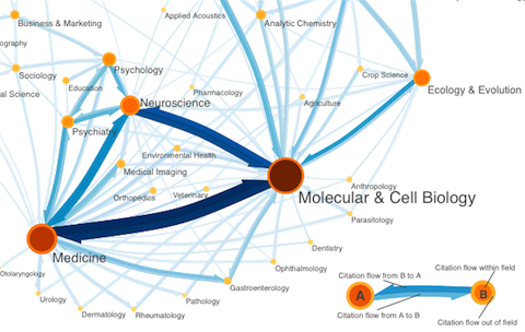
Based on citation patterns, they calculated an information flow model of how scientific disciplines are influencing each other. While I cannot follow all the technical details, I really appreciate the well-designed diagrams. Quite interesting to see an “a posteriori” order of scientific disciplines based on the actual flow of information!
An explanation of the diagrams from the eigenfactor.org:
Orange circles represent fields, with larger, darker circles indicating larger field size as measured by eigenfactor. Blue arrows represent citation flow between fields. An arrow from field A to field B indicates citation traffic from A to B, with larger, darker arrows indicating higher citation volume.
The map was creating using our information flow method for mapping large networks. Using data from Thomson Scientific’s 2004 Journal Citation Reports (JCR), we partitioned 6128 journals connected by 6,434,916 citations into 88 modules. For visual simplcity, we show only the most important links, namely those that a random surfer traverses at least once in 5000 steps, and the modules that are connected by these links.
There is also an interactive version online based on my good old Relation Browser. But honestly, I think the diagrams work much better.
Overall a great example of interdisciplinary research, where presentation and information design play together nicely with interesting+relevant analysis – exemplary!


