Mapping soccer fans
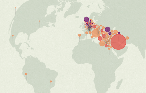
A quick note for a fun project I did together with David Bauer from the Swiss newspaper Tageswoche: “Zürich, Kairo, Bagdad: Wo auf der Welt eine Million FCB-Fans leben” — an interactive map of all the facebook fans of the soccer club FC Basel. While Basel and surroundings have the most fans per inhabitant, the highest absolute number of fans is actually located in Egypt – who knew?
The map features a little stepper that allows you to zoom out from Basel to the whole world in a few annotated steps. The map projection is azimuthal equidistant, so all points on the map have the correct distance and angle from the perspective of the center point — Basel.
It was fun to collaborate on this project. Thanks also to Herr Stucki for the help with the GEOJson!
Mapping Electionland
I created a whole new kind of election map for the German Bundestag elections 2013 for ZEIT Online. Instead of showing the electoral districts results on a geographic map, or in a table, I decided use the data to map a new land: Electionland (german version | english version), where all the districts which vote in a similar way are located nearby. This new kind of map allows us to see a Germany grouped by lifestyles, preferences and attitudes.
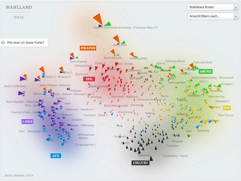
Here is some background on how I created this map. First of all, I need to normalize the data and make the parties comparable. To this end, I applied a z-score normalization on the data. In short, a z-score centers the data (so the average value is at zero), and it rescales the data, so that one standard deviation difference from the average lands at one, two standard deviation differences from the average lands at 2, etc. This makes the relative differences in voting behavior comparable, even if we compare huge parties with smaller ones.
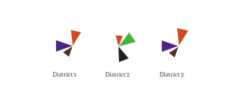
In the map, the triangle sizes correspond to these z-scores per party; I only show the results above average – these are the “characteristic” parties for a district. Each color and angle stands for one party.
I then use scikit-learn to calculate a 2-dimensional map of the resulting “electoral district space” using Multi-Dimensional Scaling or short: MDS.
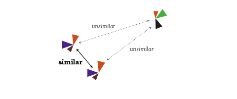
It is an algorithm that you can feed a matrix of similarities between objects (in our case, how similarly the districts voted), and it will attempt to find an arrangement that expresses these similarities as good as possible on a two-dimensional map. (For me, also a nice flashback to my 2005 B.Sc. Thesis, where I investigated MDS and related algorithms quite a bit :)
Some words about the interpretation of the map: First of all, it is important to note that the rotation of the map is a purely aesthetic choice. The MDS algorithms defines only a relative space, where the positions of all elements with respect to each are important, but not on absolute axes. But within the data, some interesting axes seem to emerge nevertheless: top-to-bottom seems to be correspond quite well to the traditional left-to-right spectrum. The left-to-right axis to interpret is a bit trickier but definitely seems related to social status or income. Also interesting to see how the blue AfD party — a newly founded euro-sceptic protest party, sort of a wild card — seems to be all over the map in the vertical center. A bit shocking also to see how there still seems to be a gap in Germany (the island on the left in pretty much exclusively ex-east Germany), with only Leipzig and Postdam (yay) bridging the gap. A note on the huge orange triangles for the Pirate party – actually, their results were not that great, but the enabled them to be very much above average in some districts.
A few words on workflow: For the frontend, I used my new favorite development combo of d3, coffeescript and SASS. In addition, I used the jQuery plugins select2 for the dropdowns and qTip2 for the tooltips.
The labels of the parties and the districts were actually hand-arranged in Adobe Illustrator. I first exported a rough version of the graphic generated with d3 using the very handy SVG crowbar bookmarklet. I hand then hand-tweaked the placements in Illustrator, and saved the resulting graphic as an SVG, which I then dynamically load into page using a combination of this technique with this one (to make it IE9 compatible). Because the layer names actually translate to group IDs in SVG, I was also able to identify the graphics elements from d3, and assign them individual click actions, etc. A very promising approach which I will surely explore further in the future.
You might wonder how I achieved the blurry contour line look in the background – the answer is simply (and a bit embarassingly) Photoshop :) Again, I used a rough version of the graphic, which was then blurred, levelled and edge-detected.
And, yes, it would definitely be interesting to compare 2009 and 2013, and see which districts moved around how much :) but this is tricky due to both the districts structure as well as the parties for vote not being exactly the same. Happy to share my data though, in case anyone is interested in that type of analysis :)
Mapping research excellence

Together with Lutz Bornmann, Rüdiger Mutz and Felix de Moya Anegon, I have been looking into which institutions (universities or research-focused institutions) are most active in different subject areas of science and which have published the most excellent papers. Based on my colleagues data analysis, we produced a small web application which allows to browse and explore the data set. The application is password protected, so you will need to end an email to password-request at excellencemapping.net to request access.
Dr. vis.
I am currently using my baby-time-off-my-university-job to get my options sorted out for further research. The MACE project is running for another year, so the big decision is, if+how to pursue a PhD. At my home base FHP, formally, I cannot do a PhD. So, at least, I have to find a good Ph.D. supervisor at a “real” university.
For this purpose, I started to map all institutions and people that could be candidates or helpful or interesting to meet on Google maps.

I am not 100% clear about both the mode and the scope of the thesis. But I think it is safe to say I would love to advance design research in visualization of the social web.
If you – prosumer you are – have any additional ideas of who I could get in touch with, or could even imagine supervising my thesis, I would be very happy about additional spots on the map or a little comment here. Thanks!