well-formed.eigenfactor
Finally, the results of a cooperation with the guys from eigenfactor are online!
For the impatient: here’s the direct link: http://well-formed.eigenfactor.org
The site features 4 different visualizations, trying different approaches to mapping information flow and citation structure in the sciences.
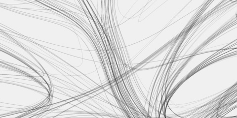
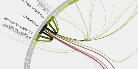
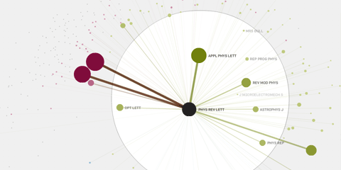
A radial visualization based on hierarchical edge bundling does a great job of displaying the overall citation and clustering structure. I love the organic feel the bundled splines bring in, and multiplying the line colors added that deep extra color twist. Aesthetically, my clear favorite. Its downside is that it does not display the direction of information flow very well. Also, I am not 100% happy with the very heavy display when you click a whole cluster, but I guess you cannot have all at the same time.
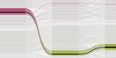
A stacked column visualization shows how cluster structure and journal importance change over time. It does not display any inter-journal citation information, however. Reminiscent – on first sight – of history flow, or other stacked charts, we were, in fact, inspired by Sankey diagrams, and tried to map change starting from the clustering structure. The truth is, 95% of the data does not change much :) but data-wise, there is a distilled version of, for instance, the very interesting development neuroscience has taken over the years. It is documented already in a paper; we might want to publish a special interactive version for this story alone…
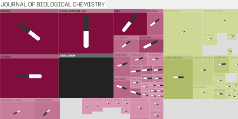
The treemap is probably the most functional of the visualizations. It transports the cluster structure quite well, additionally nicely tells the story how eigenfactor scores sum up to 1, and allows, on click, to get some pretty precise idea about the relation of the journal to others. It is a good counterpart to the radial visualization, with their complementary advantages.
Finally, a map. This is probably the most obvious approach for network visualization, but I couldn’t resist :) especially since it was a 1 day action. I used a spring embedding algorithm based on connection strength to calculate the map coordinates with cytoscape. I was quite pleased with its import, layout and export capabilities. I simply exported as gml, grep‘ed the output and voila I had some coordinates to import. Great tool! The distortion lens is custom coded, and just uses two different linear distance scales. No fisheye, since I find these harder to control.
Here is the heart of the distance scaling code, if anyone is interested:
var xx:Number = lens.x;

var yy:Number = lens.y;

var radius:Number = 50;

var scale:Number = 5;

var scaledRadius:Number = radius * scale;

var dist:Number, diffX:Number, diffY:Number, diffUniX:Number, diffUniY:Number;

for each (var n:Node in data.group("leaves")) {

  diffX = (n.props.x - xx);

  diffY = (n.props.y - yy);

  dist = Math.sqrt(Math.pow(diffX, 2) + Math.pow(diffY, 2));

  if(dist < radius) {

    n.x = xx + scale * diffX;

    n.y = yy + scale * diffY;

  } else {

    diffUniX = diffX / dist;

    diffUniY = diffY / dist;

    n.x = xx + diffUniX * (scaledRadius + dist - radius);

    n.y = yy + diffUniY * (scaledRadius + dist - radius);

  }

}
All visualizations implemented using flare, my favorite visualization framework. Amazing work, Mr Heer!
For all visualizations, the data basis came from the eigenfactor team, calculating both importance values for individual journals, as well as grouping them hierarchically according to their citation flow “neighborhoods”. You can find lots more information on the eigenfactor site.
The cooperation started when the eigenfactor team used a customized version of the good old relation browser; later, they got in touch with me to produce some more visualizations. We started work in summer 08, and after lots of scribbles, experiments, prototypes, adjustments and a little visit in Seattle autumn, we can finally present the results. I quite enjoyed the cooperation, science and design can be an explosive mix :) So, thanks to Carl Bergstrom, Martin Rosvall, Ben Althouse, and Jevin West.
Anyways – feedback welcome!
Btw if you want to blog about it – here are some screenshots.
January 28th, 2009 at 10:20 pm
wow – great stuff! The splines are very nice.
January 28th, 2009 at 11:44 pm
Thanks! Main credits for the lovely spline calculations go to the original hierarchical edge bundling inventor Danny Holten and the respective flare implementation (BundledEdgeRouter class).
January 29th, 2009 at 12:27 am
The artwork done on these data visualizations are very impressive as well! Thanks a lot for sharing.
I love this.
January 31st, 2009 at 4:34 pm
wie immer sehr schoene arbeiten, moritz. hut ab !
February 15th, 2009 at 1:46 pm
[…] Moere’s and Andrea Lau’s triangle model of information aesthetics, and showed mostly well-formed.eigenfactor and briefly some of my thesis […]
June 15th, 2012 at 6:02 am
These are fantastic! The radial visualization works very well. How are you generating the inner start radius? Flare’s RadialTreeLayout doesn’t allow for a specified inner radius, it simply interpolates between the root origin and layout bounds based on node depths – the CircleLayout does however use a method to do this and can similarly layout nodes based on tree structured data. Also, it seems like the outer radius displays nodes with a lower depth than the inner radius, an inversion from a typical radial tree, laying out nodes if greater depth along circles of increasing radii. Very impressive.
June 19th, 2012 at 9:20 am
I ended up rolling my own layout algorithm, indeed based on the two layouts you mentioned.