SEED mag – State of science

Seed magazine features a short text and interview about my work as part of the informatics chapter of their state of science 2008 dossier. Nice!
VizThink ’08
I will have a session at VizThink ’08 about visual tools for the socio-semantic web.
You can find a podcast interview with me about the session and ongoing work here.
The (preliminary) session abstract reads
In this break-out session at VizThink 08, Moritz Stefaner will present visual strategies to understand and discuss emergent information architectures in the web. Phenomena like the mainstream acknowledgement of the web as a social platform, and the first steps towards a semantic web (as envisioned by Tim Berners-Lee a decade ago) demand for new approaches to information handling. Following the research agenda for web science, visualization can not only help to understand these emrging structures, but also to shape and steer interface design. We will discuss and criticize existing and cutting-edge approaches to search and browsing of resources and the visualization of conceptual structures.
So, I planned to show some of my thesis work, and on-going work like the MACE project, and make some general positions statements about where things should head in this area. But the rest is pretty open – for those attending – what are you interested in? Happy about short comments!
Btw: If you plan to register, use the discount code DCFF23 to get 50 € discount!
Talks, talks, talks
Some of my upcoming events:
FIND08 workshop
Sept. 03, Torino
I am just preparing a presentation on the Content Landscape application I designed for SVA BizSphere based on my elastic lists. It is quite a massive Flex application for browsing and analysing thousands of resources. Details to come.
Biennale
Sept. 09, Venice
Watch out, we’ll show something beautiful. Details to come.
MACE conference
Sept. 20-21, Venice
The MACE project project goes in its final year – time to get connected!
VizThink 08
Oct. 13-14, Berlin
I am proud to be one of the facilitators (~workshop leaders) at the VizThink Conference. I haven’t decided on a topic yet, but it might well be related to visualization(oho!) and the semantic web. I am really looking forward to this event, sounds like a great format and the facilitator list is quite impressive already.
Xtopia
Nov. 17,18, Berlin
I will give an introductory talk about visualization and information design at Microsoft’s Xtopia Conference for “Business, Web Technology, Design & UX”.
Busy times huh – let me know if you attend one of these events and want to meet up!
Eigenfactor
Some interesting work from the Bergstrom Lab at the department of Biology(!), University of Washington.

(PDF version here, more info here)
Based on citation patterns, they calculated an information flow model of how scientific disciplines are influencing each other. While I cannot follow all the technical details, I really appreciate the well-designed diagrams. Quite interesting to see an “a posteriori” order of scientific disciplines based on the actual flow of information!
An explanation of the diagrams from the eigenfactor.org:
Orange circles represent fields, with larger, darker circles indicating larger field size as measured by eigenfactor. Blue arrows represent citation flow between fields. An arrow from field A to field B indicates citation traffic from A to B, with larger, darker arrows indicating higher citation volume.
The map was creating using our information flow method for mapping large networks. Using data from Thomson Scientific’s 2004 Journal Citation Reports (JCR), we partitioned 6128 journals connected by 6,434,916 citations into 88 modules. For visual simplcity, we show only the most important links, namely those that a random surfer traverses at least once in 5000 steps, and the modules that are connected by these links.
There is also an interactive version online based on my good old Relation Browser. But honestly, I think the diagrams work much better.
Overall a great example of interdisciplinary research, where presentation and information design play together nicely with interesting+relevant analysis – exemplary!
Dr. vis.
I am currently using my baby-time-off-my-university-job to get my options sorted out for further research. The MACE project is running for another year, so the big decision is, if+how to pursue a PhD. At my home base FHP, formally, I cannot do a PhD. So, at least, I have to find a good Ph.D. supervisor at a “real” university.
For this purpose, I started to map all institutions and people that could be candidates or helpful or interesting to meet on Google maps.

I am not 100% clear about both the mode and the scope of the thesis. But I think it is safe to say I would love to advance design research in visualization of the social web.
If you – prosumer you are – have any additional ideas of who I could get in touch with, or could even imagine supervising my thesis, I would be very happy about additional spots on the map or a little comment here. Thanks!
The form of facts and figures

Congratulations to Christian for another yummy Master’s thesis from FH Potsdam: The Form of Facts and Figures. He collected, organized and commented on a variety of information design and visualization patterns.

I do hope he will put a pdf online!
Linz talk
I am back from a little excursion to the Ludwig Boltzmann Institute for media art research in Linz. I gave a talk on visualization and my master’s thesis.

Here are the slides (german). Most of the external references are linked (click on the pictures).
Thanks to Mario Röhrle and Dietmar Offenhuber for the invitation!
Tumblelog
I started a tumblelog, aggregating my del.icio.us bookmarks, twitter blurbs (not that many) and my FFFFOUND pictures.
(If you are not familiar with the notion of tumblelogs, wikipedia has a short article about them)
Innovationsforum Interaktionsdesign: a late review

Although finished already over a week ago, some words on the Innovationsforum Interaktionsdesign organized by the Interface Design Program at FH Potsdam (where I happen to study). To put it short: It was a blast!
Especially remarkable:
• The design concept of the conference itself: excellently conceived and executed with love to detail. See monomo for some pictures. Props and respect to formdusche
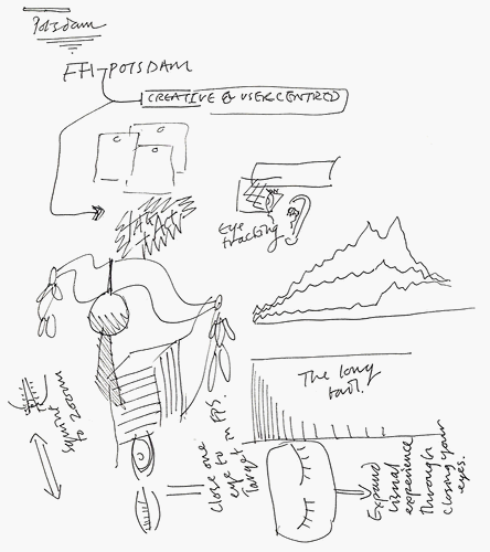
• The line-up was really impressive – find complete coverage of the talks at wmmna. Lots of pictures also on flickr, especially James King’s scribbled coverage of some of the talks — here’s the one of the 10 minute talk I gave together with Fabian at the student’s panel:
• Bruce Sterling’s talk was, as expected, “something completely different” and he really hit the nail on the head a couple of times:
Never thinking about it again is the ideal relationship of a normal human being and an object. That is the opposite of how designers think. I realized this when I was teaching at Art Center College of Design. My students were doing media design, some of them, and very commonly they would come out with some gizmo on a neck pendant. “See, the user wears this large device dangling around his neck, and…”
“No,” I would tell them, “your design project is not hung around the user’s neck. The user has other uses for his neck. This project is hung around YOUR neck. You’re the designer, you’re the one who has to obsess about the device, not them.” You obsess MORE. Let them obsess LESS.
Read Shaping Things if you haven’t yet.
Other than that, Anthony Dunne, Bernard Kerr and Tim Edler really impressed me.
An inspiring event, I wish we could have that every year!
Indexed
I have been subscribed to the indexed blog for a couple of weeks now and really, it never ceases to amaze me. Hands down, this is one of the most funny, original and yet deepest blogs I have seen.
The concept is simple: little stories or facts about life are told with infographics drawn on index cards (which I love anyways). Its amazing how much laughs or “true, true”s you can get out of little Venn or axis diagrams:
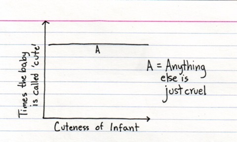
Reminds me also of the wonderful Facts of life by Pippo Lionni.