Visualizing randomness

Just came across an interesting diploma thesis by Daniel A. Becker, supervised by Prof. Johannes Bergerhausen:
WHAT DOES RANDOMNESS LOOK LIKE?
RANDOM WALK asks this question and presents experiments in mathematics and physics, showing the mysterious interaction of chaos and order in randomness.
The project RANDOM WALK simulates randomness in visualizations, which are easy to understand. In this way, it delivers insight into a phenomenon, which has so far remained unexplained.
The form of facts and figures

Congratulations to Christian for another yummy Master’s thesis from FH Potsdam: The Form of Facts and Figures. He collected, organized and commented on a variety of information design and visualization patterns.

I do hope he will put a pdf online!
The Language of Graphics
I read into Yuri Engelhardt’s dissertation “The Language of Graphics”, and I think it is a fantastic piece of work.
As the title suggests, the thesis suggests a linguistically motivated approach to the analysis of graphics: based from a syntactical analysis of space, objects and their relations, Engelhardt classifies and exemplifies different types of syntactic structures in which graphical objects can be arranged in order to convey meaning.
→ read more
Best Masters Thesis
My thesis was awarded a price for the best Masters Thesis at our university. Although the competition was not that large, I am proud nevertheless. I should be pretty much unstoppable now :)
Elastic lists
Just a short post, but another demo is online.
It is a demonstration of the “elastic list” principle for browsing multi-facetted data structures. Click any number of list entries to query the database for a combination of the selected attributes. If you create an “impossible” configuration, your selection will be reduced until a match is possible.
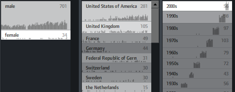
The example data is based on the Noble prize winners dataset used in the Flamenco facet browser.
Elastic lists enhance traditional facet browsing approaches by
• visualizing relative proportions (weights) of metadata values by size
• visualizing unusualness of a metadata weight by brightness
• and animated filtering transitions.
In unfiltered view, the brightness shows a trend measure, indicating a rising number of prices of the last years.
In filtered views, a brighter background indicates a higher weight of the metadata value compared to the overall distribution.
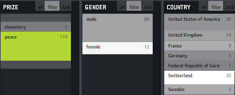
If, for instance, you click “peace” as in the example above, you will see that “female” and “Switzerland” are much brighter, indicating that the proportion of women and Swiss is much higher in this context than compared to the whole data set. That’s interesting information and could also be used to characterize the result set of a keyword query or any other collection in terms of its “characteristic” metadata values. Besides that, it fosters understanding of how metadata values are correlated with each other, which is often interesting information itself.
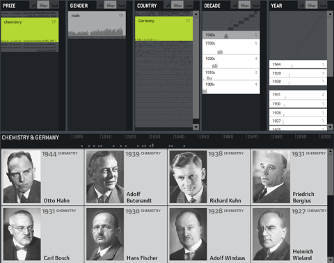
You can also switch on little sparklines to see the temporal distribution of each metadata value: