Generative Gestaltung
Generative Gestaltung is a unique new book on generative design (and related disciplines like visualization). It is quite example–driven, with loads of typical techniques explored in short processing sketches. At the moment it is only available in German, but I hear an English version is in the works. The website features all code examples and some community functions. Very nice concept and execution overall, and it really makes me eager on learning processing better :)
Visualization and Aesthetics Research
Just a quick pointer to three interesting papers about the trends in and models of information visualization:
Andrea Lau and Andrew Vande Moere
Towards a Model of Information Aesthetics in Information Visualization
This paper proposes a model of information aesthetics in the context of information visualization. It addresses the need to acknowledge a recently emerging number of visualization projects that combine information visualization techniques with principles of creative design. The proposed model contributes to a better understanding of information aesthetics as a potentially independent research field within visualization that specifically focuses on the experience of aesthetics, dataset interpretation and interaction. The proposed model is based on analysing existing visualization techniques by their interpretative intent and data mapping inspiration. It reveals information aesthetics as the conceptual link between information visualization and visualization art, and includes the fields of social and ambient visualization. This model is unique in its focus on aesthetics as the artistic influence on the technical implementation and intended purpose of a visualization technique, rather than subjective aesthetic judgments of the visualization outcome. This research provides a framework for understanding aesthetics in visualization, and allows for new design guidelines and reviewing criteria.
While I find the triangle model based on Data, Interaction and Aesthetics quite enlightening and useful, I am not so convinced of the data focus and mapping focus classification. Anyways a great paper.
Robert Kosara
Visualization Criticism – The Missing Link Between Information Visualization and Art
Interesting points, especially the claim that we need to think about frameworks to criticize information visualization examples and techniques from different perspectives. The presented model, however, is quite simplistic, focussing on readability and recognizability, and based on that, a one–dimensional and —from my perspective—too shallow distinction of pragmatic vs. artistic approaches.
Fernanda B. Viégas and Martin Wattenberg
Artistic Data Visualization: Beyond Visual Analytics
A nice overview of not strictly analytic approaches to information visualization.
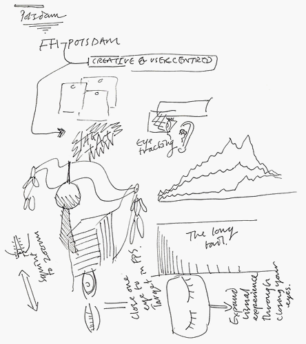
Innovationsforum Interaktionsdesign: a late review

Although finished already over a week ago, some words on the Innovationsforum Interaktionsdesign organized by the Interface Design Program at FH Potsdam (where I happen to study). To put it short: It was a blast!
Especially remarkable:
• The design concept of the conference itself: excellently conceived and executed with love to detail. See monomo for some pictures. Props and respect to formdusche
• The line-up was really impressive – find complete coverage of the talks at wmmna. Lots of pictures also on flickr, especially James King’s scribbled coverage of some of the talks — here’s the one of the 10 minute talk I gave together with Fabian at the student’s panel:
• Bruce Sterling’s talk was, as expected, “something completely different” and he really hit the nail on the head a couple of times:
Never thinking about it again is the ideal relationship of a normal human being and an object. That is the opposite of how designers think. I realized this when I was teaching at Art Center College of Design. My students were doing media design, some of them, and very commonly they would come out with some gizmo on a neck pendant. “See, the user wears this large device dangling around his neck, and…”
“No,” I would tell them, “your design project is not hung around the user’s neck. The user has other uses for his neck. This project is hung around YOUR neck. You’re the designer, you’re the one who has to obsess about the device, not them.” You obsess MORE. Let them obsess LESS.
Read Shaping Things if you haven’t yet.
Other than that, Anthony Dunne, Bernard Kerr and Tim Edler really impressed me.
An inspiring event, I wish we could have that every year!
Indexed
I have been subscribed to the indexed blog for a couple of weeks now and really, it never ceases to amaze me. Hands down, this is one of the most funny, original and yet deepest blogs I have seen.
The concept is simple: little stories or facts about life are told with infographics drawn on index cards (which I love anyways). Its amazing how much laughs or “true, true”s you can get out of little Venn or axis diagrams:
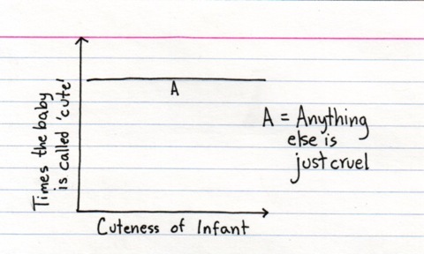
Reminds me also of the wonderful Facts of life by Pippo Lionni.
Papers on tagging
I am currently organizing my literature on tagging. When I started with research on that topic about a year ago, you could count the number of substantial contributions on one hand. Over the current year, however, the number of papers on this topic has sky-rocketed, which makes the whole area hard to oversee at the moment.
I will start with an overview of my subjective must-reads for now (all linked to citeulike):