Emerging topics update
My thesis is due pretty soon, so I am currently writing A LOT and make some on–the–go beautifications to my experiments.
First one is the emerging topics histogram. I followed my own advice and vertically centered the stacked histogram. Additionally, I never liked those sharp edges, so now I do not only “fade out” tags visually, but also fade them in, resulting in a much more organic picture, and largely improved readability of the chart. New color scheme: old tags are cold, freshly introduced ones in warm color. This is all very much inspired by the fabulous last.fm charts by Lee Byron – thanks!
> new interactive version here
and some pix:
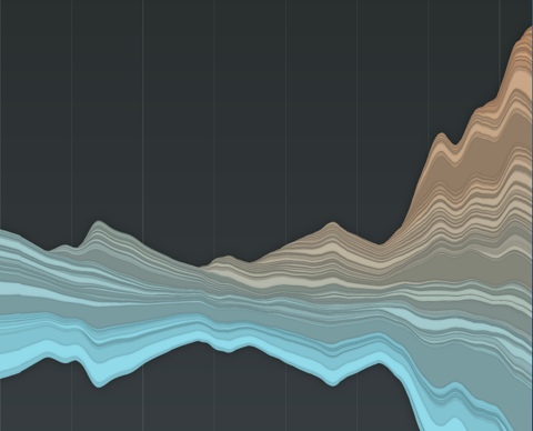

You say… We say…
Another visual experiment on tagging:
How do individuals use tags — compared to the community? Do you use private language or are you a mainstream tagger? When you tag with “design” — do the others think it is “art”?
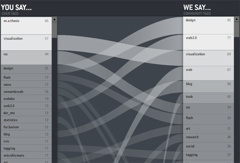
On the left: the personal tags for the personal bookmarks — ordered by frequency — the containing box per is log-scaled so you get an impression of the long–tail position of a tag. Which means: Often used tags are large, bright and go to the top.
On the right: community tags for the tagged ressources.
In the middle: tags with the same name are connected. If a line is horizontal, the indvidual and the community essentially agree on the relevance of the tag for the ressources. The steeper it is — the larger the disagreement. If no line starts at a tag, it means it is not present in the other list
So in the picture above, you can see my tags. Same facts you can read from the picture:
• “m.a.thesis” is a very often used, but private tag of mine.
• The ressources I tag in general are mostly tagged with “design” by the community. I, however, use the tag “design” much less often.
• “news”, “semantic web”, “webdev” are tags I use often, but not the community.
etc.
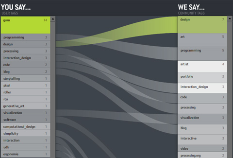
And often course, you can click individual tags to see what the comparison is like for subsets of the bookmarks. That’s especially interesting for obscure tags like “guru” — you can see what the tagger “means” by looking at the distribution of the community bookmarks (in this case “design – art – programmer – artist”). Interesting!
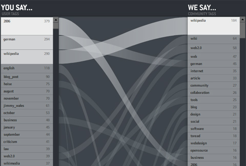
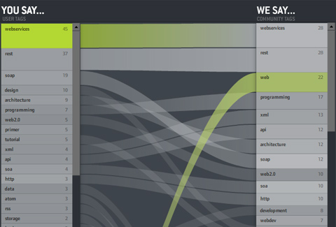
Some more shots:
I wish I could say “click here for the interactive version” as usual — but unfortunately, del.icio.us offers a JSON API, but did not put a crossdomain.xml file on their server. Which means the visualization (which runs nicely on my harddisc) cannot load data when put in the web. Bummer. I hope I can figure something out.
So for now — I can only offer a download link. Click the index.html. You might have to adjust you Flash player security settings in order to load the community tags. Caveat: The application is still a bit buggy and pretty heavy concerning processor ressources.
Hourly shots + delicious + twitter = fun
I am having fun here with a little custom made Flash app that reads
• hourly shots from my built-in webcam
• my twitter posts
• and my delicious bookmarks
and puts it all together. Bit messy at the moment, but I am working on it.
Sense hacking
Late fame for a project I was involved with at my old university: The feelSpace belt allows users to “feel” the north direction via tactile stimulation. It was an experiment in hacking the senses — can we induce new modalities by technology?

Thanks to Sunny Bains for the nice WIRED story!
Elastic lists
Just a short post, but another demo is online.
It is a demonstration of the “elastic list” principle for browsing multi-facetted data structures. Click any number of list entries to query the database for a combination of the selected attributes. If you create an “impossible” configuration, your selection will be reduced until a match is possible.
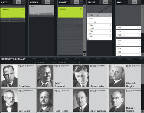
The example data is based on the Noble prize winners dataset used in the Flamenco facet browser.
Elastic lists enhance traditional facet browsing approaches by
• visualizing relative proportions (weights) of metadata values by size
• visualizing unusualness of a metadata weight by brightness
• and animated filtering transitions.
In unfiltered view, the brightness shows a trend measure, indicating a rising number of prices of the last years.
In filtered views, a brighter background indicates a higher weight of the metadata value compared to the overall distribution.
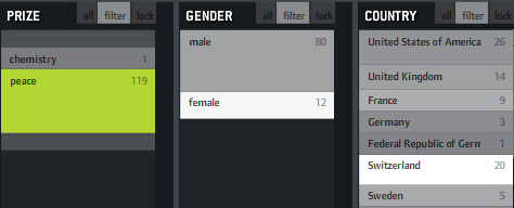
If, for instance, you click “peace” as in the example above, you will see that “female” and “Switzerland” are much brighter, indicating that the proportion of women and Swiss is much higher in this context than compared to the whole data set. That’s interesting information and could also be used to characterize the result set of a keyword query or any other collection in terms of its “characteristic” metadata values. Besides that, it fosters understanding of how metadata values are correlated with each other, which is often interesting information itself.
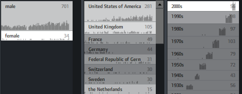
You can also switch on little sparklines to see the temporal distribution of each metadata value:
Emerging topics v2
I am currently working on trends in individual tagging behaviour. You might have seen a first, animated version of my studies based on tag maps. The original animation shows the emergence of previously rarely used tags over time. Now I dug deeper and made a richer visualization for investigating this topic.
For the impatient:
» Check out the interactive version here
And here’s the explanation:
It has been shown before (for a plausibility argument, also check out the marvellous cloudalicious tool, where you can track tag proportions for any website on the web), that tag proportions for ressources stabilize over time. Which means that the tag cloud representing a tag profile for a resource does not change much, once a sufficient number of tags has been collected. In a folksonomy, this is generally considered a good sign, since this indicates a certain agreement on how to judge a certain ressource and what vocabulary to use.
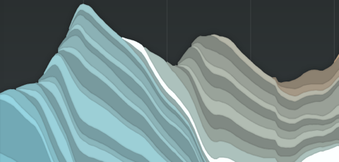
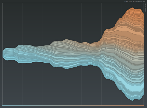
For tagging individuals, and communities, this might — at first glance — hold true as well. Consider the following the visualization of a tagging community‘s evolution, for example:
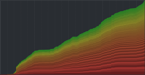
Each tag is assigned a band, with the thickness indicating the overall summed usage of a tag over time (time runs left to right). Thus, a vertical cut through the graph corresponds to taking a tag cloud snapshot at this time point. The vertical order is based on the overall frequency of the tags. The color is used to to give an impression of the long tail distortion – if all tags would appear equally often, you would see a linear transition from red to green instead of the skewed distribution.
So – what do we see? Apparently, most of the bands seem to grow in parallel, indicating a stable growth proportion for all tags. Of course, we cannot see much for the smaller tags, and there are some edgy parts of the graph which might indicate different behavior at specific time points, but overall – pretty stable impression.
However, this does not make much sense. For individuals and communities, the topics of interest evolve over time, so there must be some hidden variability not captured by the visualization and the underlying linear model.
So I decided to provide an alternative visualization for the data based on a decay model, where tags “age” over time and finally get “forgotten” if they are not used anymore. This idea is loosely based on the Yules-Simon memory model for tag generation presented in this paper.
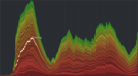
A radically different picture emerges. Not only does the overall shape now nicely display phases of community activity over time, but also the life cycle of single tags is much more transparent. You can rollover single layers highlight it and display the corresponding tag name. Great fun.
» Check out the interactive version here
What I am now curious about:
– Is there a correlation between time-dependency and over-all frequency of tags? In other words, are frequent tags more evely distributed over time, whilst the low frequency tags tend to be more variable over time?
– Is there a correlation between temporal synchronization and general co-occurrence? Which means – do related tags also appear and disappear together over time?
I think the answer is YES to both questions, but that would definitely need some statistical analysis (any bored neuroscientists around to help me? ;)
To-dos for the visualization:
– Implement a slider, so you can see how a linear and decayed tag cloud would have looked like at a specific time point.
– Stamen got it right: Maybe I should have plotted from the vertical center. Or at least provide an optional inversion of the sorting. Because right now, all the top (green) layers are really distorted, making visual analysis really hard.
– Put some numbers on the axis
– Show single tagging events on rollover. Or even “unfold” the layer to improve readability and avoid misconceptions.
Tag maps update
As promised, here is an update to the tag maps application I introduced below along with some explanations.
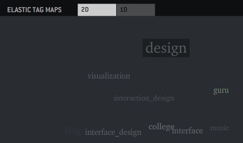
For the impatient: HERE’S THE LINK
(Update again: *The latest version can be found here*)
And for the curious: Here’s the explanations: → read more
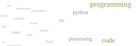
Emerging topics
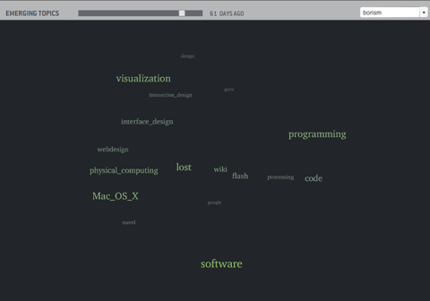
You might have seen the tag clouds posted below. I calculate tag positions based on co-occurrence, such that tags used together are placed closer to each other. Additionally, tags are scaled áccording to frequency.
A general problem I have with the resulting representation (and common tag clouds as well) is the fact, that every tag occurrence is weighted equally. As a result, these tag clouds never represent the current state of interest, but a very sluggishly changing summary of your archive. However, your interests and the corresponding vocabulary keeps moving on.
So I am currently investigating trends in tag clouds and how groups of related tags emerge and disappear again.
A first glimpse into the dynamical nature of tag structures.
Tag clouds
Just a little pointer to an ongoing project:
[edit: >> The latest version can be found here <<]
I am currently working on similarity (correlation-based) navigation mechanisms for tags and other nominal metadata and a trend measure (kind of hinted at in the interactive version with the green colors). I will soon post an update and a few explanations.
Tag Clouds 5.0 (German documentation at incom.org)
I would be happy if you could contribute your del.icio.us, ma.gnolia or furl tags, if you use one of these public bookmarking services. In this case, just do the following; it’s a one minute thing:
1. Go to https://api.del.icio.us/v1/posts/all?
2. The browser will ask you for your delicious username and password.
3. As a response, you will get an XML file containing all your posts. The browser page might look blank, but if you take a look at the source code, you will see it’s an XML file.
4. Send me the file (copy paste source code into a text file or save directly) along with a short notice, if you want it published in future experiments (with your username or anonymized).
Visualizing gaps in time-based lists
As a side product of my work on web feed visualization, I made a small comparison of different ways to deal with temporal information in lists of microcontent, such as e.g. blog entries.
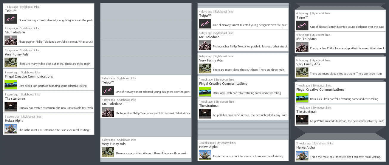
1) Ordered list without gaps: Clearly, the most space-efficient solution – however, only temporal ordering is preserved and not temporal structure. It is not visually evident how the items are distributed over time.
2) Calendar: Each time unit (days for example) has equal space assigned, regardless if there are items assigned or not. A precise display, however, very space-inefficient, since a lot of the display space is typically used for displaying “nothing”.
3) Accordion: Similar to calendar view, but empty time units are displayed on much less screen estate. This gives a pretty good first-glance impression of large gaps and close-together items. However, depending on the temporal structure, there might still be large streaks of wasted space for large gaps.
4) Folded gaps: This is the solution I propose (and which I believe is novel. If otherwise, I would be happy about a short notice!): Temporal gaps are displayed as if a part of the list was folded to the back of the display. Short gaps have almost the same size as in accordion view. Long gaps are larger, but do not grow linearly, but with the square root of the number of empty time units. Visually, this is justified by introducing shading to indicate that the “original material” is folded to the back. Folding also provides a plausible model for interactive adjustments such as regulating the gap size.
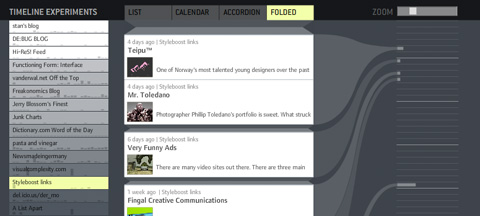
To support my argument, I also made small demonstrator based on actual web feed data. It takes a while to load (~700k of data), so please be patient. On the left, you have a menu for selecting different feeds. On the right, I drew a connection of each item to a calendar with fancy curved lines. You can adjust the size of the displayed items with the zoom slider.
Let me know if it works for you – technically and conceptually!