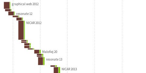
Gender balance visualization
So, I made this thing on how many women speakers we have on stage at the type of conferences I like to go to. Personally, I think our field is probably already quite grown-up in respect of diversity and balance, but I think we could still do much better. I hope my small data collection and visualization helps a bit for organizers to reflect where they would like to land on my x-axis :) Relatedly, if somebody has good intentions, but trouble finding good female speakers, drop me a line, I know plenty.
FIFA Development Globe

We finally launched the FIFA Development Globe, a project that has been in the making over the whole year. High fives and congrats to my fellow colleagues at Medienfabrik, Studio NAND, and Jens Franke. It was great to collaborate with you.
Tyne – simulation as visualization

Together with Stephan Thiel (who did all the heavy lifting) from NAND.io, I am happy to present a small new visualization: Tyne, a visualization of the sensor data generated by ~flowmill, a tide mill floating on the river Tyne, in Newcastle.

Stephan has already a great write-up on the nand.io site, which I recommend reading first, so here are a few comments beyond this project description:
What I find quite interesting about the project is the use of simulation as visualization. Although we used little image thumbnails as icons for each visualization, the actual visualization is in fact a particle simulation which is seeded with the five sensor values measured at a given point in time. Four of these are used as physics parameter – expanding the stream for values greater than the mean, contracting for values below. The fifth parameter – wheel speed – is directly related to the water speed and is thus guiding the particle speed. This experiential, process-based, anecdotal, slowly unravelling form of visualization, evoking thoughts of water and wood at the same time, reflects our experience of this highly unusual project after visiting the flowmill ourselves. It became clear that the precise values of the sensors themselves are only side actors in a larger, association-rich and quite unusual system, which we wanted to reflect in our work. Also, the anecdotal nature of the measurements (only every half hour, with quite varying results) called for a treatment of the values beyond a simple line or area chart, so we decided to represent each “data anecdote” in a like-wise closed, single anecdotal visualization, representing the situation at a given, but ultimately arbitrary point in time. Also, the imprecision in visual translation did not happen without thought, in fact, an overly precise display of the values would have, ironically, resulted in “lying about the data”, given the imprecise nature of the system generating the values. (Compute that, line chart afficionados.)
Scaling and transforming real-time sensor data in a robust manner is always tricky.To get the data into a form that it was handleable and also allowed comparisons across the very different scales in the different variables (with values ranging from fractions of zero to hundreds), we employed a z-score scaling, which centers the data around zero (i.e. “usual” data points lie around zero), and also scales the data such that around two thirds of the data lie between -1 and 1. This helps both in using the values in a predictable way, but also allowing quick identification of high, low, or average values, without having to learn different scales across variables – in the end, who knows, if a salinity value of 238 is high or low for a North English river.
Finally, I want to share one dismissed approach which was hard to control, and aesthetically not exactly the thing we were after, but quite interesting nevertheless:
Based on Kyle McDonald’s code, which in turn was based on John McCabe’s explorations of multi-scale Turing patterns, we toyed with the idea of trying to force the algorithm to produce blobs of specific sizes by “injecting” black pixels while the algorithm was running. Also, we muted all but the bottom and a few top layers, resulting in a bigger difference between micro- and macro-structure. In the end, the computations turned out to heavy to be run directly in the browser, and the code a wee bit too unpredictable, so we went with a more controllable and visually more fitting approach. Right now, the code is not quite ready for sharing, but I can offer to clean up and upload the code, in case anyone has a strong interest.
Global Agenda Survey 2011
Old news for you, if you follow me on twitter already (or read infosthetics), but here is a quick pointer to the interactive graphics for the Global Agenda Survey 2011 we launched last week for the World Economic Forum:

I realized the project together with the talented Jan Willem Tulp, from who you surely will hear much more over the next few months.
A little technical note: The interactive graphics were all done in HTML5, with the help of the following great Javascript frameworks: raphael.js, underscore.js, d3.js. Except for the network visualization, all graphics run fully interactive down to IE6. #techachievement #lookma #noflash
Max Planck Research Networks
Science! Multitouch! Networks! All in one project! Can it be true? Yes, it can. Here it is:

The multi-touch installation Max Planck Research Networks reveals how Max Planck Institutes collaborate with each other, and with their international partners.
The piece is exhibited at the Max Planck Science Gallery, a highly interactive exhibition space presenting new forms of science communication in Berlin. You should come and visit it.
This is the first larger Java project I ever did, and it would not – at all – have been possible without Christopher Warnow from onformative, so thanks for for the great cooperation! (Big thanks go to the rest of onformative, too – to Cedric for the idea for the label placement algorithm and Julia for the great support with the documentation.)
Big thanks also to my colleagues at Elsevier and Max Planck Gesellschaft, who made the collaboration a real pleasure. I was also quite impressed with the overall project direction of Archimedes, who did a fabulous job of conceiving and realizing the exhibition space.
OECD Better Life Index

Beginning of this week, we launched a new project: the OECD Better Life Index, which allows you to compare 34 countries with respect to 11 different topics, ranging from Health, Life Satisfaction over to Jobs and Income. By choosing importance levels for these topics, you can actually brew your own country ranking and share it with friends on the web.
The visualization principle is simple: Each country is represented by one flower, one topic by one of its petals. The length of a petal indicates the score of the respective country in that topic (e.g. income in Germany). If we add up all scores, we get a toal score for each country. The higher the score, the higher the flower will rise.
The launch event itself was crazy, as the presentation of the site was the first point after the keynote address at the OECD’s 50th anniversary – and of course the site would go down 20 minutes before the live demo! But in the end, all worked out great, and we were able to sort things out and cope with the quite overwhelming demand on our servers. If you are interested, here is a video recording of what happened on stage.
Overall, it was great to see how the “flower virus” took over the event, from the booth…

… to wall decorations:

A memorable day for sure!
Btw, while I worked on the design and implementation of the visualization, the branding, web design and site production was handled by Timm Kekeritz at Raureif and Jonas Leist. And big props to the fantastic team at OECD, who fought like lions for our crazy ideas and managed to put together these huge amounts of content on the site in very short time.
Notabilia — Visualizing Deletion Discussions on Wikipedia
Just in time for Wikipedia’s forthcoming tenth anniversary (congrats!), two researchers – Dario Taraborelli and Giovanni Luca Ciampaglia – approached me for a cooperation on visualizing the discussions around article deletions on Wikipedia. The (intermediate?) results are online at notabilia.net.

I came up with a tree visualization, where Article for Deletion discussion is represented by a thread starting at the bottom center. Each time a user recommends to keep, merge, or redirect the article a green segment leaning towards the left is added. Each time a user recommends to delete the article a red segment leaning towards the right is added. As the discussion progresses, the length of the segments as well as the angle slowly decay.
In the visualizations, I tried to capture the tension between chaos and order inherent to the discussions, and provide a nice serendipity interface as well.
So much to learn about…
 …or…
…or…
 …and…
…and…
But also some more hard analysis can be found at notabilia.net, looking at the vote distributions, lengths of discussions, etc. Take a look yourself!
Propositional density in visualization
A couple of months ago, I came across a very insightful article with high relevance for information visualization: “More with less” in the always excellent ACM interactions. It made me think quite a bit, and might also help some to understand a designer’s approach to visualization a bit better, so here is the gist of the story (the following section mostly paraphrases the original article).
revisit: real time twitter visualization

Just a quick post to let you know that I put a new project online: revisit – a real–time visualization of the last few hundred tweets around a topic. In contrast to the usual twitter walls, it try to capture some of the temporal dynamics as well as the conversational aspects of twitter. Scroll down for customization options!
Hope you like it – it will be at display at the see conference tomorrow, but for those of you who are not there, here is the live version so you can see what you are missing :)
Visualizing survey results
In November 2009, I did a mini-project together with Boris Müller and the boys from raureif. My task was to create a visualization of the survey results of an event. The participants were asked to rate the events with respect to 9 questions on a scale from 1-10. As we did not have much time (nor budget), we went for the first good-looking idea available. What could that be? Right, a radial visualization (be damned, circles for non-circular data!). Anyways, I produced a quick funky mockup with random data:

Each circle sector stands for one person’s ratings, and these are ordered by their average rating. For each single rating, I draw a semi-transparent wedge, with distance from center as well as color indicating the rating’s value. Special treatment is provided for the overall event rating (a more opaque, smaller wedge). For visual spice, a black spline connects all the average values of the ratings.
So, we agreed on it and shipped it. Seeing it with the real data, however, made me wonder if I should have looked into typical rating statistics a bit more :)

Well. Lesson learnt. It is a nice little visualization nevertheless.
Which reminds me of an excellent article about how to prevent to uniform votes already in the interface.
As a bonus, here is a little remake using protovis with again, ridiculously few lines of code:
→ read more