Resonet

Resonet is an attempt to map the twitter community around the resonate festival, using a technique similar to the vizosphere I made earlier. This time around, I used a zoomable SVG map, which makes text labels searchable. Make sure to also check out the data files and analysis, and feel free to remix the data!
Images as datastore
In two current projects, we use images as a datastore in parts of our processing timeline, and that proved quite handy, so I thought, I would briefly share the technique with you.
In the emoto project, we use 2D matrices to store how many tweets (brightness) fall in which sentiment category (vertical) over time (horizontal):

This is not exciting per se, but the trick here is that we use this as an elevation map for the 3D models we produce for the data sculpture. So the images are only a “messenger” between two processing steps – data analysis and the 3D modelling tool. Yet, in this form, it is much more easy to detect gaps, and get a glimpse of the data structure immediately. Also, think about it this way – if your database is an image, you can apply image transformation techniques to modify your data! (Think enhance contrast, minimum/maximum, slicing, blurring,…) What can be very difficult numeric operations if only working with numbers, can be very simple operations in Photoshop, and, again, the result is immediately inspectable. The catch is, when working with grey scale, you have only 256 steps available – but in our case, that was enough.
The second image trick is to use color as an identifier code in a 2D matrix. For instance, you might want to check in which country a certain point on earth is. You do have a list of polygons for each country, but how inefficient, error prone and tedious it is to loop through all of them, and calculate a hit test with a polygon… Also, how do you calculate a hit test with a polygon, anyways?
Now here is an incredibly simple way to do it: Pick a unique color for each country. Go through all the polygons of a country and draw them on a simple map mapping lat and long to x and y coordinates in the desired precision.

Now, for any point on earth, you just need to look up the color of the pixel belonging to its map coordinate, and – there you have the code of the corresponding country. Very handy! Again, all the difficult data processing has been taken care of by the image processing algorithm..
So, next time you have a tricky data transformation issue to solve – maybe image processing can be part of the solution! I am sure there are many more tricks along these lines to discover.
( + Thanks to Stephan and Steffen from Studio NAND for developing these workflows with me!)
Force-based label placement

Demo and code for a smart little label placement method developed in the Max Planck research networks project.
Visualizing survey results
In November 2009, I did a mini-project together with Boris Müller and the boys from raureif. My task was to create a visualization of the survey results of an event. The participants were asked to rate the events with respect to 9 questions on a scale from 1-10. As we did not have much time (nor budget), we went for the first good-looking idea available. What could that be? Right, a radial visualization (be damned, circles for non-circular data!). Anyways, I produced a quick funky mockup with random data:

Each circle sector stands for one person’s ratings, and these are ordered by their average rating. For each single rating, I draw a semi-transparent wedge, with distance from center as well as color indicating the rating’s value. Special treatment is provided for the overall event rating (a more opaque, smaller wedge). For visual spice, a black spline connects all the average values of the ratings.
So, we agreed on it and shipped it. Seeing it with the real data, however, made me wonder if I should have looked into typical rating statistics a bit more :)

Well. Lesson learnt. It is a nice little visualization nevertheless.
Which reminds me of an excellent article about how to prevent to uniform votes already in the interface.
As a bonus, here is a little remake using protovis with again, ridiculously few lines of code:
→ read more
Five Elastic Years of infosthetics.com

On the occasion of the recent fifth birthday of infosthetics.com blog, your premier source for fresh projects from visualization and information aesthetics, I made a custom adaptation of the elastic lists principle for the – up to now – 1950 posts of the site. Try it out, and read more about it here.
Happy birthday infosthetics!
Elastic times

Today was a good day, so I thought I would share its results immediately, instead of fine-tuning forever – who knows when I find the time anyways!
I built a little facet browser for the New York Times Article Search API – an impressively fast faceted search engine covering over two million articles. So, give it a spin!
Some caveats:
- Don’t look for the page navigation – there is none. Pure laziness, will update it soon.
- The initial counts are based on a search for “the” (which I figured would appear in all articles). Unfortunately, only the top 15 or so values per facet are returned, so you cannot click, e.g. the year 2008 in the beginning. Will fix.
- The API has a request limit of 5000 queries per day. So if your requests don’t work – come back tomorrow morning :)
- Unfortunately, the API seems to support only one value per facet. So, all facets are single-select.(fixed, see comments).
The code is based on my totally revamped elastic lists prototype. I used this project as a little sandbox experiment of how easy customization is possible, and especially how to make a switch from a fully client-based to a server–based filtering model.
mæve interactive installation

After much blood, sweat and cable guy issues, we could finally present the interactive installation mæve for the EveryVille student competition at the La Biennale in Venice.
In short, the installation works like this: visitors can pick up little cards representing the exhibits. Putting them on the table will draw an associative, organic network of tags, media and related projects around them. If you put multiple cards on the table, the visualization will form “bridges”, looking for direct or indirect connections between the projects.

The installation has been designed and developed by the MACE project team of the University of Applied Sciences Potsdam and made possible by many others (credits).
You can find more info and media on the mæve project website.

Technically, the installation is built with Processing, using the Gestalt framework.
For the card tracking, the Reactivision 1.4 software was used. The interactive table was built by Werk5.
By the way, if you blog about this, make sure to link to the original project page – not this blog post – thanks!
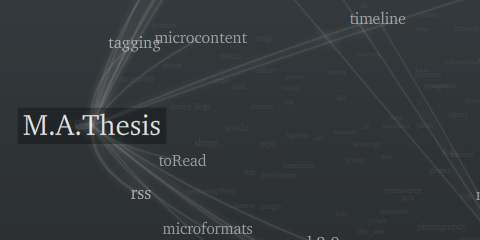
Visualizing a hierarchical glossary

For the EU project MACE, I have been experimenting with hierarchical visualizations.
Just the quick link for now, I hope I find the time to share some of the background and findings later…
On a related note: 9 days left to hand in your papers and take part in a great conference this autumn!

Tag maps update again
PS: 12 days to go, wish me luck!