Emerging topics v2
I am currently working on trends in individual tagging behaviour. You might have seen a first, animated version of my studies based on tag maps. The original animation shows the emergence of previously rarely used tags over time. Now I dug deeper and made a richer visualization for investigating this topic.
For the impatient:
» Check out the interactive version here
And here’s the explanation:
It has been shown before (for a plausibility argument, also check out the marvellous cloudalicious tool, where you can track tag proportions for any website on the web), that tag proportions for ressources stabilize over time. Which means that the tag cloud representing a tag profile for a resource does not change much, once a sufficient number of tags has been collected. In a folksonomy, this is generally considered a good sign, since this indicates a certain agreement on how to judge a certain ressource and what vocabulary to use.
For tagging individuals, and communities, this might — at first glance — hold true as well. Consider the following the visualization of a tagging community‘s evolution, for example:
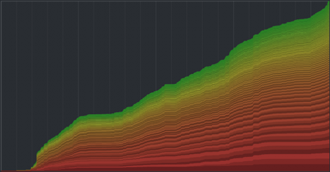
Each tag is assigned a band, with the thickness indicating the overall summed usage of a tag over time (time runs left to right). Thus, a vertical cut through the graph corresponds to taking a tag cloud snapshot at this time point. The vertical order is based on the overall frequency of the tags. The color is used to to give an impression of the long tail distortion – if all tags would appear equally often, you would see a linear transition from red to green instead of the skewed distribution.
So – what do we see? Apparently, most of the bands seem to grow in parallel, indicating a stable growth proportion for all tags. Of course, we cannot see much for the smaller tags, and there are some edgy parts of the graph which might indicate different behavior at specific time points, but overall – pretty stable impression.
However, this does not make much sense. For individuals and communities, the topics of interest evolve over time, so there must be some hidden variability not captured by the visualization and the underlying linear model.
So I decided to provide an alternative visualization for the data based on a decay model, where tags “age” over time and finally get “forgotten” if they are not used anymore. This idea is loosely based on the Yules-Simon memory model for tag generation presented in this paper.
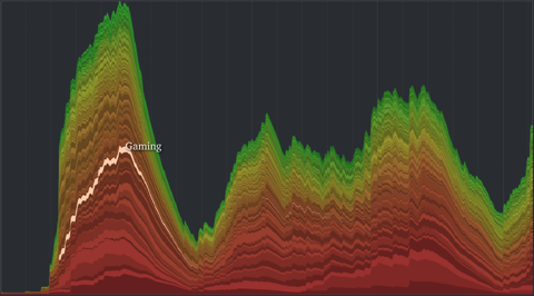
A radically different picture emerges. Not only does the overall shape now nicely display phases of community activity over time, but also the life cycle of single tags is much more transparent. You can rollover single layers highlight it and display the corresponding tag name. Great fun.
» Check out the interactive version here
What I am now curious about:
– Is there a correlation between time-dependency and over-all frequency of tags? In other words, are frequent tags more evely distributed over time, whilst the low frequency tags tend to be more variable over time?
– Is there a correlation between temporal synchronization and general co-occurrence? Which means – do related tags also appear and disappear together over time?
I think the answer is YES to both questions, but that would definitely need some statistical analysis (any bored neuroscientists around to help me? ;)
To-dos for the visualization:
– Implement a slider, so you can see how a linear and decayed tag cloud would have looked like at a specific time point.
– Stamen got it right: Maybe I should have plotted from the vertical center. Or at least provide an optional inversion of the sorting. Because right now, all the top (green) layers are really distorted, making visual analysis really hard.
– Put some numbers on the axis
– Show single tagging events on rollover. Or even “unfold” the layer to improve readability and avoid misconceptions.
Emerging topics
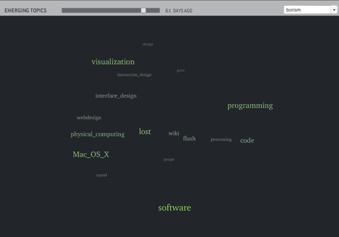
You might have seen the tag clouds posted below. I calculate tag positions based on co-occurrence, such that tags used together are placed closer to each other. Additionally, tags are scaled áccording to frequency.
A general problem I have with the resulting representation (and common tag clouds as well) is the fact, that every tag occurrence is weighted equally. As a result, these tag clouds never represent the current state of interest, but a very sluggishly changing summary of your archive. However, your interests and the corresponding vocabulary keeps moving on.
So I am currently investigating trends in tag clouds and how groups of related tags emerge and disappear again.
A first glimpse into the dynamical nature of tag structures.