Elastic Lists, revisit: open source!

In the past, I have profited immensely from using open source projects, foremost flare, but also many other libraries. I would like to give something back by open sourcing my favorite toy, the Elastic Lists project on github: github.com/MoritzStefaner/Elastic-Lists.
Have fun with it! Please keep in mind I am not a developer by training and these are side projects. Especially excuse the sketchy documentation. So if you start working with the code, and run into issues, feel free to file bug reports or add questions to the FAQ.
Heck, and while I am at it, why not publish revisit as well:
github.com/MoritzStefaner/revisit
Beautiful Visualization: The book
“Beautiful Visualization – Looking at data through the eyes of experts” is out (at least the ebook edition). I am proud to be among the authors, along with giants like Aaron Koblin, Fernanda Viega and Martin Wattenberg, Jer Thorp or Jessica Hagy. I mostly flipped through the book up to now, but from what I can see, it comprises a great collection of case studies and reflections by practitioners from the field. So if you always wondered about the stories and considerations behind great visualizations, this could be a very useful resource. My chapter deals with the process behind X by Y, and is available as a pre-print download (2.3MB pdf). I would love to see this book printed, too – if you feel the same, why not pre-order the print edition to speed up the process?
Also noteworthy: All royalties from this book will be donated to Architecture for Humanity.
revisit: real time twitter visualization
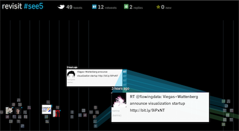
Just a quick post to let you know that I put a new project online: revisit – a real–time visualization of the last few hundred tweets around a topic. In contrast to the usual twitter walls, it try to capture some of the temporal dynamics as well as the conversational aspects of twitter. Scroll down for customization options!
Hope you like it – it will be at display at the see conference tomorrow, but for those of you who are not there, here is the live version so you can see what you are missing :)
see #5
In its five years of existence, the see conference managed to bring quite a few of the most exciting speakers from design, art, architecture and new technologies on stage to talk about their perspective on information visualization.
This year’s conference takes place on April 17, 2010 at the Kulturzentrum Schlachthof Wiesbaden (Germany) and features the following line-up:
- Gideon Obarzanek, the founder of Chunky Move, an Australian dance company known for “genre-defying dance performance”
- Joshua Prince-Ramus, President of REX, a cutting-edge architecture firm
- Nicholas Felton (feltron.com), a New York based information designer, co-founder of daytum.com and probably best known for his personal annual reports
- Hannes Koch from rAndom International, a London-based art and design collective
- Kent Demaine from OOOii, who design future interfaces for Hollywood and, among others, brought us the visionary interface design for Minority Report
- and amystery keynote speaker. (I love mysteries!)
Some tickets are still left, but not terribly many, so better register sooner than later. For those of you who cannot make it, there will be a live video stream of the event, and archived video recordings later. The recorded talks of the past conferences are well worth a visit too, with speakers ranging from Casey Reas over Carsten Nicolai to Stamen’s Eric Rodenbeck, Ben Fry, Zachary Lieberman and many more.
Presentation at TU Dresden
Last week, I gave a little presentation at the colloquium of the media informatics faculty at TU Dresden. Find the slides here. I would also like to use the chance to make you aware of the OUTPUT event on April 23, where student and research works are presented and some interesting talks are planned. For readers of this blog, probably the Technische Visualistik track will be most interesting, with talks about multi-touch, blended interaction, touchless interaction etc.
DaVis’10: Design and Aesthetics in Visualization
Everybody complains that art, design and research in information visualization should be talking more to each other.
Here is a unique opportunity: Andrew Vande Moere and I will be hosting a symposium at IV10: DAVis, the 5th International Symposium on Design and Aesthetics in Visualisation.
From the call:
“This symposium aims to bring together researchers and practitioners of design, art and related disciplines. The goal is to share their stories and experiences on how the needs and goals of both users and businesses are met through information visualisation.
It supports the publication of research in two general domains: Design and Aesthetics. Design refers to the development of visualisation as a creative design process. Aesthetics refers to the role of user experience in visualisation, as understood in three distinct components: aesthetic experience, experience of meaning, and emotional experience.
This symposium presents an opportunity to explore these issues and their consequences for the field of information visualization. In particular, we encourage the submission of design critiques; case studies, possibly with accompanying evaluation studies or critical reflections; position papers; or reports on the impact that visualization research or visualization use has had on the work and life of people. In this context, the story of failures or abandoned approaches can be as informative as descriptions of success. The fields of application are open, and can reach from traditional screen-based graphs, over innovative multi-touch interfaces, to dynamic media architecture displays.”
So – designers, coders, artists, visualizers – go forth and write!
Update: make sure to check out the submission requirements and procedure up at the IV main page.
Beware: the deadline is tight: March 1. March 21 But honestly, you would not have started earlier, anyways – right? Feel free to get in touch if you have any questions, and we are really looking forward to your submissions.
Generative Gestaltung
Generative Gestaltung is a unique new book on generative design (and related disciplines like visualization). It is quite example–driven, with loads of typical techniques explored in short processing sketches. At the moment it is only available in German, but I hear an English version is in the works. The website features all code examples and some community functions. Very nice concept and execution overall, and it really makes me eager on learning processing better :)
Visualizing survey results
In November 2009, I did a mini-project together with Boris Müller and the boys from raureif. My task was to create a visualization of the survey results of an event. The participants were asked to rate the events with respect to 9 questions on a scale from 1-10. As we did not have much time (nor budget), we went for the first good-looking idea available. What could that be? Right, a radial visualization (be damned, circles for non-circular data!). Anyways, I produced a quick funky mockup with random data:
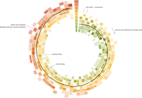
Each circle sector stands for one person’s ratings, and these are ordered by their average rating. For each single rating, I draw a semi-transparent wedge, with distance from center as well as color indicating the rating’s value. Special treatment is provided for the overall event rating (a more opaque, smaller wedge). For visual spice, a black spline connects all the average values of the ratings.
So, we agreed on it and shipped it. Seeing it with the real data, however, made me wonder if I should have looked into typical rating statistics a bit more :)
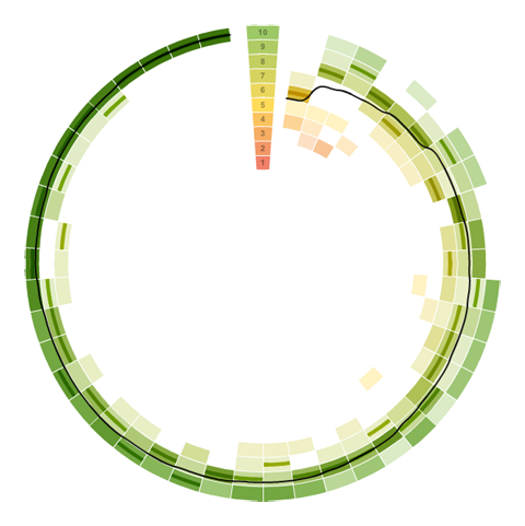
Well. Lesson learnt. It is a nice little visualization nevertheless.
Which reminds me of an excellent article about how to prevent to uniform votes already in the interface.
As a bonus, here is a little remake using protovis with again, ridiculously few lines of code:
→ read more
Five Elastic Years of infosthetics.com
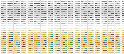
On the occasion of the recent fifth birthday of infosthetics.com blog, your premier source for fresh projects from visualization and information aesthetics, I made a custom adaptation of the elastic lists principle for the – up to now – 1950 posts of the site. Try it out, and read more about it here.
Happy birthday infosthetics!
Living with information: videos
Finally, the videos from our “Living with information” workshop are up. Find below my two favorites: Andrew Vande Moere for the best stories and Paolo Ciuccarelli for the most beautiful slides ever. Enjoy!
Andrew Vande Moere from FHP Interface Design on Vimeo.
Paolo Ciuccarelli from FHP Interface Design on Vimeo.
Find the whole album here.
