Visualizing survey results
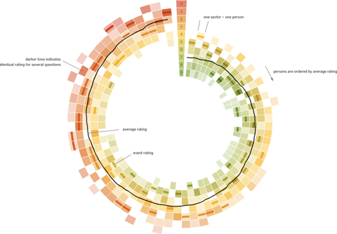
In November 2009, I did a mini-project together with Boris Müller and the boys from raureif. My task was to create a visualization of the survey results of an event. The participants were asked to rate the events with respect to 9 questions on a scale from 1-10. As we did not have much time (nor budget), we went for the first good-looking idea available. What could that be? Right, a radial visualization (be damned, circles for non-circular data!). Anyways, I produced a quick funky mockup with random data:

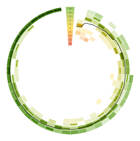
Each circle sector stands for one person’s ratings, and these are ordered by their average rating. For each single rating, I draw a semi-transparent wedge, with distance from center as well as color indicating the rating’s value. Special treatment is provided for the overall event rating (a more opaque, smaller wedge). For visual spice, a black spline connects all the average values of the ratings.
So, we agreed on it and shipped it. Seeing it with the real data, however, made me wonder if I should have looked into typical rating statistics a bit more :)

Well. Lesson learnt. It is a nice little visualization nevertheless.
Which reminds me of an excellent article about how to prevent to uniform votes already in the interface.
As a bonus, here is a little remake using protovis with again, ridiculously few lines of code:
var data=[

["05.11.09 17:01",	10,	10,	10,	10,	10,	10,	10,	10,	10]

// .. etc .., see page source for full data

];

// pre-process data

var processedData = [];

data.forEach(function(d) {

	var o={};

	o.date = Date.parse(d[0], "%d.%m.%y %H:%M");

	o.dayDate = new Date(o.date.getFullYear(), o.date.getMonth(), o.date.getDate());

	o.dayTime = o.date.getHours();

	d.shift();

	o.ratings = d;

	o.mean = pv.mean(d);

	processedData.push(o);

});

// sort by rating

processedData = processedData.sort(function(a,b) a.mean - b.mean);

// result:

// [{date:..., ratings:[10,2,3,4...], mean:6.7}, ...

// set up visualization

var w = 440, h =440;

var vis = new pv.Panel()

	.width(w)

	.height(h)

	.left(20)

	.top(20)

;

// encoders

var color = pv.Scale.linear(0, 5, 10).range("rgba(255,0,0,.3)", "rgba(200,200,0,.3)",

                  "rgba(0,90,0,.3)");

var angle = pv.Scale.linear(0, processedData.length).range(Math.PI*1.5, Math.PI*3.5);

var radius = pv.Scale.linear(0, 10).range(100, 200);

// A panel for each rating event

var panel = vis.add(pv.Panel)

	.data(processedData)

	.left(function() w*.5)

	.top(function() h*.5)

;

// a wedge for each rating value

panel.add(pv.Wedge)

	.data(function(d) d.ratings)

	.startAngle(function() angle(this.parent.index))

	.endAngle (function() angle(this.parent.index+1))

	.innerRadius(function(d) radius(d) )

	.outerRadius(function(d) radius(d+1))

	.fillStyle(function(d) color(d))

;

panel.add(pv.Wedge)

	.data(function(d) [d.mean])

	.startAngle(function() angle(this.parent.index))

	.endAngle (function() angle(this.parent.index+1))

	.innerRadius(function(d) radius(d+.5) )

	.outerRadius(function(d) radius(d+.7))

	.fillStyle(function(d) "#000")

;

vis.render();
January 13th, 2010 at 6:56 pm
I really want to like the radial chart you’ve made here, but I’m having trouble viewing the data in a circular format. It would be interesting to see a non-circular version.
January 14th, 2010 at 11:16 pm
Hi Marlena, I agree the comparison would be interesting, and it should take only a couple of minutes to adjust the protovis code.
January 15th, 2010 at 4:10 pm
At a quick glance, it looks like the change would just be to make the angle and radius the same for all of the wedges.
December 22nd, 2014 at 1:26 pm
[…] did a little more searching and found this blog post with some exploration of how scale survey data could be dealt with in the same way. Not terribly […]