Better Life Index: 2014 update
The OECD Better Life Index is one of the more popular projects in my portfolio, and now, entering its fourth year, it is still going strong, and is actively developed further. After adding gender and social inequalities, refining the sharing functionality and transitioning over from Flash to HTML5 in the years before, this year’s update is especially interesting: We are closing the loop by visualizing the responses from people all over the world using the site and sharing their Better Life Index with others.
Thanks again to my incomparable and invaluable collaborators Dominikus Baur as well as Timm Kekeritz and Frank Rausch from Raureif without whom none of this would have been possible.
Here’s a few of the new features and details:

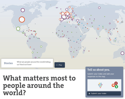
The map initially shows the number of responses per country and gives a hint at the most favored topic per country. You can also switch to equal dot sizes, which highlights the favorite topic distribution across the world, which I found a quite interesting angle on the data.

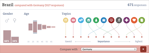
Zooming in on a country, you can learn about the gender and age distributions, and the topic ranking per country (based on the indexes submitted). You can even compare to other countries or the average response.
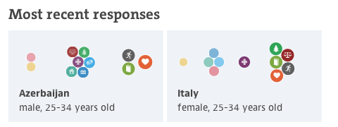
I had fun developing the force directed bubble behavior for the ranking visualizations, it is also used for the miniature visualizations of the submitted indexes and we plan to make it a core component of the Better Life Index toolbox. I would like to say thanks to Gregor for the original inspiration!
Also, on the details front — note how gracefully the visualization deals with identical values — they are all stacked neatly on top of each other, as they should have the same position in the ranking.
Last, there is a soft editorial touch with a “guided tour” through some of the most interesting facts to discover in the visualization, taking you for a quick tour around the world. I hear storytelling with big data is the next big thing, so we just wanted to hop on the bandwagon there :D. On a more serious note, these quick highlights can be an excellent way into a complex visualization and I will definitely explore these types of narrative techniques further in the future.

Anyways, I am really happy how the update turned out, and am especially looking forward to a whole new, but related site for the OECD we are launching soon! Stay tuned!
Mapping soccer fans
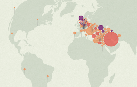
A quick note for a fun project I did together with David Bauer from the Swiss newspaper Tageswoche: “Zürich, Kairo, Bagdad: Wo auf der Welt eine Million FCB-Fans leben” — an interactive map of all the facebook fans of the soccer club FC Basel. While Basel and surroundings have the most fans per inhabitant, the highest absolute number of fans is actually located in Egypt – who knew?
The map features a little stepper that allows you to zoom out from Basel to the whole world in a few annotated steps. The map projection is azimuthal equidistant, so all points on the map have the correct distance and angle from the perspective of the center point — Basel.
It was fun to collaborate on this project. Thanks also to Herr Stucki for the help with the GEOJson!
Workshoppin’
Hey all,
I’ll give a (German language) workshop on data visualization together with Dominikus Baur in Munich on May 16 and 17.
The workshop is split in two days, with day one discussing the concept and design aspects of data visualization, while day two goes into the nitty gritty of building a data-based graphic from scratch.

I teach only occasionally, so this is a rare opportunity. I can only recommend to register as soon as possible :)
Also, a good opportunity to talk a bit about the last workshop Dominikus and I gave at resonate. It was a great group, and I was really impressed what the participants came up with in very short time. We worked with a dataset about movies and TV series from IMDb and after a day of basic introduction, the participants went from initial questions and concept over data explorations to visual refinement and annotation in what was basically a day of workshop time.

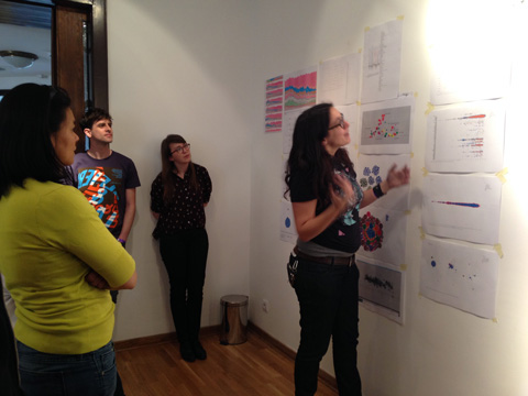

Tableau and RAW proved to be extremely valuable tools. It is amazing what you can achieve in really short time with these applications. The workshop was a big success, and a really nice experience, which also showed in the evaluation results.
Anyways, do consider signing up for the Munich event! And of course, please feel free to ask any questiony by email.
Upcoming appearances
Hey all,
it’s been busy times over here, with a lot of new stuff coming out in May, and also a few new opportunities to see me:
There’s a public Google Hangout with me on Wednesday April 30 organized by the CHI Belgium community. I’ll talk about unusual forms of data visualization – sculptures, food, etc. I think, it will be fun!
Next up: a panel at re:publica on May 06, with Jan Arpe, Maya Ganesh and Tariq Khokhar, on data visualization in a globalized world. I will show the new OECD Regional Well-Being website I have been working on together with Dominikus Baur over the last few months.
And, then there’s a workshop in Munich! Which deserves a post of its own :)
And, then there’s Oslo in June, and Basel in July – let me know in case you want to meet up.
Malofiej award
I am honored and proud to have received one of the prestigious Malofiej awards — sometimes called the Oscars of Information Design — for the Electionland/Wahlland visualization for ZEIT online.
Worlds, not stories
Here is the video of my talk at visualized, presenting the selfiecity project:
At the end, I tried to make a more general point, which is of big importance to me, and which I would like to expand on in the following:
You will often hear these days, that data visualization is great for “telling stories”, to “make the complex simple” or to “make boring facts exciting”.
While this all true to some degree, I think it misses the greatest quality of data visualization today: to provide us with new kinds of “glasses” to see the world.
Selfiecity
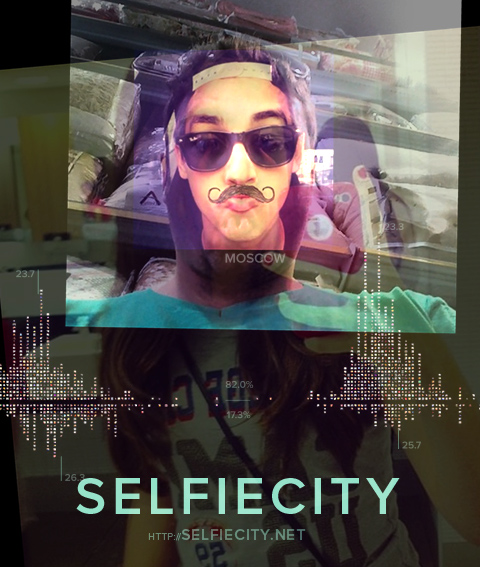
The selfiecity project has launched earlier this week, and boy, it has hit a nerve. We had 10’000s of visitors in the first few days, and hundreds of articles and posts linking to the project.
Where the wild bees are
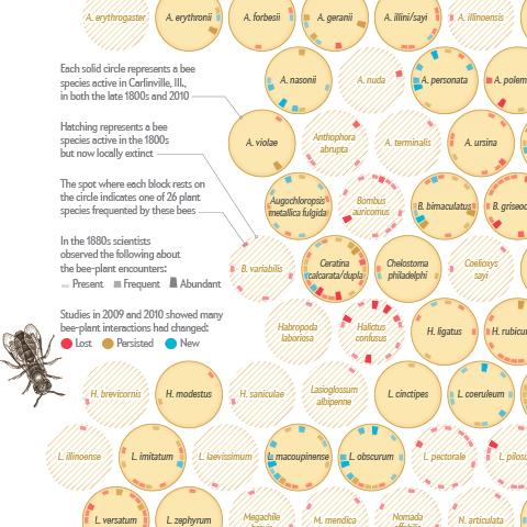
I am happy to announce that I just published my first information graphic for Scientific American on a topic that is very close to my heart – bees :)
Together with my passion for communicating complex science, Jen Christiansen correctly realized this package would be an offer I could hardly resist (despite my packed schedule), and I am really glad how the project and collaboration turned out.
Personally, I am always keen on hearing the inside stories behind projects — so, here is me returning the favor, with a brief overview of how I approached the project:
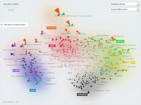
Mapping Electionland
I created a whole new kind of election map for the German Bundestag elections 2013 for ZEIT Online. Instead of showing the electoral districts results on a geographic map, or in a table, I decided use the data to map a new land: Electionland (german version | english version), where all the districts which vote in a similar way are located nearby. This new kind of map allows us to see a Germany grouped by lifestyles, preferences and attitudes.
Here is some background on how I created this map. First of all, I need to normalize the data and make the parties comparable. To this end, I applied a z-score normalization on the data. In short, a z-score centers the data (so the average value is at zero), and it rescales the data, so that one standard deviation difference from the average lands at one, two standard deviation differences from the average lands at 2, etc. This makes the relative differences in voting behavior comparable, even if we compare huge parties with smaller ones.
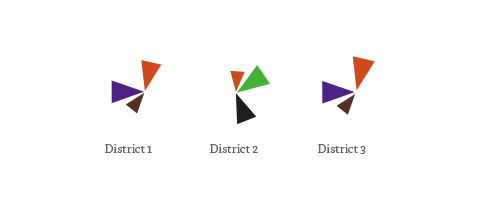
In the map, the triangle sizes correspond to these z-scores per party; I only show the results above average – these are the “characteristic” parties for a district. Each color and angle stands for one party.
I then use scikit-learn to calculate a 2-dimensional map of the resulting “electoral district space” using Multi-Dimensional Scaling or short: MDS.
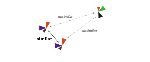
It is an algorithm that you can feed a matrix of similarities between objects (in our case, how similarly the districts voted), and it will attempt to find an arrangement that expresses these similarities as good as possible on a two-dimensional map. (For me, also a nice flashback to my 2005 B.Sc. Thesis, where I investigated MDS and related algorithms quite a bit :)
Some words about the interpretation of the map: First of all, it is important to note that the rotation of the map is a purely aesthetic choice. The MDS algorithms defines only a relative space, where the positions of all elements with respect to each are important, but not on absolute axes. But within the data, some interesting axes seem to emerge nevertheless: top-to-bottom seems to be correspond quite well to the traditional left-to-right spectrum. The left-to-right axis to interpret is a bit trickier but definitely seems related to social status or income. Also interesting to see how the blue AfD party — a newly founded euro-sceptic protest party, sort of a wild card — seems to be all over the map in the vertical center. A bit shocking also to see how there still seems to be a gap in Germany (the island on the left in pretty much exclusively ex-east Germany), with only Leipzig and Postdam (yay) bridging the gap. A note on the huge orange triangles for the Pirate party – actually, their results were not that great, but the enabled them to be very much above average in some districts.
A few words on workflow: For the frontend, I used my new favorite development combo of d3, coffeescript and SASS. In addition, I used the jQuery plugins select2 for the dropdowns and qTip2 for the tooltips.
The labels of the parties and the districts were actually hand-arranged in Adobe Illustrator. I first exported a rough version of the graphic generated with d3 using the very handy SVG crowbar bookmarklet. I hand then hand-tweaked the placements in Illustrator, and saved the resulting graphic as an SVG, which I then dynamically load into page using a combination of this technique with this one (to make it IE9 compatible). Because the layer names actually translate to group IDs in SVG, I was also able to identify the graphics elements from d3, and assign them individual click actions, etc. A very promising approach which I will surely explore further in the future.
You might wonder how I achieved the blurry contour line look in the background – the answer is simply (and a bit embarassingly) Photoshop :) Again, I used a rough version of the graphic, which was then blurred, levelled and edge-detected.
And, yes, it would definitely be interesting to compare 2009 and 2013, and see which districts moved around how much :) but this is tricky due to both the districts structure as well as the parties for vote not being exactly the same. Happy to share my data though, in case anyone is interested in that type of analysis :)
Look ma, no flash!

We reworked the OECD Better Life index. Besides a general facelift and interface overhaul (top work by Raureif, as usual), more languages (Spanish and Russian), the biggest change has been to replace the Flash-based interactive visualization with an HTML5 based component. Big congratulations to Dominikus Baur for the feat of accomplishing something very close to the Flash original (and in some parts even better)!
Dominikus has a super-useful in depth write-up of all the many little tricks that went into optimizing the graphics over on his blog, so I’ll shut up now and let the dirty rectangles do the talking.