OECD Better Life Index
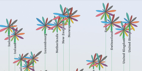
Beginning of this week, we launched a new project: the OECD Better Life Index, which allows you to compare 34 countries with respect to 11 different topics, ranging from Health, Life Satisfaction over to Jobs and Income. By choosing importance levels for these topics, you can actually brew your own country ranking and share it with friends on the web.
The visualization principle is simple: Each country is represented by one flower, one topic by one of its petals. The length of a petal indicates the score of the respective country in that topic (e.g. income in Germany). If we add up all scores, we get a toal score for each country. The higher the score, the higher the flower will rise.
The launch event itself was crazy, as the presentation of the site was the first point after the keynote address at the OECD’s 50th anniversary – and of course the site would go down 20 minutes before the live demo! But in the end, all worked out great, and we were able to sort things out and cope with the quite overwhelming demand on our servers. If you are interested, here is a video recording of what happened on stage.
Overall, it was great to see how the “flower virus” took over the event, from the booth…

… to wall decorations:

A memorable day for sure!
Btw, while I worked on the design and implementation of the visualization, the branding, web design and site production was handled by Timm Kekeritz at Raureif and Jonas Leist. And big props to the fantastic team at OECD, who fought like lions for our crazy ideas and managed to put together these huge amounts of content on the site in very short time.
Notabilia — Visualizing Deletion Discussions on Wikipedia
Just in time for Wikipedia’s forthcoming tenth anniversary (congrats!), two researchers – Dario Taraborelli and Giovanni Luca Ciampaglia – approached me for a cooperation on visualizing the discussions around article deletions on Wikipedia. The (intermediate?) results are online at notabilia.net.
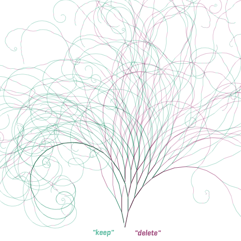
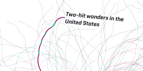
I came up with a tree visualization, where Article for Deletion discussion is represented by a thread starting at the bottom center. Each time a user recommends to keep, merge, or redirect the article a green segment leaning towards the left is added. Each time a user recommends to delete the article a red segment leaning towards the right is added. As the discussion progresses, the length of the segments as well as the angle slowly decay.
In the visualizations, I tried to capture the tension between chaos and order inherent to the discussions, and provide a nice serendipity interface as well.
So much to learn about…
 …or…
…or…
 …and…
…and…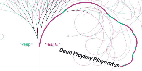
But also some more hard analysis can be found at notabilia.net, looking at the vote distributions, lengths of discussions, etc. Take a look yourself!
Visualizations for the Global Agenda
Just a quick post to announce two visualizations which went live this week, related to the Global Agenda Summit of the World Economic Forum.
Global Agenda Outlook 2011
A half-explanatory, half-exploratory sequence of visualizations, summarizing the results of a survey among Global Agenda Council members about their perceptions of important trends and developments. This “guided” visualization can be quite satisfying, when done right (the New York Times graphics department are clearly masters in that genre), but poses some challenges, both from a technical as well as a conceptual point of view. Overall, I am quite happy with how it turned out and hope I will learn more about this type of mixed exploration/explanation tools.
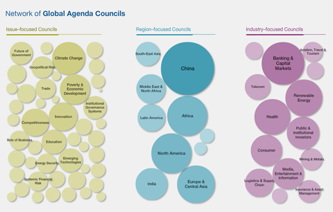
GAC Issue Browser 2010
This application allows to browse and search for the Global Agenda Councils, based on their interlinkage. (Again, this data is based on a survey, where Council members were asked who their council should cooperate with).
On the start screen, the bubbles representing councils are scaled according to how much interest they received from other Councils. China is huge in this respect.
Clicking one of the bubbles will lead you to the detail screen, where you can see the exact interlinkage, and read the survey members’ commentary by hovering over the arrows.
Also noteable: There was a visualizing.org challenge based on the same data, so make sure to check out the results.
misc. updates
After a two month break – our second, and very lovely baby arrived – I am sort of back at the desk, so here are some news and my current plans to get everyone up to speed.
I am much looking forward to speaking at decoded conference October 23 in Munich, along with Mario Klingemann, Massimo Manzi, the Generatives Design book team and many others. Thanks already for envis precisely and reppa.net for organizing the event, I am sure it is going to be a great little conference. I think it is wise to get your tickets now, as the first early bird batch has sold out rather quickly…
Also, I will be teaching smaller workshops at TU Dresden and HfG Schwäbisch Gmünd in late November.
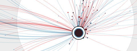
As a little diversion, and because I found the data set quite interesting, I made a little visualization of WNYC’s Map your moves dataset.
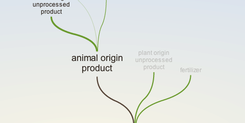
A little tree navigation I did for the organic edunet portal.
Update: revisit will be on display at the alphaville festival in London later this month.
Generally, I am really behind on documenting projects (Skype, dpa, …), but I hope I can catch in the next few weeks. One reason is that I would love to unify my two sites into one smart wordpress portfolio system, but this will take a while… Anyways, good to be back and see you around! Did I miss anything? ;)
