Visualizations for the Global Agenda
Just a quick post to announce two visualizations which went live this week, related to the Global Agenda Summit of the World Economic Forum.
Global Agenda Outlook 2011
A half-explanatory, half-exploratory sequence of visualizations, summarizing the results of a survey among Global Agenda Council members about their perceptions of important trends and developments. This “guided” visualization can be quite satisfying, when done right (the New York Times graphics department are clearly masters in that genre), but poses some challenges, both from a technical as well as a conceptual point of view. Overall, I am quite happy with how it turned out and hope I will learn more about this type of mixed exploration/explanation tools.
GAC Issue Browser 2010
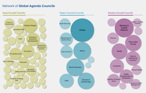
This application allows to browse and search for the Global Agenda Councils, based on their interlinkage. (Again, this data is based on a survey, where Council members were asked who their council should cooperate with).
On the start screen, the bubbles representing councils are scaled according to how much interest they received from other Councils. China is huge in this respect.
Clicking one of the bubbles will lead you to the detail screen, where you can see the exact interlinkage, and read the survey members’ commentary by hovering over the arrows.
Also noteable: There was a visualizing.org challenge based on the same data, so make sure to check out the results.

