OECD Better Life Index
Beginning of this week, we launched a new project: the OECD Better Life Index, which allows you to compare 34 countries with respect to 11 different topics, ranging from Health, Life Satisfaction over to Jobs and Income. By choosing importance levels for these topics, you can actually brew your own country ranking and share it with friends on the web.
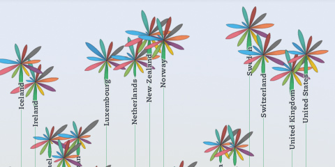
The visualization principle is simple: Each country is represented by one flower, one topic by one of its petals. The length of a petal indicates the score of the respective country in that topic (e.g. income in Germany). If we add up all scores, we get a toal score for each country. The higher the score, the higher the flower will rise.
The launch event itself was crazy, as the presentation of the site was the first point after the keynote address at the OECD’s 50th anniversary – and of course the site would go down 20 minutes before the live demo! But in the end, all worked out great, and we were able to sort things out and cope with the quite overwhelming demand on our servers. If you are interested, here is a video recording of what happened on stage.
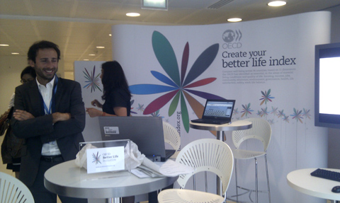
Overall, it was great to see how the “flower virus” took over the event, from the booth…

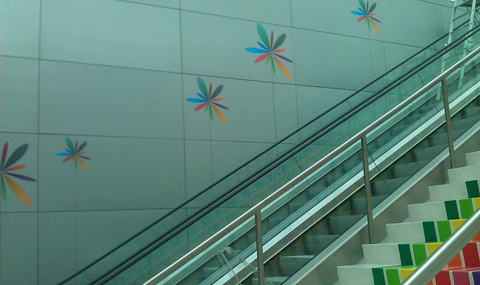
… to wall decorations:

A memorable day for sure!
Btw, while I worked on the design and implementation of the visualization, the branding, web design and site production was handled by Timm Kekeritz at Raureif and Jonas Leist. And big props to the fantastic team at OECD, who fought like lions for our crazy ideas and managed to put together these huge amounts of content on the site in very short time.

July 16th, 2011 at 5:13 am
Great job. I worked on a similar project not too long ago, if you want to take a look.
September 13th, 2011 at 10:20 pm
[…] across the site as well as branding for the index itself, marketing materials and even environmental decoration. It’s one of the only visualization projects I’ve seen where the display of data is so closely […]
November 1st, 2012 at 12:28 pm
Great idea and a very good way to make it real. Congrats!
November 2nd, 2012 at 1:44 pm
Great site, great idea, great graphics! Will you add more countries as time goes by?
November 2nd, 2012 at 1:48 pm
Great project! I’d also like to see another topic regarding leisure time and how many options do you have of spending it.