revisit: real time twitter visualization

Just a quick post to let you know that I put a new project online: revisit – a real–time visualization of the last few hundred tweets around a topic. In contrast to the usual twitter walls, it try to capture some of the temporal dynamics as well as the conversational aspects of twitter. Scroll down for customization options!
Hope you like it – it will be at display at the see conference tomorrow, but for those of you who are not there, here is the live version so you can see what you are missing :)
Presentation at TU Dresden
Last week, I gave a little presentation at the colloquium of the media informatics faculty at TU Dresden. Find the slides here. I would also like to use the chance to make you aware of the OUTPUT event on April 23, where student and research works are presented and some interesting talks are planned. For readers of this blog, probably the Technische Visualistik track will be most interesting, with talks about multi-touch, blended interaction, touchless interaction etc.
Visualizing survey results
In November 2009, I did a mini-project together with Boris Müller and the boys from raureif. My task was to create a visualization of the survey results of an event. The participants were asked to rate the events with respect to 9 questions on a scale from 1-10. As we did not have much time (nor budget), we went for the first good-looking idea available. What could that be? Right, a radial visualization (be damned, circles for non-circular data!). Anyways, I produced a quick funky mockup with random data:

Each circle sector stands for one person’s ratings, and these are ordered by their average rating. For each single rating, I draw a semi-transparent wedge, with distance from center as well as color indicating the rating’s value. Special treatment is provided for the overall event rating (a more opaque, smaller wedge). For visual spice, a black spline connects all the average values of the ratings.
So, we agreed on it and shipped it. Seeing it with the real data, however, made me wonder if I should have looked into typical rating statistics a bit more :)

Well. Lesson learnt. It is a nice little visualization nevertheless.
Which reminds me of an excellent article about how to prevent to uniform votes already in the interface.
As a bonus, here is a little remake using protovis with again, ridiculously few lines of code:
→ read more
Five Elastic Years of infosthetics.com

On the occasion of the recent fifth birthday of infosthetics.com blog, your premier source for fresh projects from visualization and information aesthetics, I made a custom adaptation of the elastic lists principle for the – up to now – 1950 posts of the site. Try it out, and read more about it here.
Happy birthday infosthetics!
Living with information: videos
Finally, the videos from our “Living with information” workshop are up. Find below my two favorites: Andrew Vande Moere for the best stories and Paolo Ciuccarelli for the most beautiful slides ever. Enjoy!
Andrew Vande Moere from FHP Interface Design on Vimeo.
Paolo Ciuccarelli from FHP Interface Design on Vimeo.
Find the whole album here.
Dynamic Taxonomies and Faceted Search:
UI design

I contributed to the user interface design chapter in the recent Springer book “Dynamic Taxonomies and Faceted Search – Theory, Practice, and Experience” (online version) edited by Giovanni Maria Sacco and Yannis Tzitzikas. Based on a definition of core principles and challenges, the chapter presents a taxonomy of navigation modes observed in existing applications. On that basis, design patterns for enabling these navigation modes in user interfaces as well as extensions and related approaches are discussed. The chapter closes with a section on personalizing faceted search.
The book itself covers a wide range of topics and current research questions related to Dynamic Taxonomies and Faceted Search from an academic point of view.
You can find a pre-print version of the User Interface Design chapter here. Thanks also to my co–authors Sébastian Ferré, Saverio Perugini, Jonathan Koren and Yi Zhang!
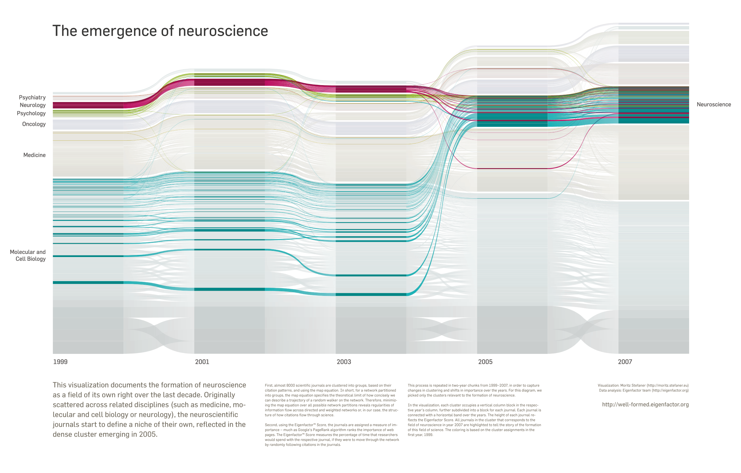
Neuroscience infoporn
This month’s WIRED UK magazine features a remix of one of the well-formed.eigenfactor visualizations in their infoporn section.
Together with my colleagues in Seattle and Umea, I modified the “change over time” visualization to tell a specific story: The formation of neuroscience as a field of its own right over the last decade. Originally scattered across related disciplines (such as medicine, molecular and cell biology or neurology), the neuroscientific journals start to define a niche of their own, reflected in the dense cluster emerging in 2005.

Download a larger version with full explanatory text here: png (1MB) pdf (4MB)
And here is some more in depth info:
→ read more
X by Y
Here’s a new project of mine:

X by Y visualizes all submissions to the prix ars electronica, from the early beginnings in 1987 up to 2009. The goal is to characterize the “ars world” in quantitative terms. A series of diagrams groups and juxtaposes the submissions by years, categories, prizes and countries. The graphics are composed of little dots (each representing a single submission) to provide a visual scale for the statistical statements and thematize the relation of the totality and the individual.
Their placement is computed with a Fibonacci series, imitating the arrangement of sunflower seeds – a very efficient and visually mesmerizing way of packing small elements into a large circle. Color distinguishes the submission categories, and a diamond shape marks submission that have been awarded a prize. The numbers in the center of the diagram elements are constructed by skipping points in the pattern – establishing a tight connection between the number and the individuals, but also demonstrating the duality of the two concepts.

The project is currently at display at the history lounge of ars electronica 09.

The project was done in cooperation with the Ludwig Boltzmann Institute for media.art.research. Find all diagrams and some more info here: X by Y. Also, don’t miss the other works on the poster over at vis.mediaartresearch.at.
SIGGRAPH09: Information Aesthetics

SIGGRAPH 2009 is over. Traditionally renowned as a graphics geek fest, with a focus on 3D and animation, I was not surprised to hear “GPU” in every second overheard sentence. But there is also the other side of SIGGRAPH: the art exhibitions, the emerging technologies exhibition and the freshly introduced information aesthetics program with talks, a panel and an exhibition. I was present there with the well-formed.eigenfactor project and also had the chance to give a little talk.
dbcounter – quick visual database stats

At the moment, I am digging through a couple of databases for an upcoming project. I did not really find a tool to quickly get an overview over a large set of categorical data. So I decided to roll my own and write a little nodebox script that walks over a CSV file, determines all the unique value attributes, counts how often they occur and plots the output as an area chart. The tool is good for getting a quick overview of categorical data, esp. missing values and the data diversity.
Download the dbcounter script including a sample data set of the Titanic passengers.
(needs nodebox – OS X only)
On a related note, you can also use the freshly released Parallel Sets application by Robert Kosara to determine relationships between the attributes. But that’s step 2 :)
On another related note, I cannot stress enough how awesome python is.