VIS 2014
I long, long resisted going to IEEE VIS, but this year, it’s about time. I’ll moderate a panel featuring top notch speakers: Tariq, Scott, Matteo, Greg and I will try to shed some light on what it’s like to work with and publish data in the NGO context, and how we can improve! This should be interesting. Check out the (simple) announcement video here:
The other thing I am really looking forward to, is the tutorial I’ll teach together with Dominikus Baur. We will look at all the practical aspects of producing successful web-based data visualizations — except the actual data vis code. So, we will discuss deeplinking, performance, shareability, help and explanations, fallbacks, mobile optimizations – all the stuff that makes great web applications really great, but which we all underestimate all the time.
Looking forward! Who else is going? Ping me!
PS: Maybe we should do a datastories listener meetup? Or something?
OECD Data Portal
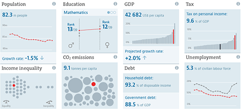
A few notes on a new, big project I have been involved with: The OECD Data Portal is now in public beta. It is still a bit rough around the edges, but we are excited to see the full website in its entirety. The main design credit goes to Raureif, and the UI implementation has been done by 9elements. I have been responsible for the chart design and specifications, and general data visualization strategy.
Unlike many of my other projects, this project is less about spotting patterns in the data, or communicating insights, but starts one step earlier: How can we actually make large collections of data sets available, and how can we guide users to the datasets they are looking for?
OECD Regional Well-Being
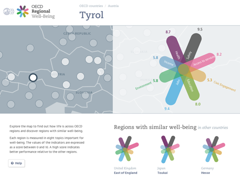
OECD Regional Well-Being: A new site for the OECD, and once again with my great collaborator Dominikus Baur and some help from my friends over at Raureif.
The site presents an exciting new perspective on more than 300 regions worldwide. As we all know, conditions inside a country can differ quite drastically, so going beyond the country averages presents an important step in the Better Life Initiative.
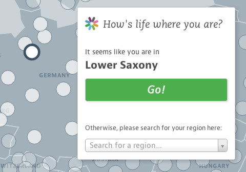
The user experience of the site is very consciously centered around the comparison of single regions in their context. Instead of presenting complex overviews, we start the experience with what people know best – their own home region. How does it compare to other regions in their country? And across all OECD regions? How have things developed over time?

The key visual element – the multi-colored star charts – represent the diversity of aspects we need to consider at when talking about regional differences. Each region receives a unique symbol, representing its particular well-being profile. This design principle was pioneered in the famous flower design of the OECD Better Life Index — which is part of the same initiative — and was now brought to a new logical extension for this new “family member”.
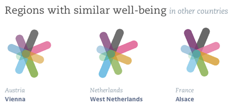
Reflecting your own region in context provides a natural starting point for further explorations. One particular option we offer is the “Regions with similar well-being” section, which suggests regions with similar indiator values all over the world. Who knew that Texas and Scotland are actually not that far apart, when it comes to well-being (well, except for the Safety aspect)? Or that Berlin has a similar profile as Alsace?
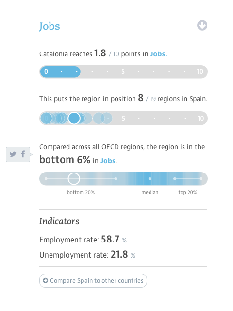
From a design point of view, the main challenge has been to deal with the complexity and scale of the data set. With ten indicators per region, most of which have also trend values, and 362 regions in the dataset, the site provides access to over 7000 data points. In designing the site, we made sure to introduce a hierarchy of information that presents the most important values values at a glance, but at the same always provides the context to a single data points that makes it meaningful, and reveals deeper information step by step.
Another detail we really like is that we added twitter and facebook buttons to all the auto-generated short factoid sentences, so you can easily spread facts you find interesting or surprising. Just hover with your mouse and wait for two seconds for the pop-ups to appear.
Here is a full region page in all its glory:

And finally — if you like the “no overview” approach, you should also definitely check out our datastories episode with Marian Dörk.
Now, go and find out how your region fares :)
PS: In case you would like to report on the project – why not use these crisp retina screenshots!
Better Life Index: 2014 update
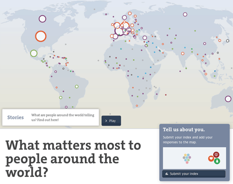
The OECD Better Life Index is one of the more popular projects in my portfolio, and now, entering its fourth year, it is still going strong, and is actively developed further. After adding gender and social inequalities, refining the sharing functionality and transitioning over from Flash to HTML5 in the years before, this year’s update is especially interesting: We are closing the loop by visualizing the responses from people all over the world using the site and sharing their Better Life Index with others.
Thanks again to my incomparable and invaluable collaborators Dominikus Baur as well as Timm Kekeritz and Frank Rausch from Raureif without whom none of this would have been possible.
Here’s a few of the new features and details:

The map initially shows the number of responses per country and gives a hint at the most favored topic per country. You can also switch to equal dot sizes, which highlights the favorite topic distribution across the world, which I found a quite interesting angle on the data.

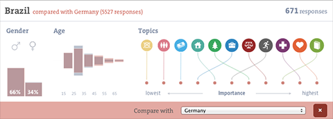
Zooming in on a country, you can learn about the gender and age distributions, and the topic ranking per country (based on the indexes submitted). You can even compare to other countries or the average response.
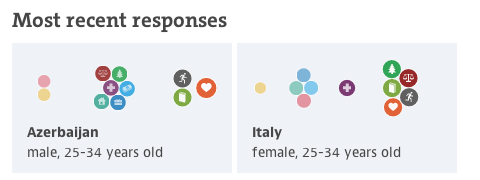
I had fun developing the force directed bubble behavior for the ranking visualizations, it is also used for the miniature visualizations of the submitted indexes and we plan to make it a core component of the Better Life Index toolbox. I would like to say thanks to Gregor for the original inspiration!
Also, on the details front — note how gracefully the visualization deals with identical values — they are all stacked neatly on top of each other, as they should have the same position in the ranking.
Last, there is a soft editorial touch with a “guided tour” through some of the most interesting facts to discover in the visualization, taking you for a quick tour around the world. I hear storytelling with big data is the next big thing, so we just wanted to hop on the bandwagon there :D. On a more serious note, these quick highlights can be an excellent way into a complex visualization and I will definitely explore these types of narrative techniques further in the future.

Anyways, I am really happy how the update turned out, and am especially looking forward to a whole new, but related site for the OECD we are launching soon! Stay tuned!
Look ma, no flash!

We reworked the OECD Better Life index. Besides a general facelift and interface overhaul (top work by Raureif, as usual), more languages (Spanish and Russian), the biggest change has been to replace the Flash-based interactive visualization with an HTML5 based component. Big congratulations to Dominikus Baur for the feat of accomplishing something very close to the Flash original (and in some parts even better)!
Dominikus has a super-useful in depth write-up of all the many little tricks that went into optimizing the graphics over on his blog, so I’ll shut up now and let the dirty rectangles do the talking.
OECD Better Life Index

Beginning of this week, we launched a new project: the OECD Better Life Index, which allows you to compare 34 countries with respect to 11 different topics, ranging from Health, Life Satisfaction over to Jobs and Income. By choosing importance levels for these topics, you can actually brew your own country ranking and share it with friends on the web.
The visualization principle is simple: Each country is represented by one flower, one topic by one of its petals. The length of a petal indicates the score of the respective country in that topic (e.g. income in Germany). If we add up all scores, we get a toal score for each country. The higher the score, the higher the flower will rise.
The launch event itself was crazy, as the presentation of the site was the first point after the keynote address at the OECD’s 50th anniversary – and of course the site would go down 20 minutes before the live demo! But in the end, all worked out great, and we were able to sort things out and cope with the quite overwhelming demand on our servers. If you are interested, here is a video recording of what happened on stage.
Overall, it was great to see how the “flower virus” took over the event, from the booth…

… to wall decorations:

A memorable day for sure!
Btw, while I worked on the design and implementation of the visualization, the branding, web design and site production was handled by Timm Kekeritz at Raureif and Jonas Leist. And big props to the fantastic team at OECD, who fought like lions for our crazy ideas and managed to put together these huge amounts of content on the site in very short time.