Symposium: Living with information
I am excited to announce the following symposium at FH Potsdam:
The symposium »Living with Information: Architecture and Visualization« (October 16 , 2009 at FH Potsdam) will juxtapose experiences and results from the MACE project with thoughts and design approaches from practitioners in the fields of design, architecture and technology. Guided by five central questions, we will explore future trends in information visualization, the relationship of visualization tools and creativity plus issues like information over- and underload.
I am really looking forward to the unique speaker combination we put together:
- Miguel Cardoso from bestiario,
- Paolo Ciuccarelli from Politecnico Milano /density design,
- Georgi Kobilarov from FU Berlin / dbpedia,
- Norbert Palz (CV + info) and
- Andrew Vande Moere from infosthetics.com!
In addition, Prof. Boris Müller and I will provide a rear-mirror view and outlook of our activities related to the MACE project… A wide spectrum, but hopefully all held together by the central issue of the workshop and the five questions we prepared for the speakers.
Hope to see you there – register soon – space is limited!
On a related note, the Potsdam–based W3C office opens on the day before, which should be quite interesting, too.
X by Y
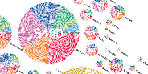
X by Y visualizes all submissions to the prix ars electronica, from the early beginnings in 1987 up to 2009. The goal is to characterize the “ars world” in quantitative terms. A series of diagrams groups and juxtaposes the submissions by years, categories, prizes and countries. The graphics are composed of little dots (each representing a single submission) to provide a visual scale for the statistical statements and thematize the relation of the totality and the individual.
Their placement is computed with a Fibonacci series, imitating the arrangement of sunflower seeds – a very efficient and visually mesmerizing way of packing small elements into a large circle. Color distinguishes the submission categories, and a diamond shape marks submission that have been awarded a prize. The numbers in the center of the diagram elements are constructed by skipping points in the pattern – establishing a tight connection between the number and the individuals, but also demonstrating the duality of the two concepts.
The project is currently at display at the history lounge of ars electronica 09.
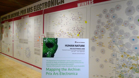
The project was done in cooperation with the Ludwig Boltzmann Institute for media.art.research. Find all diagrams and some more info here: X by Y. Also, don’t miss the other works on the poster over at vis.mediaartresearch.at.
dbcounter – quick visual database stats
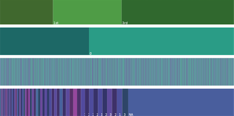
At the moment, I am digging through a couple of databases for an upcoming project. I did not really find a tool to quickly get an overview over a large set of categorical data. So I decided to roll my own and write a little nodebox script that walks over a CSV file, determines all the unique value attributes, counts how often they occur and plots the output as an area chart. The tool is good for getting a quick overview of categorical data, esp. missing values and the data diversity.
Download the dbcounter script including a sample data set of the Titanic passengers.
(needs nodebox – OS X only)
On a related note, you can also use the freshly released Parallel Sets application by Robert Kosara to determine relationships between the attributes. But that’s step 2 :)
On another related note, I cannot stress enough how awesome python is.
MACE portal update
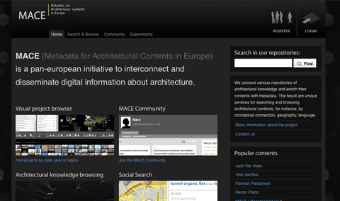
We recently launched a whole new version of the MACE portal. MACE (Metadata for Architectural Contents in Europe) is a pan-european initiative to interconnect and disseminate digital information about architecture. The idea is to connect and enrich various databases containing eLearning material for architectural contents and to connect and make them accessible in novel ways. The project is co-funded by the European commission. If you are more interested in the background of the project, you can also view our info page here. Personally, I am working half of my time on this project here at FH Potsdam.
So, let me give you a little overview of the portal:
→ read more
The scent of information
I just came back from the great workshop “The Scent of Information” organized by the visualization gang from LBI Linz. (program + live-blog)
Here are the slides from my talk. Basically, I was presenting Andrew vande Moere’s and Andrea Lau’s triangle model of information aesthetics, and showed mostly well-formed.eigenfactor and briefly some of my thesis work.
Imitate and informate
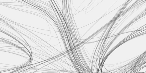
Some striking nature-inspired generative visualizations can be found over at Imitate and informate. From the site:
This is an experimental visualization project. We are inspired by nature or other real phenomena and try to transform formal aspects of it into data visualization systems.
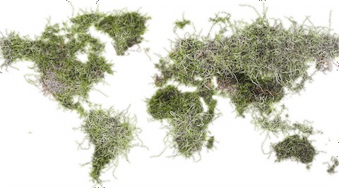
Imitate and Informate is a project by Cedric Kiefer and Christopher Warnow. It emerged from a course called “Reality in Virtuality†at Potsdam University of Applied Sciences, Prof. Danijela Djokic.
well-formed.eigenfactor
Finally, the results of a cooperation with the guys from eigenfactor are online!
For the impatient: here’s the direct link: http://well-formed.eigenfactor.org
The site features 4 different visualizations, trying different approaches to mapping information flow and citation structure in the sciences.
Election visualization roundup
With the US presidential elections coming up tomorrow (exciting!), here is a little roundup of related visualizations and information graphics I enjoyed:
→ read more
Running the numbers
Seeing Chris Jordan‘s TED talk (embedded below) just made me remember his great work in visualizing large numbers of things going wrong.
About his latest project, Running the numbers, he writes:
Running the Numbers looks at contemporary American culture through the austere lens of statistics. Each image portrays a specific quantity of something: fifteen million sheets of office paper (five minutes of paper use); 106,000 aluminum cans (thirty seconds of can consumption) and so on. My hope is that images representing these quantities might have a different effect than the raw numbers alone, such as we find daily in articles and books. Statistics can feel abstract and anesthetizing, making it difficult to connect with and make meaning of 3.6 million SUV sales in one year, for example, or 2.3 million Americans in prison, or 32,000 breast augmentation surgeries in the U.S. every month.
This project visually examines these vast and bizarre measures of our society, in large intricately detailed prints assembled from thousands of smaller photographs. Employing themes such as the near versus the far, and the one versus the many, I hope to raise some questions about the role of the individual in a society that is increasingly enormous, incomprehensible, and overwhelming.
Eigenfactor
Some interesting work from the Bergstrom Lab at the department of Biology(!), University of Washington.
(PDF version here, more info here)
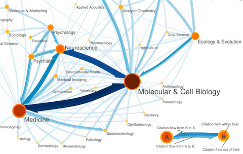
Based on citation patterns, they calculated an information flow model of how scientific disciplines are influencing each other. While I cannot follow all the technical details, I really appreciate the well-designed diagrams. Quite interesting to see an “a posteriori” order of scientific disciplines based on the actual flow of information!
An explanation of the diagrams from the eigenfactor.org:
Orange circles represent fields, with larger, darker circles indicating larger field size as measured by eigenfactor. Blue arrows represent citation flow between fields. An arrow from field A to field B indicates citation traffic from A to B, with larger, darker arrows indicating higher citation volume.
The map was creating using our information flow method for mapping large networks. Using data from Thomson Scientific’s 2004 Journal Citation Reports (JCR), we partitioned 6128 journals connected by 6,434,916 citations into 88 modules. For visual simplcity, we show only the most important links, namely those that a random surfer traverses at least once in 5000 steps, and the modules that are connected by these links.
There is also an interactive version online based on my good old Relation Browser. But honestly, I think the diagrams work much better.
Overall a great example of interdisciplinary research, where presentation and information design play together nicely with interesting+relevant analysis – exemplary!
