OECD Data Portal
A few notes on a new, big project I have been involved with: The OECD Data Portal is now in public beta. It is still a bit rough around the edges, but we are excited to see the full website in its entirety. The main design credit goes to Raureif, and the UI implementation has been done by 9elements. I have been responsible for the chart design and specifications, and general data visualization strategy.
Unlike many of my other projects, this project is less about spotting patterns in the data, or communicating insights, but starts one step earlier: How can we actually make large collections of data sets available, and how can we guide users to the datasets they are looking for?
The design of the data visualizations reflects that purpose: Much emphasis has been put on responsiveness, the charts have flexible sizes and functionalities, depending on context – from full screen piece to tiny list element, all of our chart types will always look good and work well. Of course, responsiveness does not mean to draw everything smaller, but to think about reasonable functionalities for all sizes – for instance, moving the subtitles, title, and caption elements into little info buttons for small sizes, and dealing in a smart way with axes, grids, and annotations. Here is for instance, a full view of all the variations for the line chart: (click to embiggen)
 .
.
A really nice effect of this strategy is that even small teaser charts are fully functional and dynamic:
Finding a meaningful slice of the data, and also highlighting individual countries is made very easy, as can be seen in this interaction prototype:
(Note how the visualization component reacts to the user settings – presenting a bar chart for a single year, slopegraph for two years, line chart for multiple years..
All charts are embeddable, too – even with custom country, time range, etc. selection. Here is a live version of the unemployment rates:
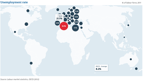
The maps feature a Dorling-cartogram-like optimization to avoid overlaps of the bubbles, but still place them as near as possible to their origin. And, of course, a proper map projection.
Finally, the country dashboard is probably my favorite piece of visualization on the portal, and features a nice mixture of custom as well as standard components.
But enough talking, give it a spin, and see if you can find interesting data to work with, there! It is a huge step for the OECD to make so much data available, and we are excited to see how all this will be put to use.
July 4th, 2014 at 3:57 pm
Moritz,
Very nice. I am a big fan of your work and this is very exciting. I love the slopegraph design and the highlighted bar and line charts. Very clean and great design elements. I am not a fan of the bubble chart for emissions though. There are so many better ways to visualize that comparison. There appears to be a number of categories, so maybe a tree map or another variation of bar charts.
Keep up the good work.
Jeff
July 5th, 2014 at 5:04 pm
[…] OECD Data Portal | Well-Formed Data […]
July 24th, 2014 at 8:18 am
[…] OECD Data Portal | Well-Formed Data […]
August 7th, 2014 at 3:03 am
[…] Stefaner, who describes himself as a “Truth and Beauty Operator”, reports on his blog, well-formed-data.net, that he is responsible for the chart designs, specifications, and general data visualization […]