On the role of bacon in visualization
I recently ran across a chart on Spiegel Online, the most popular German site for online news. The chart was a tilted 3D heatmap in fully saturated primary colors, with a thick black arrow aside.

I quickly uttered my surprise at the presence of such a poorly designed chart – esp. in such a high profile online publication – in a snarky Twitter comment, and soon after, Robert Kosara posted a whole blog post defending the graphic, and calling for “a bit more subtlety in our criticism”.
Well, I am not sure if Twitter was optimized for subtlety, yet, I guess I should clarify a bit the background of my judgement (especially since Robert’s speculative assumptions about my train of thought is not accurate in all points).
Generative Gestaltung
Generative Gestaltung is a unique new book on generative design (and related disciplines like visualization). It is quite example–driven, with loads of typical techniques explored in short processing sketches. At the moment it is only available in German, but I hear an English version is in the works. The website features all code examples and some community functions. Very nice concept and execution overall, and it really makes me eager on learning processing better :)
Election visualization roundup
With the US presidential elections coming up tomorrow (exciting!), here is a little roundup of related visualizations and information graphics I enjoyed:
→ read more
Running the numbers
Seeing Chris Jordan‘s TED talk (embedded below) just made me remember his great work in visualizing large numbers of things going wrong.
About his latest project, Running the numbers, he writes:
Running the Numbers looks at contemporary American culture through the austere lens of statistics. Each image portrays a specific quantity of something: fifteen million sheets of office paper (five minutes of paper use); 106,000 aluminum cans (thirty seconds of can consumption) and so on. My hope is that images representing these quantities might have a different effect than the raw numbers alone, such as we find daily in articles and books. Statistics can feel abstract and anesthetizing, making it difficult to connect with and make meaning of 3.6 million SUV sales in one year, for example, or 2.3 million Americans in prison, or 32,000 breast augmentation surgeries in the U.S. every month.
This project visually examines these vast and bizarre measures of our society, in large intricately detailed prints assembled from thousands of smaller photographs. Employing themes such as the near versus the far, and the one versus the many, I hope to raise some questions about the role of the individual in a society that is increasingly enormous, incomprehensible, and overwhelming.
Parallax

David Huynh has recently joined the freebase team, after having worked on Exhibit and other SIMILE tools at MIT. His new project Parallax is obviously based on Exhibit (which followed mostly a faceted filtering paradigm) but demonstrates a really interesting “sidewards browsing technique” for navigating related sets of different types of entities.
As an example, you could start with a set of architects, then filter down to all modern architects, plot them on a map, a timeline etc. – quite nice already, but traditional facet browsing in principle. The catch however, is that you can explore related collections, like the buildings they designed,
their birth places etc. in the same manner. Very interesting principle and nicely executed, yet a bit hard to explain.
In this screencast, David explains it himself:
Freebase Parallax: A new way to browse and explore data from David Huynh on Vimeo.
As a side remark: academically, I think the Humboldt paper by Georgi Kobilarov first presented this principle (but they also refer to an earlier prototype of David’s work). Unfortunately it was introduced under the name of pivot browsing, which is sort of reserved already for the quite related, but not identical principle introduced in dogear.
Any ideas for a good name? Sidewards browsing? Entity shift? Or just stick with parallax?
Physical visualization
Automaten–Andreas created a beautiful new project together with Benjamin Maus:
Reflection.

Essentially, the waveforms of a musical piece by Frans de Waard were rendered as a sculpture with a CNC Milling Machine.
This project sort of follows a week in the life, another physical visualization, where a week of location data of the author is mapped in a wooden cartogram.

The right design

I just finished reading Bill Buxton‘s Sketching User Experiences and it had quite an impression on me. It starts with a general, broad argument on the role of design thinking in business and product development, illustrating how design, design thinking and design artifacts are not yet well enough integrated and understood in technology business. A great introduction also for non-designers, including a fantastic discussion of the iPod design and business story.
For design practitioners, the main part of the book is concerned with the activities of sketching and prototyping. His main argument is that these two concepts are often used interchangeably, however serve two very different purposes:
Sketches are for getting the right design , developing the basic idea, the punchline of the design project. Sketches are quick, disposable, diverging, and abundant.
Prototypes (as well as usability testing, mock-ups, etc.) are for getting the design right – narrowing down the possibilities, making decisions, just doing what it takes to get from an idea to a really well designed thing.
To experienced designers, this might sound quite obvious, but I have to admit myself I did not reflect properly on how I use these words, and how I use these design tools. Buxton did a great job of introducing subtle distinctions in this area, and gives you lots of different angles and examples to get it. Great stuff. Obligatory reading for designers, and highly recommended for anyone who has designers around them – I promise you will understand them much better afterwards :)
I’m in yr bookz…
… visualizing your tags :)
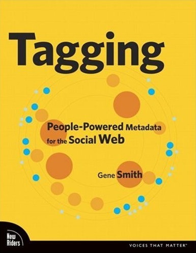
The “Tagging” book by Gene Smith is out. I am still awaiting a paper copy, but had a chance to look at the online version already. It looks really comprehensive, concise and covering all important tagging concepts. Which is not easy for such a moving target topic.
Besides, my elastic tag maps visualization is featured on p.102f. Nice!
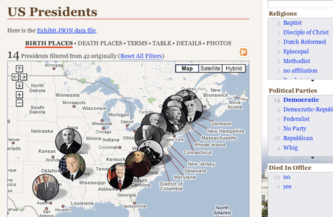
Exhibit
Flare
Finally, a decent Flash framework for Information Visualization is available: Flare is an offspring of the Java-based prefuse toolkit, written in ActionScript 3. Especially notable is the good support for animated transitions, an important topic in interactive visualization. Flare is open source software licensed under the terms of the BSD license, and can be freely used for both commercial and non-commercial purposes.
Thanks to Till for the tip!