Little boxes
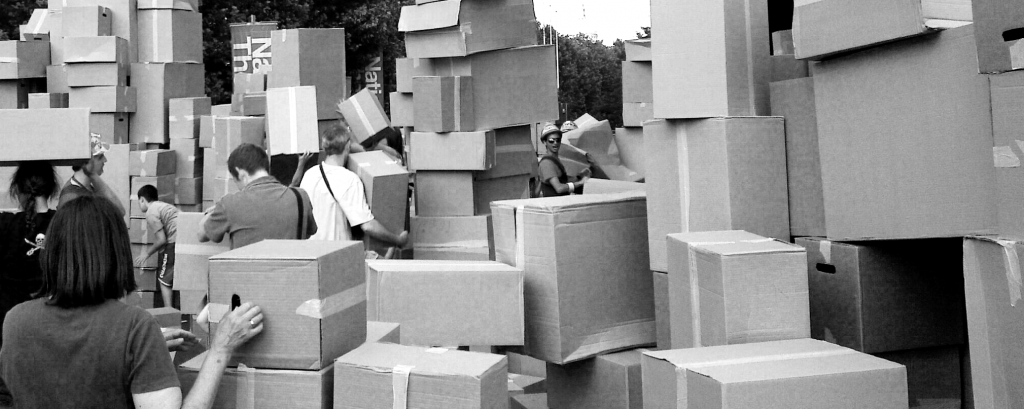 Foto credit
Would the field of data vis benefit from a clear line between art and design, as Lisa C. Rost suggests (see also the follow-up post)?
This debate has been around for a while (see e.g. Lev Manovich’s Info Aesthetics, The Manifesto debate, the Cargo Cult debate, Jorge Camoe’s attempts, but also helpful papers like “The Role of Design in Information Visualization“ etc) and of course, there is a literally a century of discourse on art and design in other fields as well.
Here’s my take:
-ach, -ingen, -zell
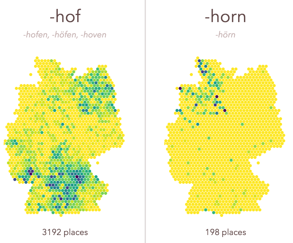
If you travel across Germany, you will notice how some place name endings are quite universal, and others are quite specific, regionally. -ach, -ingen, -zell is a little exploration of those spatial patterns. It was a welcome opportunity to experiment with a few techniques I wanted to learn more about. Find the code with some remarks on github.
All new: Truth & Beauty Operations

After many months — building your own sites is hard! — I am finally able to launch truth-and-beauty.net, my new portfolio site! It replaces the old moritz.stefaner.eu, which now lives at archive.stefaner.eu, as I was not able to (and probably won’t) migrate all old contents over.
A few notes on technology – I knew I wanted a static site generator, rather than a database driven site. Being able to sync, version control, move the whole site with normal file operations is such a huge win. After a few experiments with Jekyll, Octopress and DocPad, I finally settled for kirby. I really don’t like php. But I really like kirby. It is the only half-way sane CMS I know and working with it has been a breeze so far. Thanks Bastian!
Shared tag space
A little sideproduct from the selfiecity project:
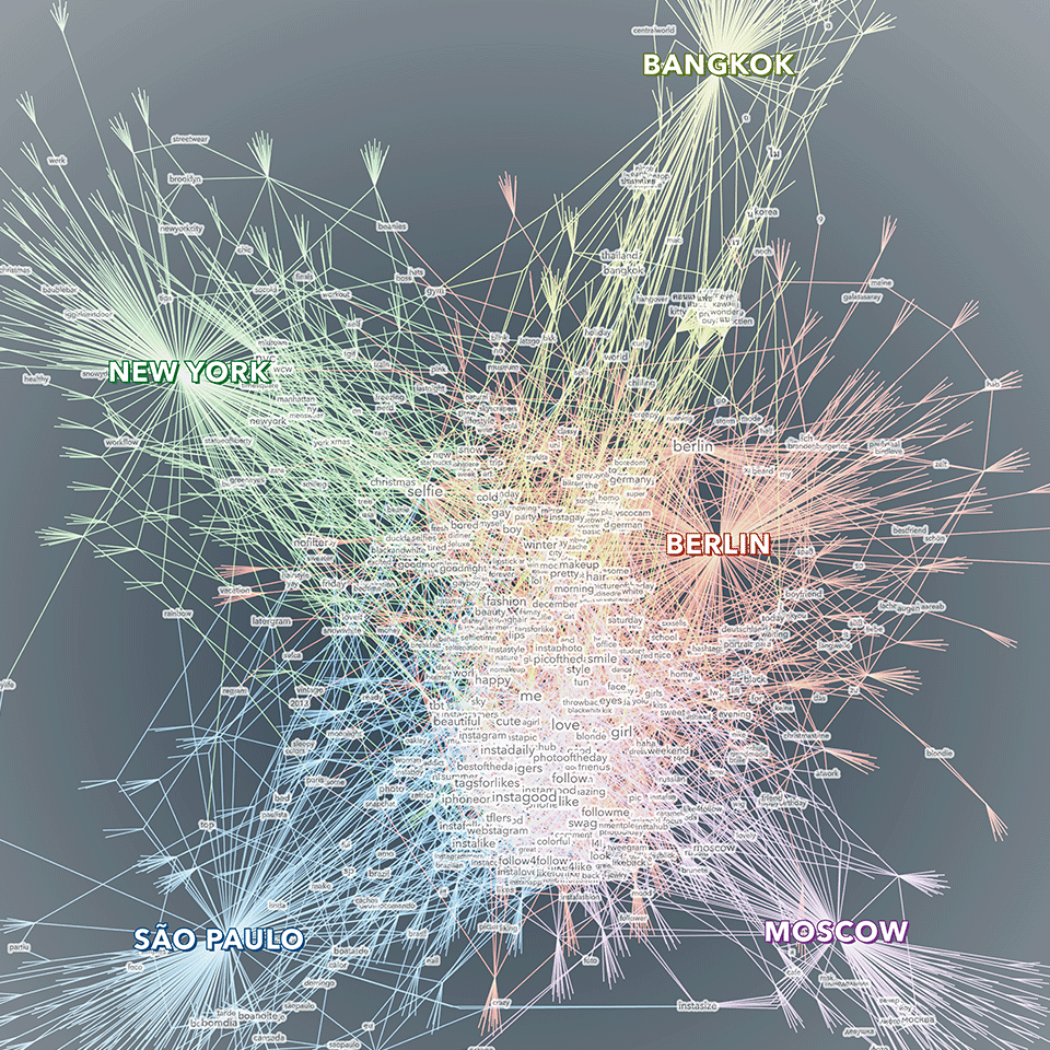
Shared tag space — a comparative visualization of the keywords people in five cities use to describe their selfies. The visualization displays a network of tags, cities and photos. The photos are used as bridges between tags and cities. Only tags that have been used at least twice are displayed with a text label. Bigger tags are used more often. The tags in the center constitute shared vocabulary across the cities, while the ones on the outside are more specific to one (or sometimes two) cities. The visualization was created as part of the selfiecity project, an interdisciplinary investigation of the selfie phenomenon.
Created with gephi, processing, Adobe Illustrator.
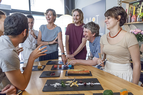
Data Cuisine Workshop Barcelona: The results

The Data Cuisine Workshop Barcelona was fantastic, we had a really great time.
Big thanks to my collaborators Dr. Susanne Jaschko and Sebastian Velilla, thanks to Jose Luis de Vicente and Olga Subiros for bringing us over, and last but not least for our great participants for the crazy dish ideas they came up with!

Check out the full documentation at data-cuisine.net. (And do get in touch in case you have ideas for other occasions where we could place the workshop – we love exploring this field.)
Workshoppin’
Hey all,
I’ll give a (German language) workshop on data visualization together with Dominikus Baur in Munich on May 16 and 17.
The workshop is split in two days, with day one discussing the concept and design aspects of data visualization, while day two goes into the nitty gritty of building a data-based graphic from scratch.

I teach only occasionally, so this is a rare opportunity. I can only recommend to register as soon as possible :)
Also, a good opportunity to talk a bit about the last workshop Dominikus and I gave at resonate. It was a great group, and I was really impressed what the participants came up with in very short time. We worked with a dataset about movies and TV series from IMDb and after a day of basic introduction, the participants went from initial questions and concept over data explorations to visual refinement and annotation in what was basically a day of workshop time.

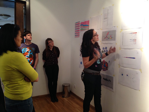

Tableau and RAW proved to be extremely valuable tools. It is amazing what you can achieve in really short time with these applications. The workshop was a big success, and a really nice experience, which also showed in the evaluation results.
Anyways, do consider signing up for the Munich event! And of course, please feel free to ask any questiony by email.
Worlds, not stories
Here is the video of my talk at visualized, presenting the selfiecity project:
At the end, I tried to make a more general point, which is of big importance to me, and which I would like to expand on in the following:
You will often hear these days, that data visualization is great for “telling stories”, to “make the complex simple” or to “make boring facts exciting”.
While this all true to some degree, I think it misses the greatest quality of data visualization today: to provide us with new kinds of “glasses” to see the world.
Where the wild bees are
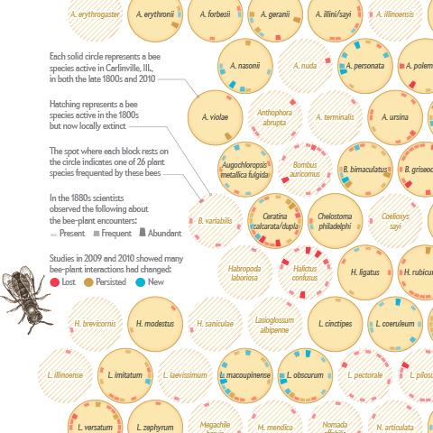
I am happy to announce that I just published my first information graphic for Scientific American on a topic that is very close to my heart – bees :)
Together with my passion for communicating complex science, Jen Christiansen correctly realized this package would be an offer I could hardly resist (despite my packed schedule), and I am really glad how the project and collaboration turned out.
Personally, I am always keen on hearing the inside stories behind projects — so, here is me returning the favor, with a brief overview of how I approached the project:
Look ma, no flash!

We reworked the OECD Better Life index. Besides a general facelift and interface overhaul (top work by Raureif, as usual), more languages (Spanish and Russian), the biggest change has been to replace the Flash-based interactive visualization with an HTML5 based component. Big congratulations to Dominikus Baur for the feat of accomplishing something very close to the Flash original (and in some parts even better)!
Dominikus has a super-useful in depth write-up of all the many little tricks that went into optimizing the graphics over on his blog, so I’ll shut up now and let the dirty rectangles do the talking.
Keynote at European Communication Summit
My speech from the summit. No big surprises for long-time followers, but a good summary overall, I guess. Also, I wear a suit!