Where the wild bees are
I am happy to announce that I just published my first information graphic for Scientific American on a topic that is very close to my heart – bees :)
Together with my passion for communicating complex science, Jen Christiansen correctly realized this package would be an offer I could hardly resist (despite my packed schedule), and I am really glad how the project and collaboration turned out.
Personally, I am always keen on hearing the inside stories behind projects — so, here is me returning the favor, with a brief overview of how I approached the project:
Understand the research, doubt the data
The project was based on a published piece of research, providing me not only with existing data, but also results of scientific analysis, and a thorough description of how the data was gathered, and how it can be interpreted. In a nutshell, the study was looking at how bee-plant interactions have changed at a specific site over time, by looking at the results of a study from the late 19th century on which bee species would fly to which plants, repeating the same study today, and then looking at the differences. While the paper is pretty explicit about the results, unfortunately, the main graphic I was commissioned to redesign did not really help much in understanding the gist of the research.
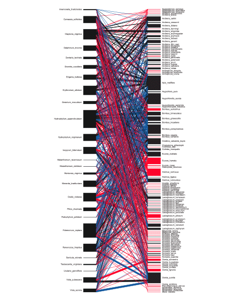
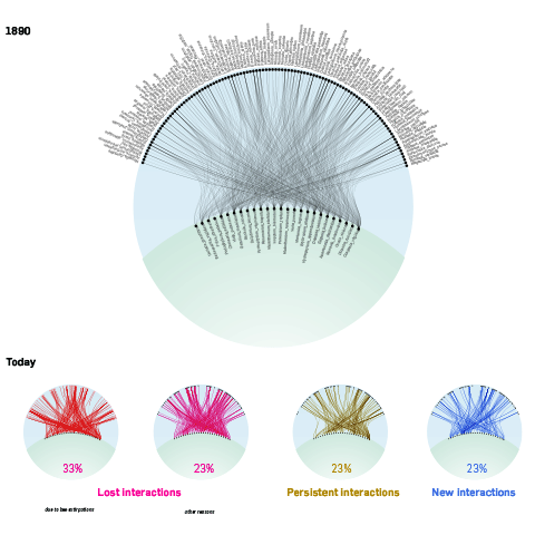
In this graphic, the two columns stand for bees and plants and the lines indicate what happened to interactions between them -where they lost or did they persist – and in which strengths they were observed. But, let’s be honest, this graphic makes it very hard both to see the big picture or go into individual species and understand how things have changed on a micro level.
Also, from reading the paper I gathered that actually, also new connections were formed, but this fact was not represented in this figure and the data set I received, so I went back to the researchers to receive this addition to the dataset, in order to be able to create a more truthful and complete representation of their research. Understanding the limitations and biases of your data sets early on is really important, and sometimes, things can be done to fix them.
Poles in the ground
Based on this new data set, I quickly tried to determine the key statistics of the data and the main story in the research.

So, from my first explorations I learned that we had 109 bee species organized in 24 geni, 26 plants, with 653 interactions between these. The main story seems to be that half(!) of the bee species present in the 19th century were not observed anymore today, and that there were also major changes in the interaction network. Almost 2/3 of interactions were lost (due to the bees being gone locally extinct, or other reasons). In turn, 20% new interactions were formed, hinting at nature’s resilience and adaptivity.
To me, it is quite important to determine these basic facts early, just to put a pole into the ground as a reference point for later. If later on, my visualization fails to show these very simple key insights, I might be on the wrong track.
Or in other words:
Your data vis should be better than a bar chart? Well, then… first, make a bar chart.
— Moritz Stefaner (@moritz_stefaner) November 1, 2013
The other benefit of these simple statements is plausibility checking: together with the client, I can quickly verify that the data set I have is complete and indeed delivering a plausible first message.
Get a feel for the texture of your data
The next step usually involves getting a feel for the texture f the data – understanding what can be done with it, and which views seem to generate the most interesting insights. To get started, I produced a matrix view of the network using Tableau.
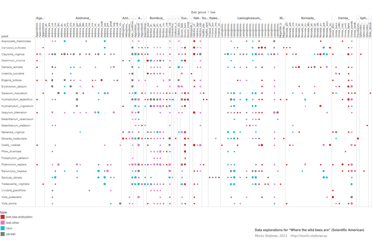
Matrices are really great for getting an overview of the links of a network, how dense or sparse the connectivity is, and which nodes have similar connection patterns. It became clear, that some bee geni (i.e. groups of species) shared a few connectivity patterns, but others were quite mixed up. Generally, there seemed to be a huge variation of patterns, and the fate of each species seemed somewhat unique.
I then became interested in the topology of the network – are there any meaningful groups or niches in the data?
So, I proceeded to produce a few views in gephi, to investigate, for instance, if certain bees in the network shared similar links, and had all gone extinct together, or if there is anything else we could learn from the topology of the network.
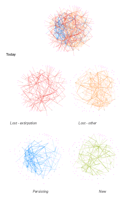
As you can see, we see nothing — no striking topological features stand out. Well, some of the “persisting” links seem to form sort of a niche, but, overall, we are just dealing with a densely interconnected network, that had become a lot less densely connected, mainly due to the loss of actors. But we had known that before, right?
Find a metaphor
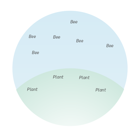
Stepping back a bit, I was thinking how I could make better use of the specific topic at hand. One charming, really simple idea was to arrange the plants on the ground, and the bees hovering in the air, as this makes sense when we compare think of the physical situation in nature.
However, even the most charming idea cannot fix the fact that the network looked still very messy:
even if I added more info by varying node placement and sizes:
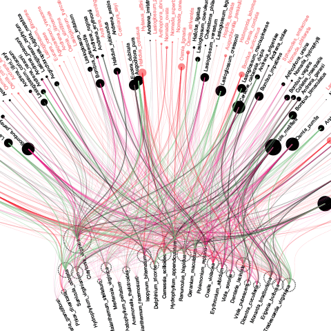
At this point, I was sort of at a loss. The matrix was quite informative, but visually not really suited for the purpose. The network views proved uninformative and messy. How to go on?
Macro-views or micro-views?
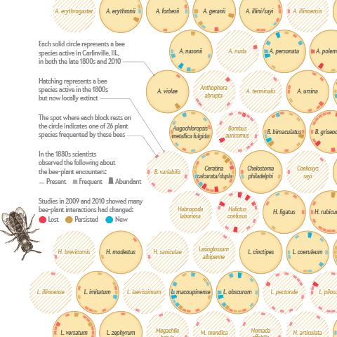
At this point, I decided to rethink the general approach a bit. Reconsidering the fact that the main changes in the network were actually due to half of the bee species disappearing, while the plant population stayed the same, I decided to center the whole graphic around the bee population, and characterize each “plant visitation profile” per bee species individually.
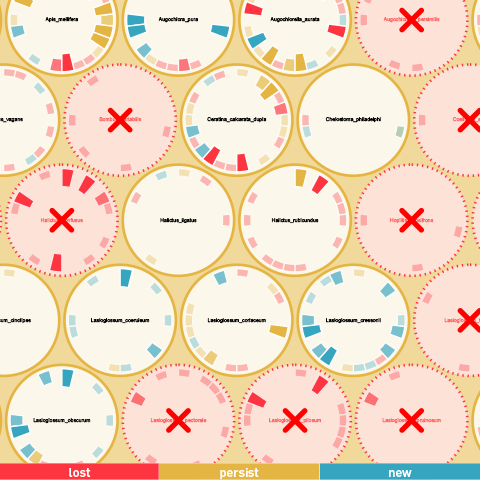
So, I had this idea to represent the bees in individual cells, arranged as in a bee hive, with each plant interaction indicated on the outside ring as a circle wedge, with size indicating strength of interaction, and color representing the type. Extinct species are marked with a strong “X” marker, in order to emphasize the disappearance. I quickly whipped up a prototype in d3.js and immediately know this was the way to go forward.
In this case, shifting the view from the macro-patterns to the micro-level —the fate of the individual bee species — was crucial to untangle the mess and make sure the basic statistics about the bees – the main story – come across well.
The last 20% are the second 80%
So, while I was thrilled to have found a smart principle at last, a lot of the work was still ahead – explaining the visual, framing it properly, laying out the page, coordinate with the text to be produced, check back with the scientists, etc. These details, in sum, make a lot of the quality of an information graphic and I found a really great counterpart in Jen Christiansen, who was key in this important part of the process.
For the final result, we went with a hatched background for the missing bees, which, together with the lovely bee illustrations by Jillian Walters, helps to bring in a vintage theme – reminiscent of the fact that parts of the results are based on a very old study – and to support readers to remember “that bee graphic”.
Summing up, I hope this project reveals a bit how it is like to toil in the data mines, and finding the right angle and framing for your data visualization project based on these data explorations.
And again, just because something could be seen as a network, you often fare better when avoiding the usual hairball mess altogether.
PS: This is not an isolated study or anedoctal result. The bees are actually in big trouble today. Greenpeace’s SOS bees can be a starting point, if you want to get involved.
November 28th, 2013 at 12:12 pm
Congrats, Moritz!
November 28th, 2013 at 3:23 pm
Cheers Gregor!
November 28th, 2013 at 3:57 pm
Great article !
one question, what apps have you used for presenting the data ? Grate graphics for your analysis !
November 28th, 2013 at 3:59 pm
Indeed, I forgot to mention that I used the great SVG crowbar (http://nytimes.github.io/svg-crowbar/) in order to save an SVG from the browser-based graphic I created with d3, and then finished the graphic in Illustrator.
November 28th, 2013 at 4:33 pm
terrific work !
November 29th, 2013 at 10:54 pm
Congratulations Moritz. This is a really good write-up explaining the process and how much work is involved in getting to the final visualisation. It should be a good pointer for people who are trying to understand the value of visualisers.
Paula
November 30th, 2013 at 8:00 am
[…] Where the wild bees are | Well Formed Data […]
November 30th, 2013 at 2:48 pm
Mo, I really loved this. Everyone should publish the process the same way you did. Also, a lot of good ideas on the single items versus relationships. This may be applied to many many other cases.
March 20th, 2014 at 7:04 pm
[…] Online, and Where the wild bees are, for Scientific American, both explained in detail here and here. Are you experiencing a rise in this type of demand from news and scientific […]
June 30th, 2014 at 1:33 pm
Really enjoyed your thought process as you went through the data analysis. It’s shocking, though not unexpected that we’ve lost half of the bee species. Your pole in the ground should help us monitor the decline in future, and unfortunately, I do think it will be decline.
November 4th, 2014 at 4:11 pm
[…] Online, and Where the wild bees are, for Scientific American, both explained in detail here and here. Are you experiencing a rise in this type of demand from news and scientific outlets? MS – I can't […]
November 14th, 2015 at 3:46 pm
[…] Where the Wild Bees Are: Documenting a Loss of Native Bee Species between the 1800s and 2010s (Piece on Bees done with Moritz) (project’s page from Moritz) […]
December 21st, 2016 at 8:36 am
echkmnmiughjeividsqekahqwiksexctywovgcuyzmjyezxyzkrebbpke