Quantitative data visualization
Recently, a number of interesting online tools for quantitative data visualization popped up:
swivel.com
“…is a place where curious people explore all kinds of data.” (tag line)
It allows anybody to upload, visualize and share data sets. The diagrams can be embedded in any web page by using HTML snippets. I haven’t figured out yet if these update automatically, when the data set changes. If so, this is a really neat way to display dynamic graphs on your page. And the whole sharing/discussing data aspect is really interesting.

reinvigorate.net
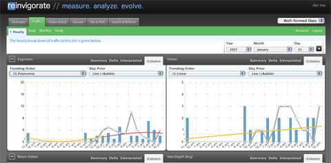
My favorite online web site analytics tool, which I totally forgot about, because it has been offline for two years or so. But the relaunch was really worth the wait, nice style, except for the glossy buttons (WHY?), the colors and visual ideas are really good. Also feature-wise, it easily puts google analytics behind – trend analysis with polynomial fitting, real-time analysis, in-depth stats etc. I recommend testing it out if you are a stats junkie as I am.
IBM: many eyes


Looks a lot like swivel, except there are far more visualization options and the diagrams are interactive (Java though – hrrr). Haven’t looked at it in depth yet, but it looks very interesting as well.