Emerging topics update
My thesis is due pretty soon, so I am currently writing A LOT and make some on–the–go beautifications to my experiments.
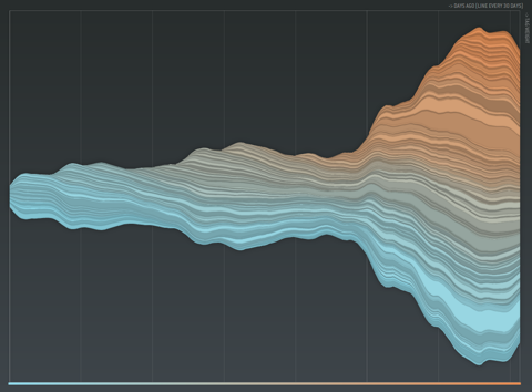
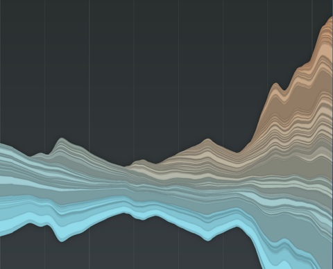
First one is the emerging topics histogram. I followed my own advice and vertically centered the stacked histogram. Additionally, I never liked those sharp edges, so now I do not only “fade out” tags visually, but also fade them in, resulting in a much more organic picture, and largely improved readability of the chart. New color scheme: old tags are cold, freshly introduced ones in warm color. This is all very much inspired by the fabulous last.fm charts by Lee Byron – thanks!
> new interactive version here
and some pix:


May 24th, 2007 at 2:29 pm
Nice work
May 25th, 2007 at 1:19 pm
Thanks—same to you!
May 26th, 2007 at 2:55 pm
One thing I forgot: Credit where credit is due; this type of visualization has been around for quite a while already: http://infoviz.pnl.gov/pdf/themeriver99.pdf
June 2nd, 2007 at 4:55 am
[…] by mikelove on June 1st, 2007 Another nice visual applet from Moritz Stefaner’s Well-formed data, showing the use of a person’s del.icio.us tags. The key here is that the height of the tag […]
May 29th, 2008 at 11:41 am
It’s amazing ! Is there a way to have it in a free/open source licence ?
February 13th, 2009 at 8:59 pm
This is great for correlating a tag’s popularity with a surge in use of the service, as I think you already noted. Maybe to add an additional dimension of data, you could base a tag’s decay upon how useful it is (i.e. how many times people access bookmarks with that tag). It would be a different way of looking at the data; “useful” tags will stick around longer, and you will weed out tags that nobody finds useful.