eyeo community visualizations
The eyeo festival and the community around it has a very special place in my heart. When Dave Schroeder announced the team was editing a book to celebrate the fifth anniversary, my immediate thought was to use this opportunity to follow up on an old idea, which I had been kicking around for a while (also with a few friends) — mapping the community around this arts-tech-creative-code-datavis thing.
What are the different niches in the community? Who is bridging the clusters? How do places, institutions, shape these communities, how do people influence each other over time? End of the day, I’d really like to have this big map of how the last 20 years went down in the field.
So, I took the chance and asked each eyeo contributor (speaker, panelist, lecturer…) from the past five years to name their most important connections in three categories:

resulting in the eyeo scenegraph network visualization:
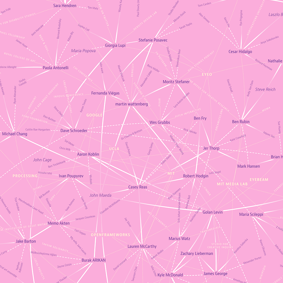
This map is much less about the big topology and importance of individual nodes, but much more about all the individual connections and anecdotes. You really need to take some time to study all the links and references.
Most interesting to me — the list of people who were mentioned by at least two others, but never spoke themselves at the festival (or, at least, din’t answer the survey): Nicole Aptekar, Mike Migurski, Laszlo Barabasi, Maria Popova, Steve Reich, John Cage, Aurelia Moser, Alexander Galloway, Daito Manabe (spoke in 2013), Jesper Kouthoofd, Michael Naimark, Sep Kamvar, John Maeda.
The workflow for this one was quite complex – a python script to collect the data (took days, as the new twitter API allows only very limited access), layout calculations in gephi, svg export for manual tweaks in Illustrator.
But, it left me (and Golan Levin, who dropped by at my house one day :D) a bit unsatisfied: where are all the other people… Just focussing on the people on stage seemed inadequate for eyeo, where the visitors are sometimes more interesting than the speakers :D
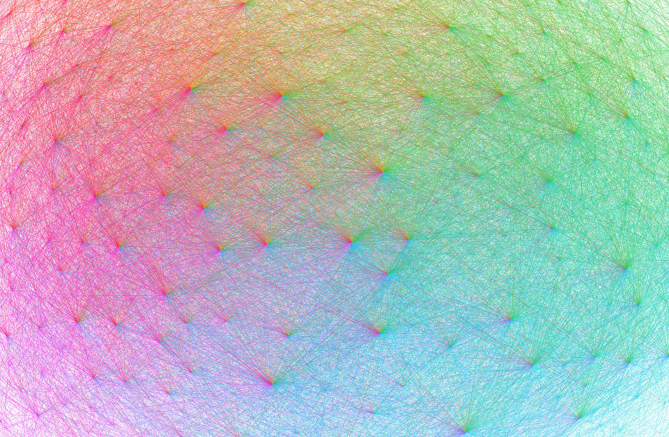
Luckily, the eyeo team collected twitter handles from attendees! So I went on and created the eyeo crowdcloud:
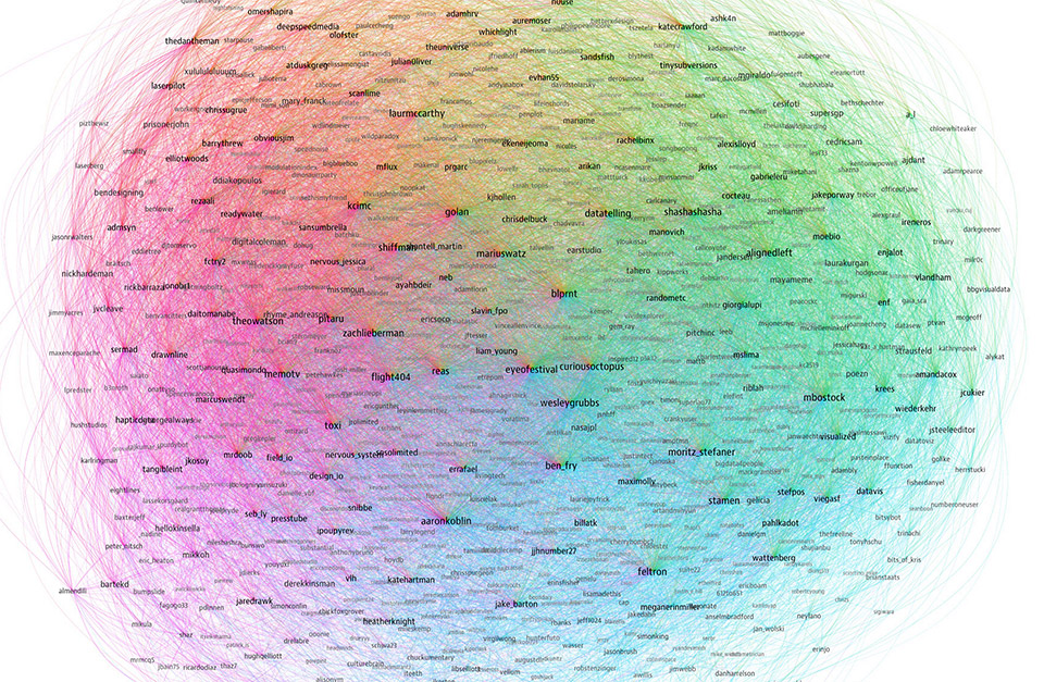
A network map, showing 852 twitter accounts related to the eyeo festival. The network layout was calculated using gephi and brings more strongly connected accounts closer together. The size of the account labels corresponds to the number of followers in this network. Each line drawn is a followership relation. It is colored according to the followers color which is assigned based on the angular position on the map. As a result, accounts with followers from many different regions of the map look more colorful.
This one is much more dense and interesting from a “landscape” point of view — the different sub communities are represented quite well on different areas in the map, with colorful connectors in the center :)
Obvious “see also”: The resonet visualization I did for resonate.
And, here’s the best part — the visuals actually made it to the book — as cover and chapter visuals!
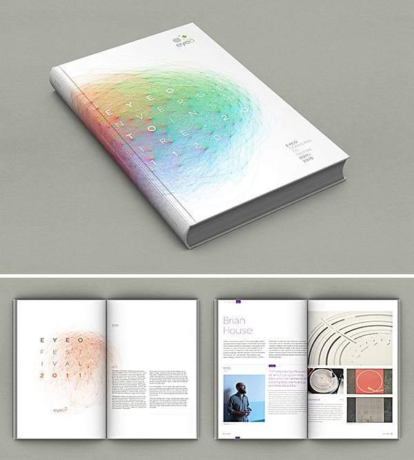
I am super grateful to Dave Schroeder and the team for this huge honor, and enabling me to give back to a festival that has been so important for me!
Now, my only drop of bitterness is that I’ll miss the festival next week… but there’s only so-and-so much travel I (and the family) can enjoy. I’ll be following on twitter! ;)