Stadtbilder — mapping the digital shape of cities
Stadtbilder (“city images”) is a new little side project of mine — an attempt to map the digital shape of cities. I am increasingly fascinated by the idea of mapping the “real world” — life and culture as opposed to just physical infrastructure — and when I learned about the really deep datasets Georgi from Uberblic had been collecting, I just had to work with the data.
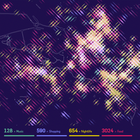
The maps show an overlay of all the digitally marked “hotspots” in a city, such as restaurant, hotels, clubs, etc. collected from different service like yelp, or foursquare. What they don’t show are the streets, the railroads, the buildings. I wanted to to portray the living parts of the cities as opposed to the technical/physical infrastructure you usually see on maps.The only exception are the rivers and lakes, because I felt they help a lot in orienting on these fairly abstract maps.
While the designs are meant to be printed, as a digital companion, the website helps you decipher the posters by providing a little map overlay on click. If you are interested in a print, please sign up to be notified when prints are available — I still need to figure out the precise logistics. (Let me know if you know of a high-quality poster printing and shipping service a la imagekind which can also ship from EU/worldwide..)
For now I settled on the three main German cities, because they have very different characteristics, and I know them very well. But I might be convinced to do other city editions as well :)
Here are some process shots!
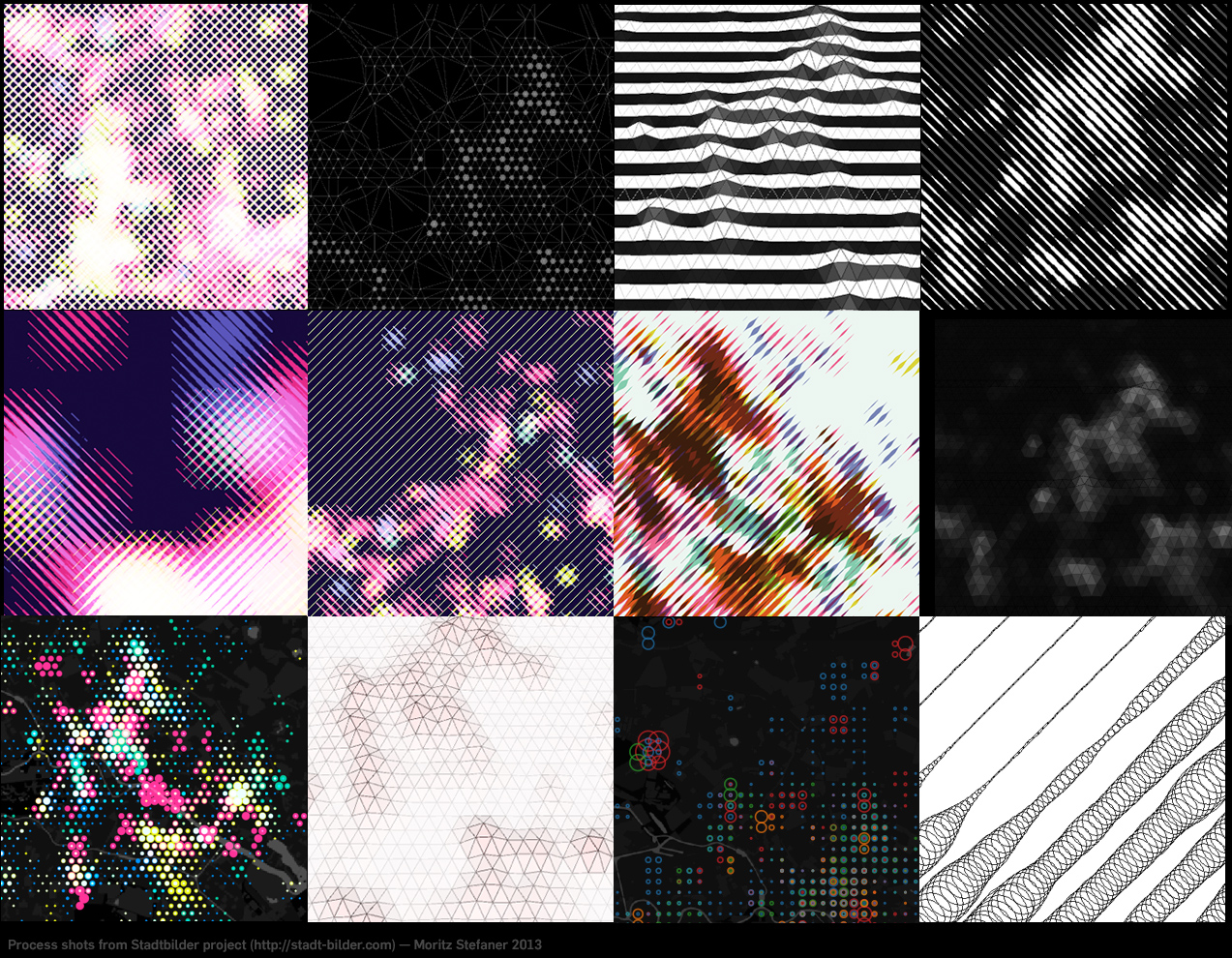
It took me a while to figure out how to overlay these four different heatmaps on top of each other. I experimented with 3D manifolds, different dot patterns, small multiples, etc. etc. In the end, I am really happy with the solution I came up with, as combining always two of them in one stroke direction allows to decipher all of the dimensions, and just by looking at stroke width and brightness (if the two overlap), no need to do “color mixing reverse engineering” in your head, which is pretty much impossible anyways. The downside of this approach is obviously a low spatial resolution.
How does it work technically?
I first query the Uberblic API (not public yet, sorry ;) for the scores in the different categories by marching through a hexagonal grid.
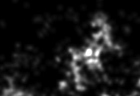
From the values, I first draw fairly blurry heatmaps in processing:
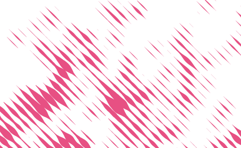
I then walk over these heatmaps pixel by pixel in diagonal lines, and draw on a new canvas a line whose stroke corresponds to the brightness of the pixel on each step:
and then I merge and simplify these images in Illustrator. That’s it!
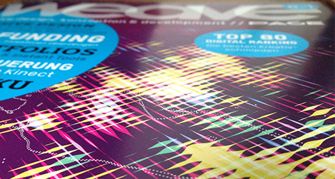
In other news, the Berlin version made it to the cover of WEAVE magazine already (but it should be noted that for this use case, the background was tweaked more into a blueberry tone, the original is way more violet):
If you find this project interesting, Flowingcity hosts a collection many more projects in this direction.
Anyways, let me know what you think of it!
Update: Prints are now available!
May 25th, 2013 at 5:15 pm
[…] Stadtbilder — mapping the digital shape of cities | Well-Formed Data […]
May 26th, 2013 at 5:29 pm
[…] Well-formed data » Stadtbilder — mapping the digital shape of cities. via @geo_will […]
May 28th, 2013 at 8:47 am
Hey Moritz,
das ist eine tolle Arbeit.
Ich habe Sie tatsächlich zuerst auf dem Weave-Cover entdeckt und bin gerade auf der Stadtbilder-Website gewesen. Großartig ist auch der Städte-Vergleich und ich wäre gespannt auf eine Darstellung über die Zeit (wie verändert sich eine Stadt).
Beste Grüße,
Daniel
June 5th, 2013 at 4:07 pm
[…] Stadtbilder: Mapping the Digital Shape of Cities […]
June 27th, 2013 at 6:04 am
[…] Für die drei deutschen Städte Berlin, Hamburg, München hat er Daten von Location Based Services wie z.B. Yelp und Foursquare ausgewertet und grafisch gelungene Stadtbilder geschaffen, die man auch als Poster kaufen kann. Zudem erklärt Stefaner für Interessierte auf seiner Seite die Vorgehensweise. […]
June 28th, 2013 at 7:39 pm
This is really cool!!
Could you build a New York City version of this map? It’s one of the most interesting cities, and I’m sure a lot of people would like to see how it looks like. :)
Cheers!
July 5th, 2013 at 10:21 pm
[…] images © Moritz Stefaner. For more information see the project website or Moritz’ project description. Prints are available at Redbubble. Data source: Uberblic. Thanks, […]
September 4th, 2014 at 3:49 pm
Just looks like a lot of blurry images to be honest. But making sense of it could be useful. Example, finding out which areas of my city are hottest during certain times of the week.