Quantitative data visualization
Recently, a number of interesting online tools for quantitative data visualization popped up:
swivel.com
“…is a place where curious people explore all kinds of data.” (tag line)
It allows anybody to upload, visualize and share data sets. The diagrams can be embedded in any web page by using HTML snippets. I haven’t figured out yet if these update automatically, when the data set changes. If so, this is a really neat way to display dynamic graphs on your page. And the whole sharing/discussing data aspect is really interesting.

reinvigorate.net
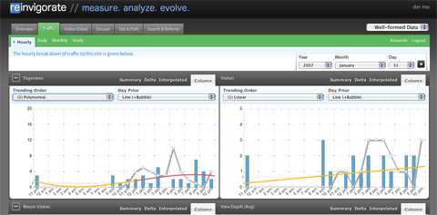
My favorite online web site analytics tool, which I totally forgot about, because it has been offline for two years or so. But the relaunch was really worth the wait, nice style, except for the glossy buttons (WHY?), the colors and visual ideas are really good. Also feature-wise, it easily puts google analytics behind – trend analysis with polynomial fitting, real-time analysis, in-depth stats etc. I recommend testing it out if you are a stats junkie as I am.
IBM: many eyes


Looks a lot like swivel, except there are far more visualization options and the diagrams are interactive (Java though – hrrr). Haven’t looked at it in depth yet, but it looks very interesting as well.
February 1st, 2007 at 1:58 am
Moritz, thanks for mentioning Swivel and posting our graphs. I’m not familiar with reinvigorate.net, but as a trivia point, Swivel was going to be a pay-per-click ad reporting and site analytics tool before it became what it is, so seeing this reminded me of what we worked on once upon a time. And of course, Many Eyes made quite a splash when they launched, and our jaws dropped at all the visulalizations the folks there can churn out.
Regarding auto-update, the images you embed in a blog are frozen snapshots of the data. Come on over to Swivel.com and drop us some feedback about what you would like to have in an auto-updating graph, or about anything else at Swivel.
Regards,
Dmitry Dimov
Product Chief & Cofounder
http://www.swivel.com
February 1st, 2007 at 11:10 am
Thanks for commenting. I think the auto-update would definitely take your idea to another level. Given the current show-off-hype, I think many people would love to show their weight loss, vistor stats, poker winnings, miles travelled, etc. in dynamically updating diagrams. Ideally, it should then also be possible to update the data sets vin API.
Concerning ManyEyes: I think swivel has clear advantages concerning a) simplicity and b) stressing the community aspects. So it will be very interesting to see which model is more successful. But I am not even sure if you really compete for the same market share.
February 19th, 2007 at 9:55 am
Just discovered: A great in-depth comparison of manyeyes vs swivel can be found here.
March 20th, 2007 at 1:35 am
Moritz,
I noticed that you posted a graph from Swivel a while back. Thanks for linking to us! I wanted to invite you to come back to Swivel and check out all of the great new data and graphs uploaded since you last posted. Also, we recently added an updating feature for datasets (as you discussed with Dmitry), and will be rolling out an API in the next few weeks. Please feel free to e-mail me if you have any questions or suggestions about Swivel!
Thanks,
Chris Grisanti
Swiveler
chris@swivel.com
April 10th, 2007 at 10:49 pm
[…] P.S. I have found a great in-depth comparison of Swivel and Many Eyes from his comment to his own post. […]