Data Cuisine: Barcelona

I am *ridiculously* excited to announce a new edition of data cuisine workshop. This time, it is the Data Cuisine Workshop Barcelona!
The workshop is happening in coordination with CCCB, the Big Bang Data exhibition, and Sónar. For the culinary side of the project, we will collaborate with Sebastian Velilla — a chef who has worked for the AlÃcia Foundation and is currently involved in the activities of the Torribera Food and Nutrition Campus of the University of Barcelona. And — it’s all happening in two and a half weeks (June 10-13). This. is. Crazy!
In case you are interested – register right now! (I expect things to move very fast, so be quick!)
Better Life Index: 2014 update
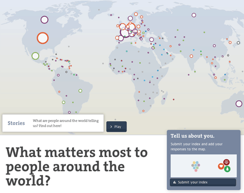
The OECD Better Life Index is one of the more popular projects in my portfolio, and now, entering its fourth year, it is still going strong, and is actively developed further. After adding gender and social inequalities, refining the sharing functionality and transitioning over from Flash to HTML5 in the years before, this year’s update is especially interesting: We are closing the loop by visualizing the responses from people all over the world using the site and sharing their Better Life Index with others.
Thanks again to my incomparable and invaluable collaborators Dominikus Baur as well as Timm Kekeritz and Frank Rausch from Raureif without whom none of this would have been possible.
Here’s a few of the new features and details:

The map initially shows the number of responses per country and gives a hint at the most favored topic per country. You can also switch to equal dot sizes, which highlights the favorite topic distribution across the world, which I found a quite interesting angle on the data.Â

Zooming in on a country, you can learn about the gender and age distributions, and the topic ranking per country (based on the indexes submitted). You can even compare to other countries or the average response.
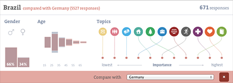
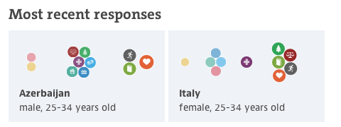
I had fun developing the force directed bubble behavior for the ranking visualizations, it is also used for the miniature visualizations of the submitted indexes and we plan to make it a core component of the Better Life Index toolbox. I would like to say thanks to Gregor for the original inspiration!
Also, on the details front — note how gracefully the visualization deals with identical values — they are all stacked neatly on top of each other, as they should have the same position in the ranking.
Last, there is a soft editorial touch with a “guided tour” through some of the most interesting facts to discover in the visualization, taking you for a quick tour around the world. I hear storytelling with big data is the next big thing, so we just wanted to hop on the bandwagon there :D. On a more serious note, these quick highlights can be an excellent way into a complex visualization and I will definitely explore these types of narrative techniques further in the future.

Anyways, I am really happy how the update turned out, and am especially looking forward to a whole new, but related site for the OECD we are launching soon! Stay tuned!
Mapping soccer fans
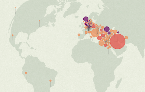
A quick note for a fun project I did together with David Bauer from the Swiss newspaper Tageswoche: “Zürich, Kairo, Bagdad: Wo auf der Welt eine Million FCB-Fans leben” — an interactive map of all the facebook fans of the soccer club FC Basel. While Basel and surroundings have the most fans per inhabitant, the highest absolute number of fans is actually located in Egypt – who knew?
The map features a little stepper that allows you to zoom out from Basel to the whole world in a few annotated steps. The map projection is azimuthal equidistant, so all points on the map have the correct distance and angle from the perspective of the center point — Basel.
It was fun to collaborate on this project. Thanks also to Herr Stucki for the help with the GEOJson!