Infovis lecture at HfK Bremen
This semester, I held a lecture on Information Visualization at HfK Bremen. For the final projects, the theme was “mapping you, mapping me”. The idea was to generate data sets of personal relevance, and visualize them adequately. Check out the student projects here:Â http://infovis-hfkb.tumblr.com/
OECD Better Life Index
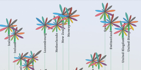
Beginning of this week, we launched a new project: the OECD Better Life Index, which allows you to compare 34 countries with respect to 11 different topics, ranging from Health, Life Satisfaction over to Jobs and Income. By choosing importance levels for these topics, you can actually brew your own country ranking and share it with friends on the web.
The visualization principle is simple: Each country is represented by one flower, one topic by one of its petals. The length of a petal indicates the score of the respective country in that topic (e.g. income in Germany). If we add up all scores, we get a toal score for each country. The higher the score, the higher the flower will rise.
The launch event itself was crazy, as the presentation of the site was the first point after the keynote address at the OECD’s 50th anniversary – and of course the site would go down 20 minutes before the live demo! But in the end, all worked out great, and we were able to sort things out and cope with the quite overwhelming demand on our servers. If you are interested, here is a video recording of what happened on stage.
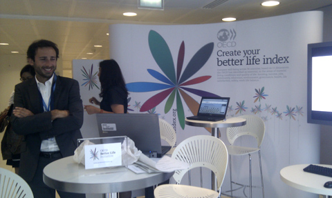
Overall, it was great to see how the “flower virus” took over the event, from the booth…
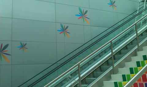
… to wall decorations:
A memorable day for sure!
Btw, while I worked on the design and implementation of the visualization, the branding, web design and site production was handled by Timm Kekeritz at Raureif and Jonas Leist. And big props to the fantastic team at OECD, who fought like lions for our crazy ideas and managed to put together these huge amounts of content on the site in very short time.
Places & Spaces
I am happy to announce that the MACE taxonomy visualization I did a few years ago will be part of this year’s Places and Spaces exhibition. For this occasion, I brushed up the original graphic a bit (most notably somehow managed to export a somewhat editable pdf from Flash with AlivePDF), and added some explanations, and voila, here is the poster:
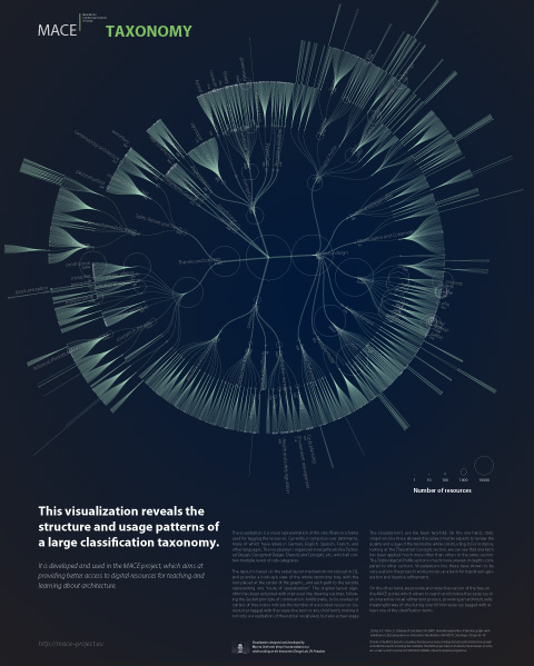
Feel free to print it yourself (CC BY-NC-SA):
download portrait version (pdf)
download landscape version (pdf)
Lasst die Daten sprechen
Here is the recording of my (German) talk from last year’s decoded conference: “Lasst die Daten sprechen – Datenvisualisierung und Informationsaesthetik”
see+
I am happy to announce that together with my friends Andrew Vande Moere and Benjamin Wiederkehr, I am organizing a little informal extension to the see conference on Sunday April 10. We call it see+.
In the morning (i.e. hang-over friendly 11:30), we will have Justin Manor and Wes Grubbs over for an open discussion on information visualization, life, the universe, and all the rest.
And in case you wanted to get your hands dirty in data, in the afternoon (around 14:00), a hands-on workshop on information visualization tools will provide you with a practical overview of how to develop your own interactive data representations.
In case you are still pondering if you should go to the see conference – hesitate no longer – the tickets are becoming scarce! For me, it is always one of the highlights of the infovis year, and I am sure it will be as inspiring as ever.
If you plan to attend see+, let us know on the facebook page or in the comments. Also, all kinds of suggestions for discussion or workshop topics are welcome.
Speaking at eyeo

The eyeo festival is going to take place end of June in Minneapolis, and boy, does it have a line-up: Ben Fry, Zach Lieberman, Aaron Koblin, Mark Hansen, Robert Hodgin, Nervous System, Marius Watz, Amanda Cox, Nicholas Felton, Golan Levin, Greg Smith and many other great speakers – it reads like the “who is who” of contemporary code+design culture.
Imagine how I was rubbing my eyes when I was asked to speak there too! I am much looking forward to what will surely be a very unique event and I hope many of you can make it there, so we can hang out and talk shop. Tickets are quite limited, so make sure to decide quickly!
Notabilia — Visualizing Deletion Discussions on Wikipedia
Just in time for Wikipedia’s forthcoming tenth anniversary (congrats!), two researchers – Dario Taraborelli and Giovanni Luca Ciampaglia – approached me for a cooperation on visualizing the discussions around article deletions on Wikipedia. The (intermediate?) results are online at notabilia.net.
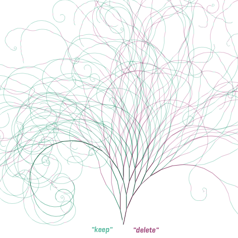
I came up with a tree visualization, where Article for Deletion discussion is represented by a thread starting at the bottom center. Each time a user recommends to keep, merge, or redirect the article a green segment leaning towards the left is added. Each time a user recommends to delete the article a red segment leaning towards the right is added. As the discussion progresses, the length of the segments as well as the angle slowly decay.
In the visualizations, I tried to capture the tension between chaos and order inherent to the discussions, and provide a nice serendipity interface as well.
So much to learn about…
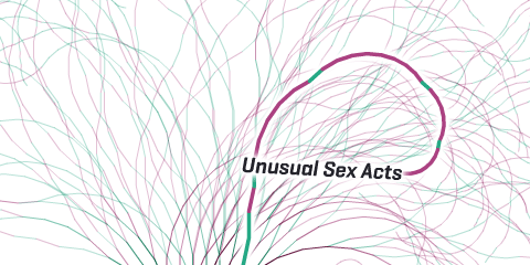 …or…
…or…
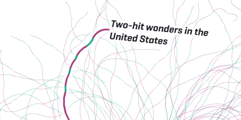 …and…
…and…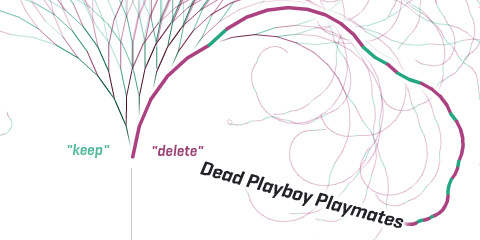
But also some more hard analysis can be found at notabilia.net, looking at the vote distributions, lengths of discussions, etc. Take a look yourself!
