Visualization and Aesthetics Research
Just a quick pointer to three interesting papers about the trends in and models of information visualization:
Andrea Lau and Andrew Vande Moere
Towards a Model of Information Aesthetics in Information Visualization
This paper proposes a model of information aesthetics in the context of information visualization. It addresses the need to acknowledge a recently emerging number of visualization projects that combine information visualization techniques with principles of creative design. The proposed model contributes to a better understanding of information aesthetics as a potentially independent research field within visualization that specifically focuses on the experience of aesthetics, dataset interpretation and interaction. The proposed model is based on analysing existing visualization techniques by their interpretative intent and data mapping inspiration. It reveals information aesthetics as the conceptual link between information visualization and visualization art, and includes the fields of social and ambient visualization. This model is unique in its focus on aesthetics as the artistic influence on the technical implementation and intended purpose of a visualization technique, rather than subjective aesthetic judgments of the visualization outcome. This research provides a framework for understanding aesthetics in visualization, and allows for new design guidelines and reviewing criteria.
While I find the triangle model based on Data, Interaction and Aesthetics quite enlightening and useful, I am not so convinced of the data focus and mapping focus classification. Anyways a great paper.
Robert Kosara
Visualization Criticism – The Missing Link Between Information Visualization and Art
Interesting points, especially the claim that we need to think about frameworks to criticize information visualization examples and techniques from different perspectives. The presented model, however, is quite simplistic, focussing on readability and recognizability, and based on that, a one–dimensional and —from my perspective—too shallow distinction of pragmatic vs. artistic approaches.
Fernanda B. Viégas and Martin Wattenberg
Artistic Data Visualization: Beyond Visual Analytics
A nice overview of not strictly analytic approaches to information visualization.
Visual tools for the socio–semantic web
Yes, it’s done.
Find the pdf here
and an overview of the experiments and visualizations here
and me in the sun :)
Check back, there might be more updates (especially for Konduit) over the next couple of weeks, as I am preparing my final presentation.
And other than that, this blog will, of course, go on, with more visualization and interaction pieces, critiques and discoveries.
Weinberger at the Well
There is an interesting discussion with David Weinberger (author of “Everything is miscellaneous“) going on at the Well about folksonomies and metadata.
Tag maps update again
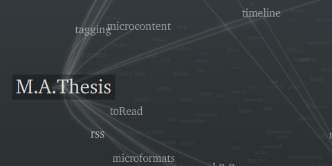
PS: 12 days to go, wish me luck!
Emerging topics update
My thesis is due pretty soon, so I am currently writing A LOT and make some on–the–go beautifications to my experiments.
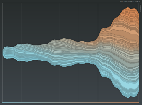
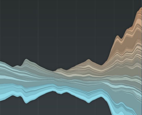
First one is the emerging topics histogram. I followed my own advice and vertically centered the stacked histogram. Additionally, I never liked those sharp edges, so now I do not only “fade out” tags visually, but also fade them in, resulting in a much more organic picture, and largely improved readability of the chart. New color scheme: old tags are cold, freshly introduced ones in warm color. This is all very much inspired by the fabulous last.fm charts by Lee Byron – thanks!
> new interactive version here
and some pix:

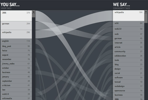
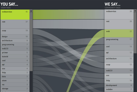
You say… We say…
Another visual experiment on tagging:
How do individuals use tags — compared to the community? Do you use private language or are you a mainstream tagger? When you tag with “design” — do the others think it is “art”?
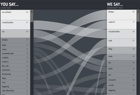
On the left: the personal tags for the personal bookmarks — ordered by frequency — the containing box per is log-scaled so you get an impression of the long–tail position of a tag. Which means: Often used tags are large, bright and go to the top.
On the right: community tags for the tagged ressources.
In the middle: tags with the same name are connected. If a line is horizontal, the indvidual and the community essentially agree on the relevance of the tag for the ressources. The steeper it is — the larger the disagreement. If no line starts at a tag, it means it is not present in the other list
So in the picture above, you can see my tags. Same facts you can read from the picture:
• “m.a.thesis” is a very often used, but private tag of mine.
• The ressources I tag in general are mostly tagged with “design” by the community. I, however, use the tag “design” much less often.
• “news”, “semantic web”, “webdev” are tags I use often, but not the community.
etc.
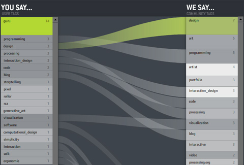
And often course, you can click individual tags to see what the comparison is like for subsets of the bookmarks. That’s especially interesting for obscure tags like “guru” — you can see what the tagger “means” by looking at the distribution of the community bookmarks (in this case “design – art – programmer – artist”). Interesting!
Some more shots:
I wish I could say “click here for the interactive version” as usual — but unfortunately, del.icio.us offers a JSON API, but did not put a crossdomain.xml file on their server. Which means the visualization (which runs nicely on my harddisc) cannot load data when put in the web. Bummer. I hope I can figure something out.
So for now — I can only offer a download link. Click the index.html. You might have to adjust you Flash player security settings in order to load the community tags. Caveat: The application is still a bit buggy and pretty heavy concerning processor ressources.
Hourly shots + delicious + twitter = fun
I am having fun here with a little custom made Flash app that reads
• hourly shots from my built-in webcam
• my twitter posts
• and my delicious bookmarks
and puts it all together. Bit messy at the moment, but I am working on it.
Forrester Research: Social Technographics
Just got my hands on the quite fascinating “Social Technographics” study from Forrester Research. They take a close look at the social and demographic structure of the social web population — unlike Technorati’s statistics which mostly focus on raw blog growth numbers and structural features of the blogosphere. The study is based on two surveys including including close to 5000 North-American individuals each.
Interesting facts:
22% of adults now read blogs at least monthly, and 19% are members of a social networking site. Even more amazingly, almost one–third of all youth publish a blog at least weekly, and 41% of youth visit a social networking site daily.
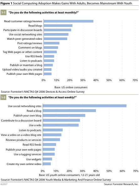
Based on an analysis of online participation and consumption practices, the authors identify six segments of users, ordered by degree of participation:
Sense hacking
Late fame for a project I was involved with at my old university: The feelSpace belt allows users to “feel” the north direction via tactile stimulation. It was an experiment in hacking the senses — can we induce new modalities by technology?
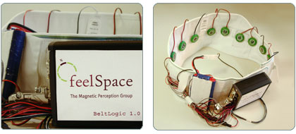
Thanks to Sunny Bains for the nice WIRED story!
Hans Rosling / gapminder
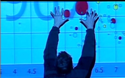
Watch Myths about the developing world, a talk by Hans Rosling from gapminder.org
Intense, thrilling, passionate. 10/10.