Visualizing gaps in time-based lists
As a side product of my work on web feed visualization, I made a small comparison of different ways to deal with temporal information in lists of microcontent, such as e.g. blog entries.
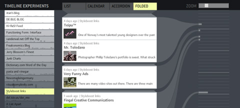
1) Ordered list without gaps: Clearly, the most space-efficient solution – however, only temporal ordering is preserved and not temporal structure. It is not visually evident how the items are distributed over time.
2) Calendar: Each time unit (days for example) has equal space assigned, regardless if there are items assigned or not. A precise display, however, very space-inefficient, since a lot of the display space is typically used for displaying “nothing”.
3) Accordion: Similar to calendar view, but empty time units are displayed on much less screen estate. This gives a pretty good first-glance impression of large gaps and close-together items. However, depending on the temporal structure, there might still be large streaks of wasted space for large gaps.
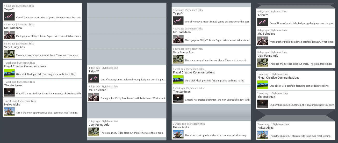
4) Folded gaps: This is the solution I propose (and which I believe is novel. If otherwise, I would be happy about a short notice!): Temporal gaps are displayed as if a part of the list was folded to the back of the display. Short gaps have almost the same size as in accordion view. Long gaps are larger, but do not grow linearly, but with the square root of the number of empty time units. Visually, this is justified by introducing shading to indicate that the “original material” is folded to the back. Folding also provides a plausible model for interactive adjustments such as regulating the gap size.
To support my argument, I also made small demonstrator based on actual web feed data. It takes a while to load (~700k of data), so please be patient. On the left, you have a menu for selecting different feeds. On the right, I drew a connection of each item to a calendar with fancy curved lines. You can adjust the size of the displayed items with the zoom slider.
Let me know if it works for you – technically and conceptually!
November 21st, 2006 at 12:58 am
Great stuff.
Honestly!
Where can I buy it?
Is there a Firefox plugin?
Screw Sage feedreader…
Best from Paris,
J.
November 21st, 2006 at 9:43 am
[…] I found 2 very interesting experimental demo: “the relational tag cloud” and the “time relational gaps visualizer“. […]
November 21st, 2006 at 1:09 pm
very nice idea and realization :)
but you should make “calendar” view (left part) clickable. if I know, in which dates user posts, I also want to click-and-view these time frames.
November 21st, 2006 at 5:51 pm
Thanks for your comments!
@genie: Yes, this was the plan, however, it didn’t work out technically due to the odd code I wrote. Definitely, the calendar could be used for scrolling, but maybe also for zooming the list. Right now, it’s only there for comparing the visualizations, not a really functional component…
@daniele, jerry: Thanks for the praise!
November 22nd, 2006 at 2:31 pm
it’s awesome! :)
February 3rd, 2007 at 4:45 am
[…] some of the really cools toys by Moritz Stefaner , I got particularly interested in his post about visualizing time gaps in data and had a moment of […]
February 12th, 2009 at 10:43 am
[…] http://www.well-formed-data.net | Trackback « OSM 2008: A Year of […]
February 13th, 2009 at 8:51 pm
You’re doing great work here man! I find your explorations inspiring and enlightening. Keep it up.
October 29th, 2009 at 1:30 am
Cool
Where can I get it?
November 23rd, 2009 at 3:33 am
[…] Visit the Well-formed data Website By admin – October 30, 2007 – No comments – Posted in Data, Visualizations. – Tagged with Data, visualization, […]
November 28th, 2009 at 6:35 am
I go to your website from time to time and I just have to mention that I like your template!